#packaging #design #curd #rajo #byMAISON
Packaging design for a series of flavoured cheeses
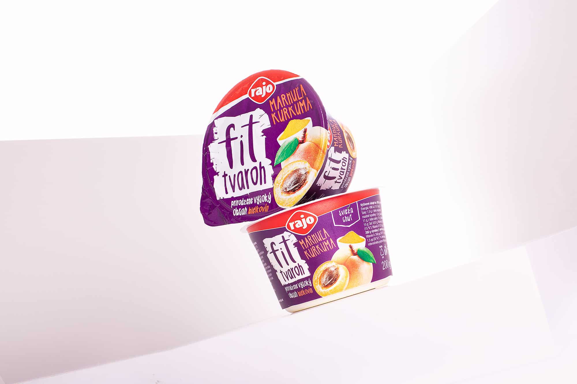
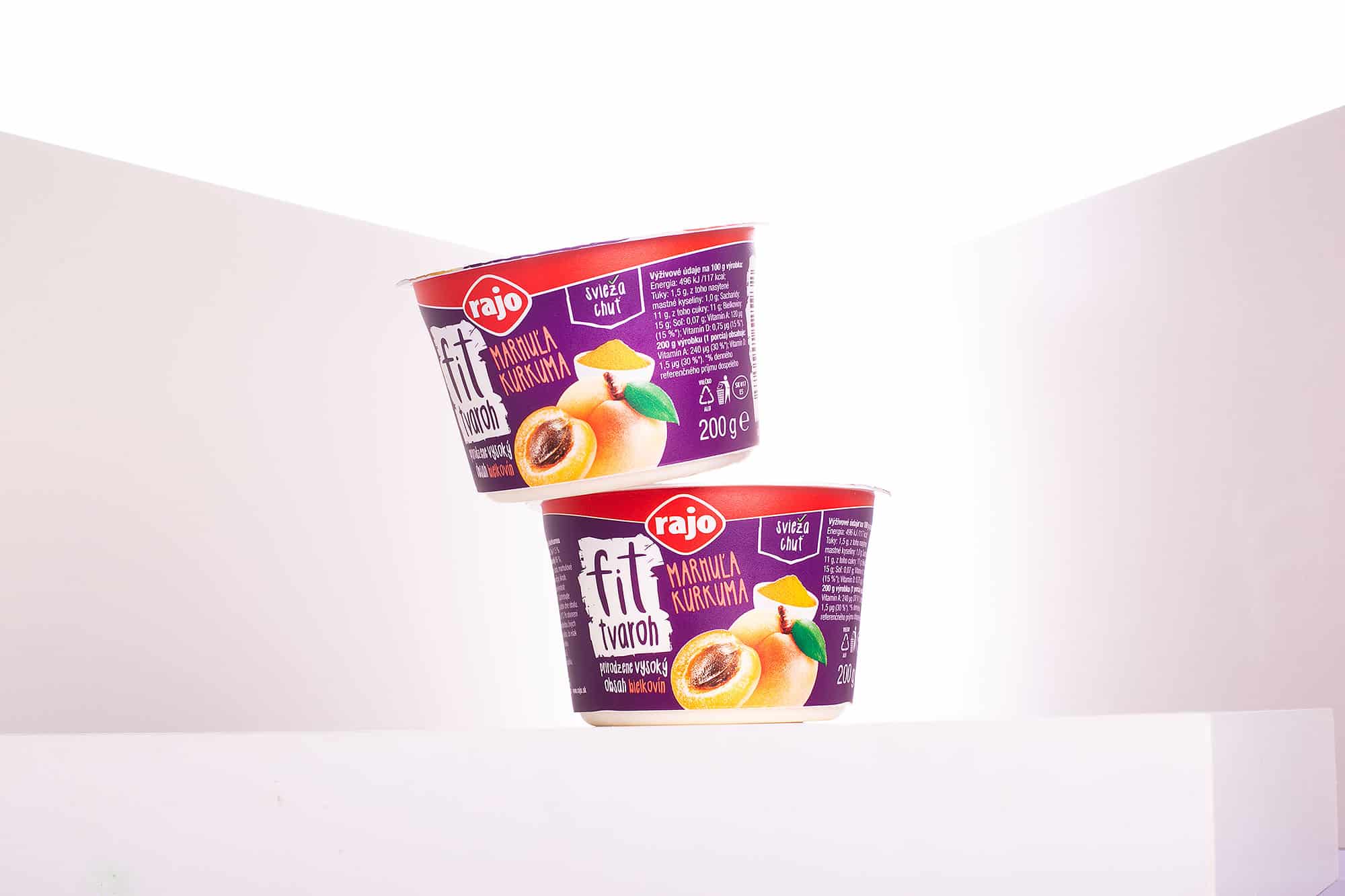
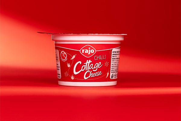
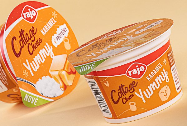
After the success of the redesign of the Cottage Cheese product line, Rajo a.s. approached us to prepare the packaging design and overall look of the new product, Fit Cottage Cheese. The target group was again young and dynamic people who prefer an active and healthy lifestyle. Rajo’s Fit Cottage Cheese is unique because of its low fat content and increased protein content.
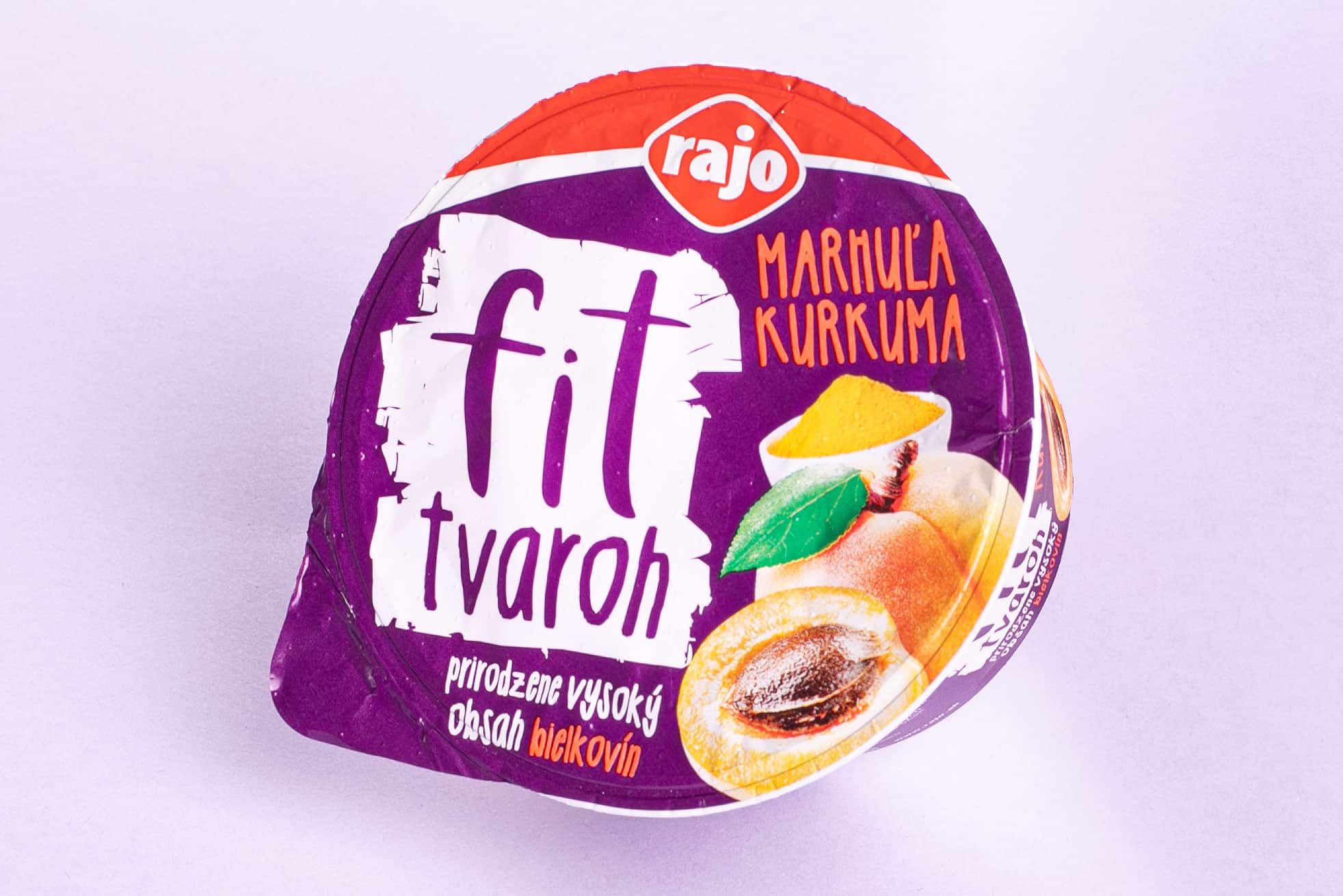
Purple identity as a supporting element for FIT products.
Our idea was to create a distinctive packaging design that would draw a lot of attention to this new product on the shelves. That’s why we chose an unconventional purple colour to serve as a base for all the flavours of the product. This way, the product does not differ in colour according to type and the impression of its placement on the shelf is not broken by the different colours. Rajo supported our idea and we were able to proceed to selecting a strongly stylized typography, creating the logo and refining the overall product concept into the final version.
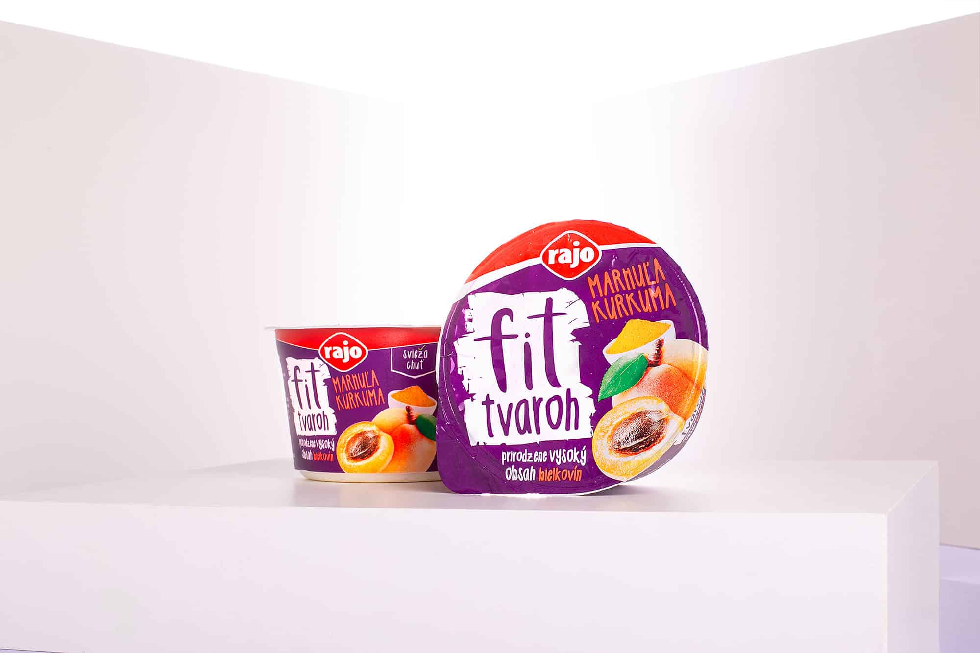
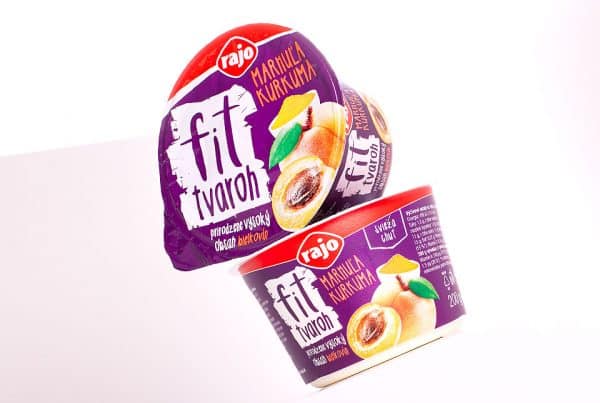
From idea to print to visualizations.
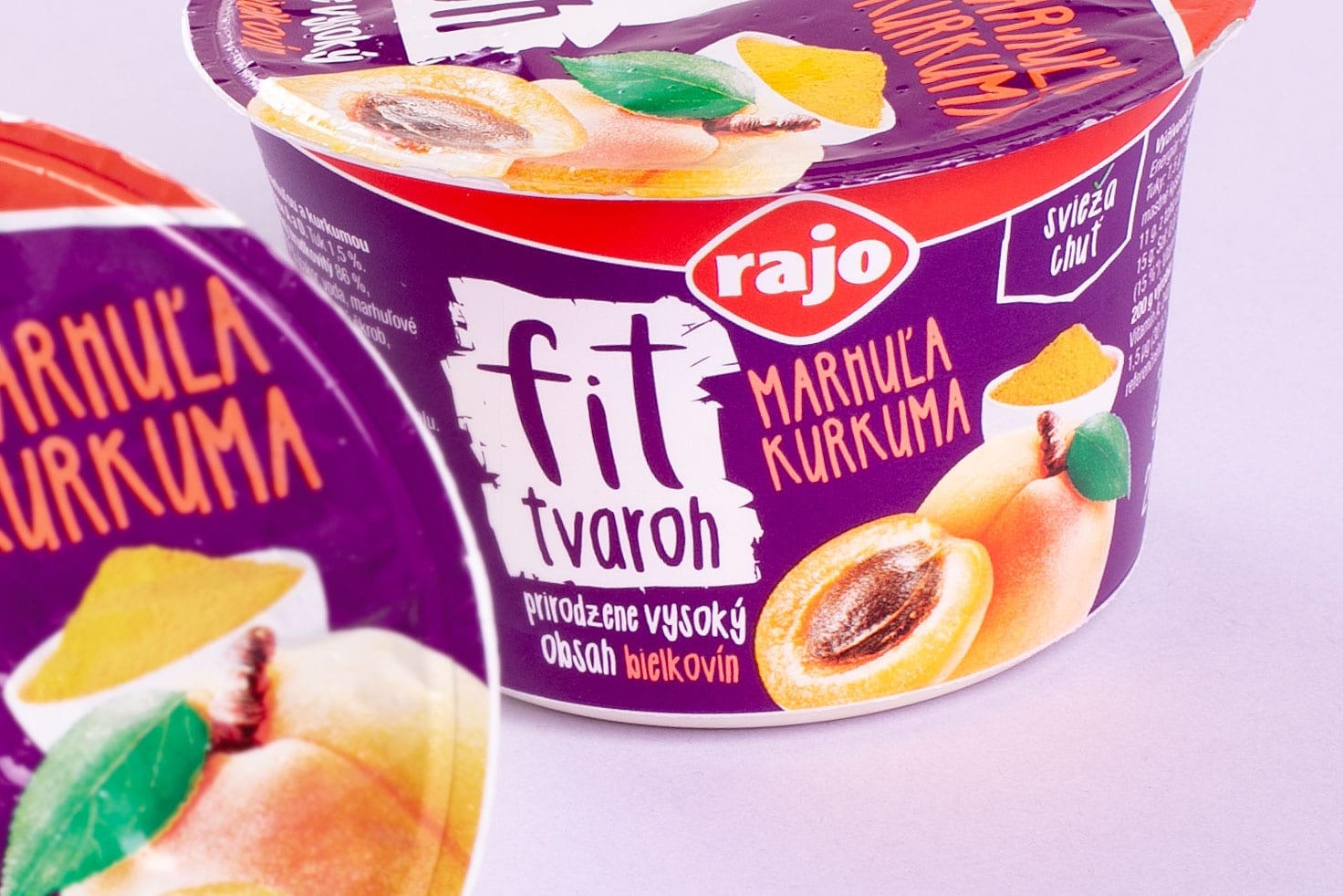
The solution we delivered included not only the idea, graphic design of visuals and print materials, but also the final 3D visualization of the product. Compared to the original packaging used for Cottage Cheese, it was supplemented with a modified transparent plastic cover with a cleverly placed spoon. We modelled this down to the last detail and fitted it into the final visualisation.
The cooperation with Rajo a.s. was once again great and we are looking forward to the next joint project, which we believe will be as successful as the previous ones.