Project name: Penna Hygienic Products Packaging
Art Director: Martin Kuspal
Agency: MAISON D’IDÉE
Client: Packaging Concept
Design year: 2015
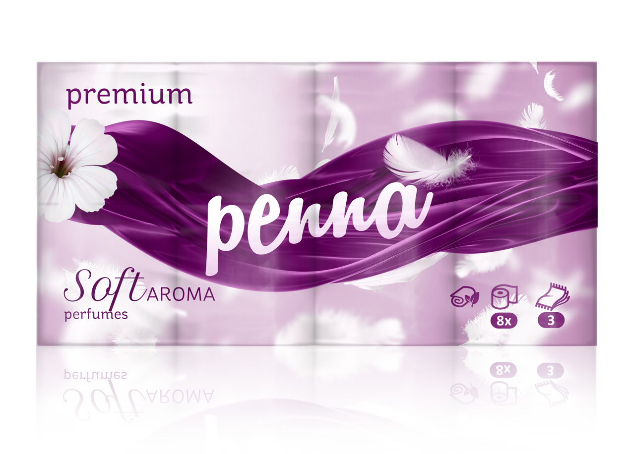
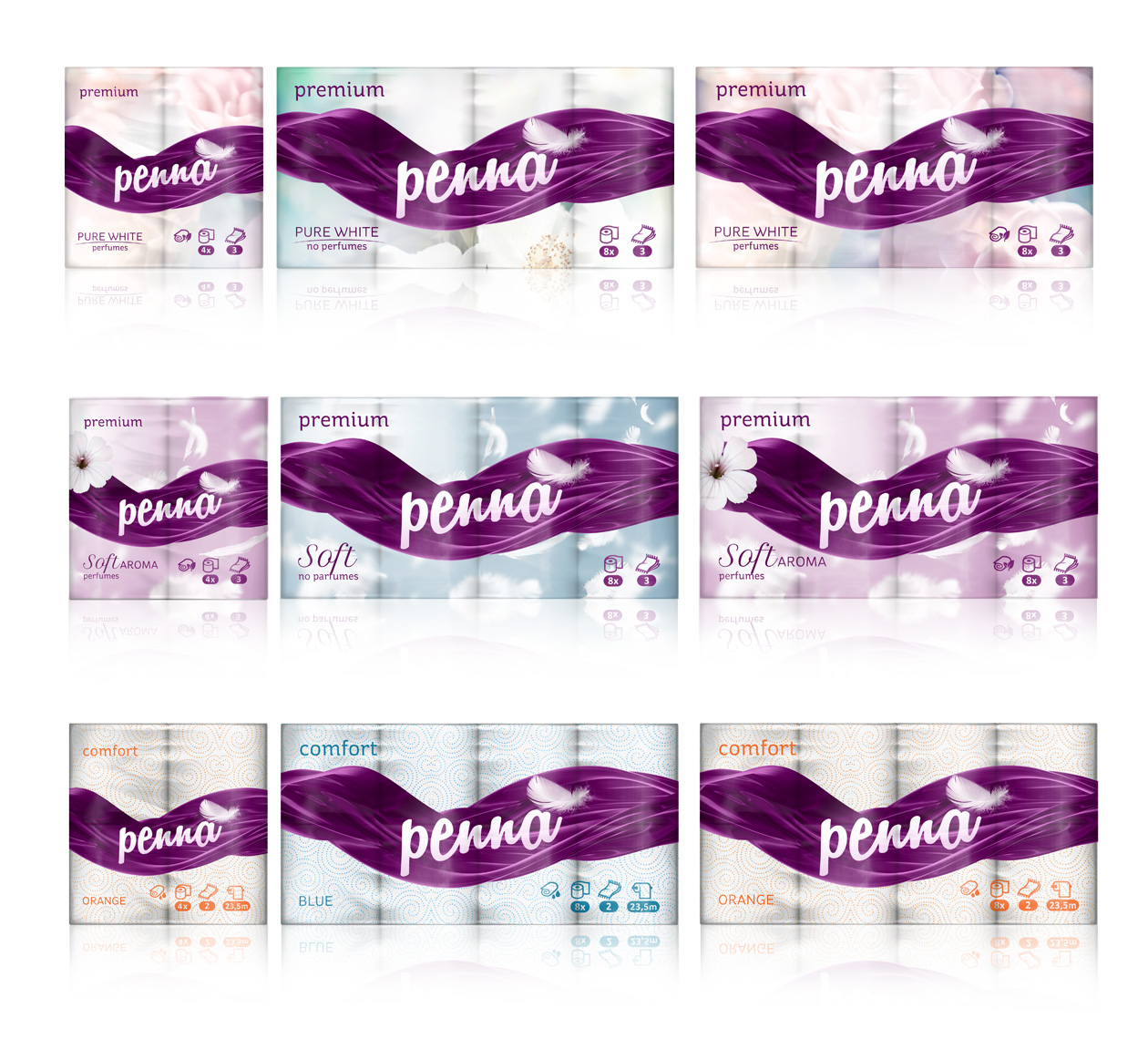
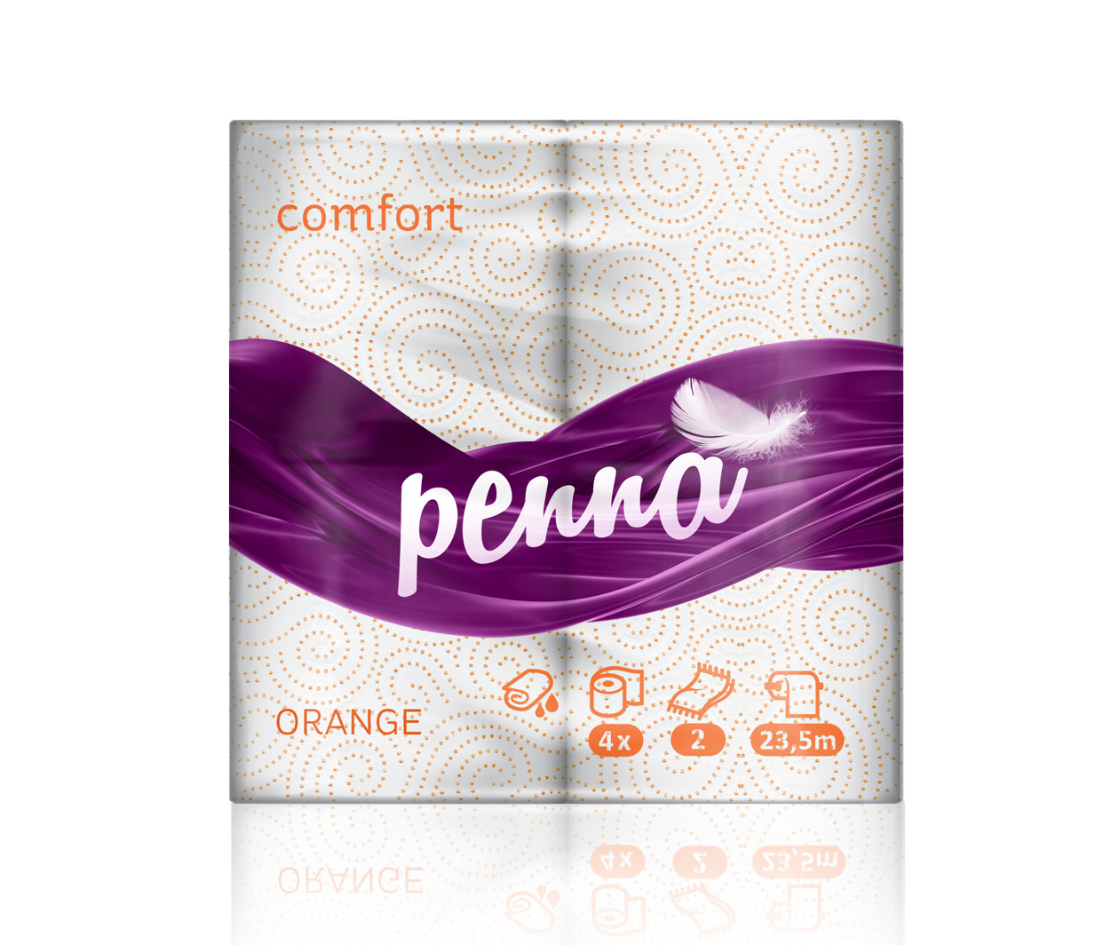
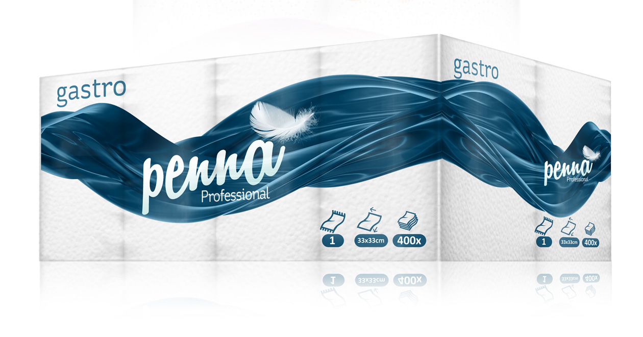
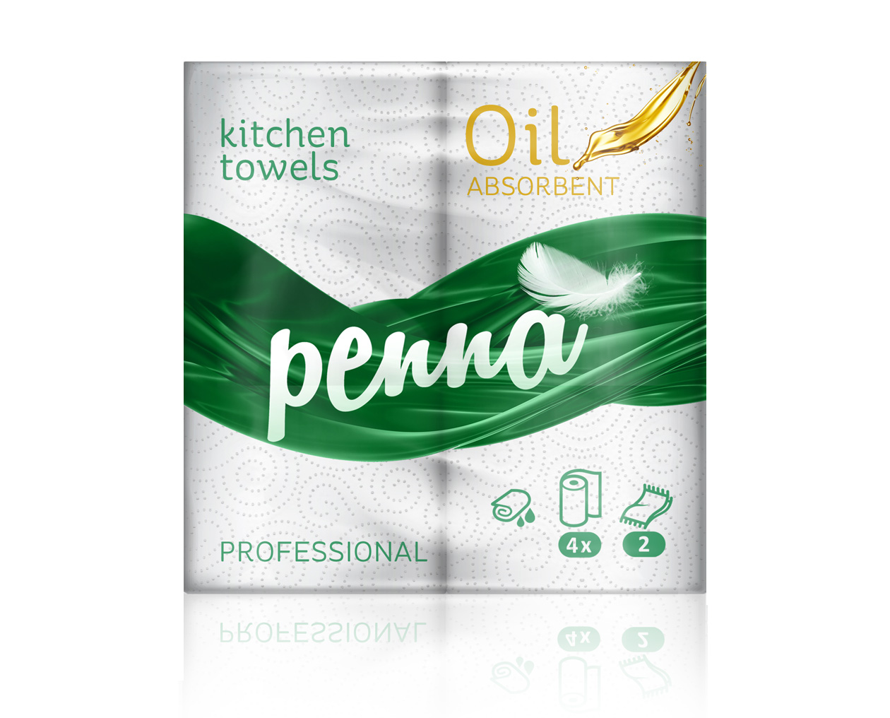
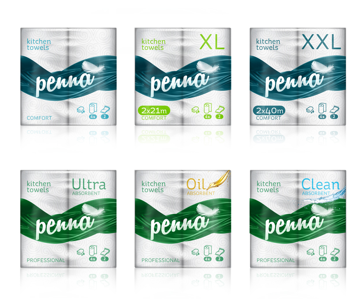
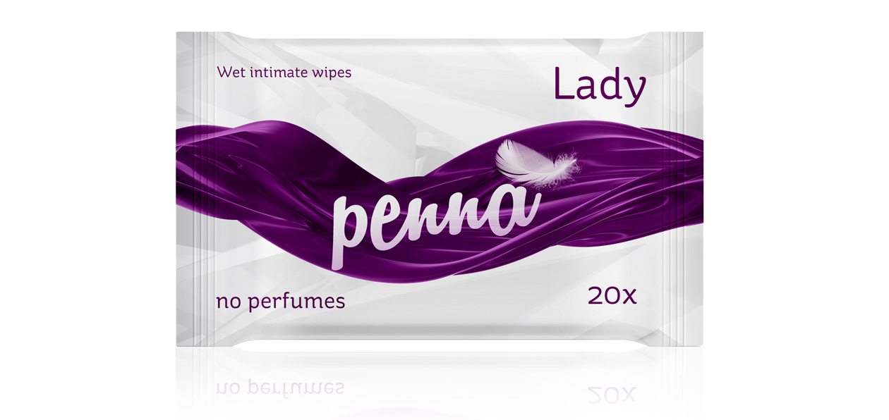
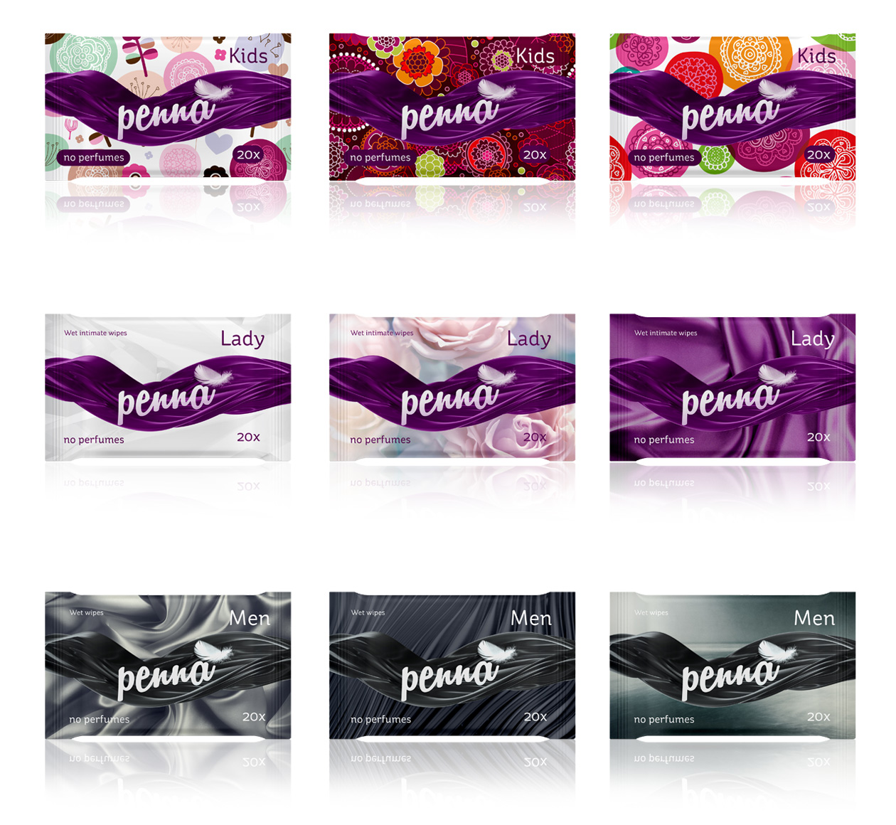
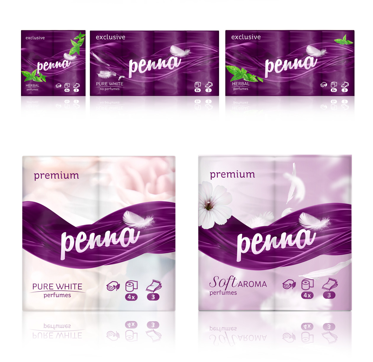
Penna, meaning feather in Latin, wanted us to transform the image of its wide variety product line. We decided to keep the use of rather generic logo but to make it more eye catching by adding actual photograph of a feather, instead of using an illustration. This was a bit tricky for further use and application on the packaging itself. However, we have solve the problem by creating a strong secondary graphic element which covers the most of the product, making it clearly distinctive on a shelf. The purple tones of brand identity vary to different product lines including home, professional and luxury products.