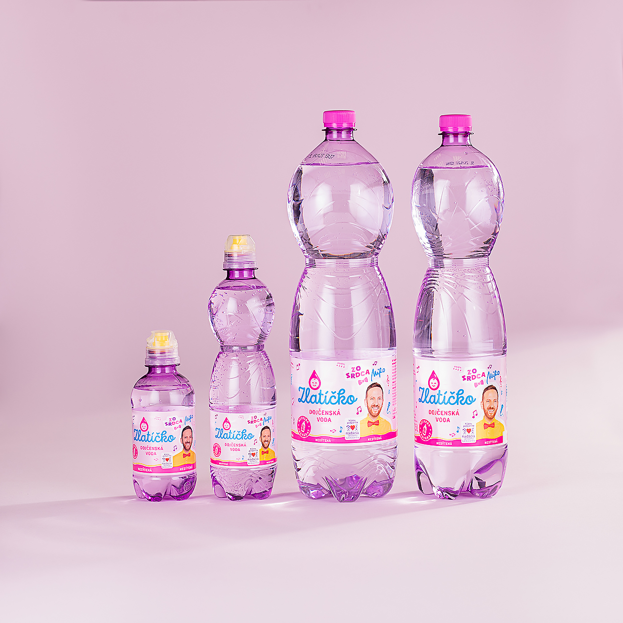
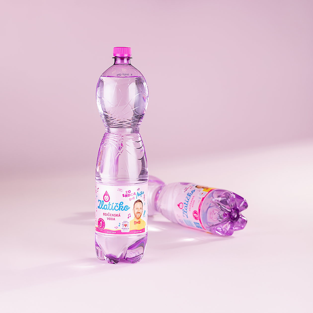
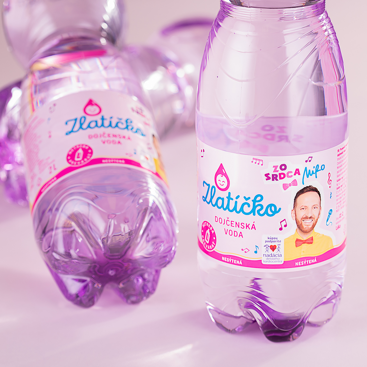
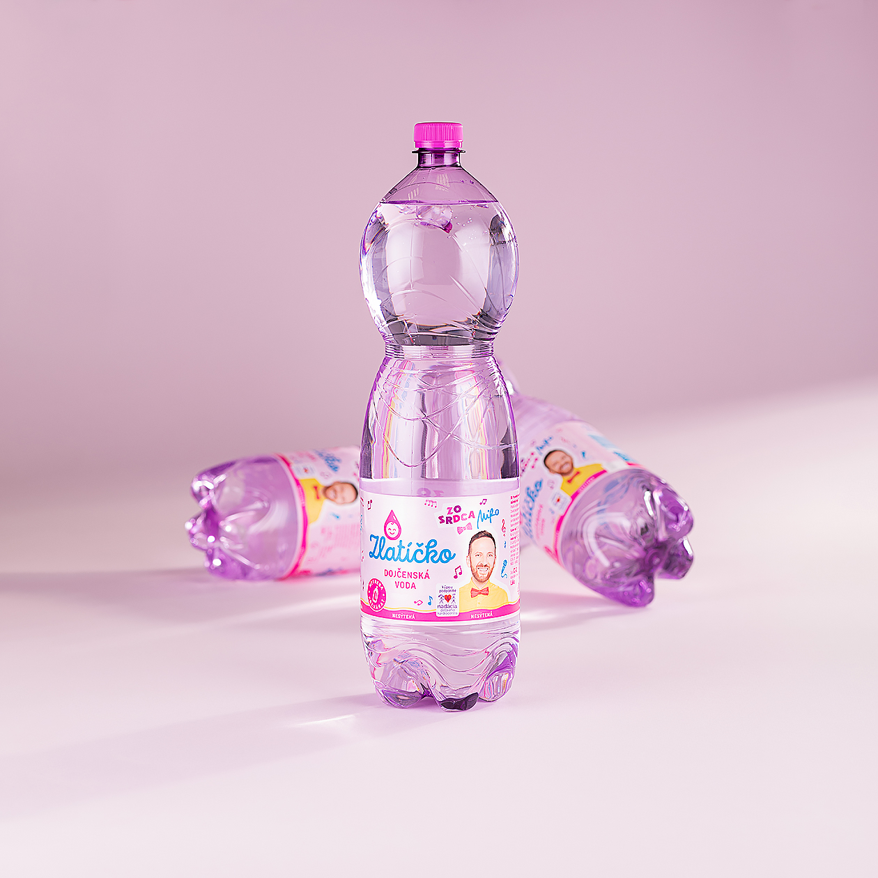
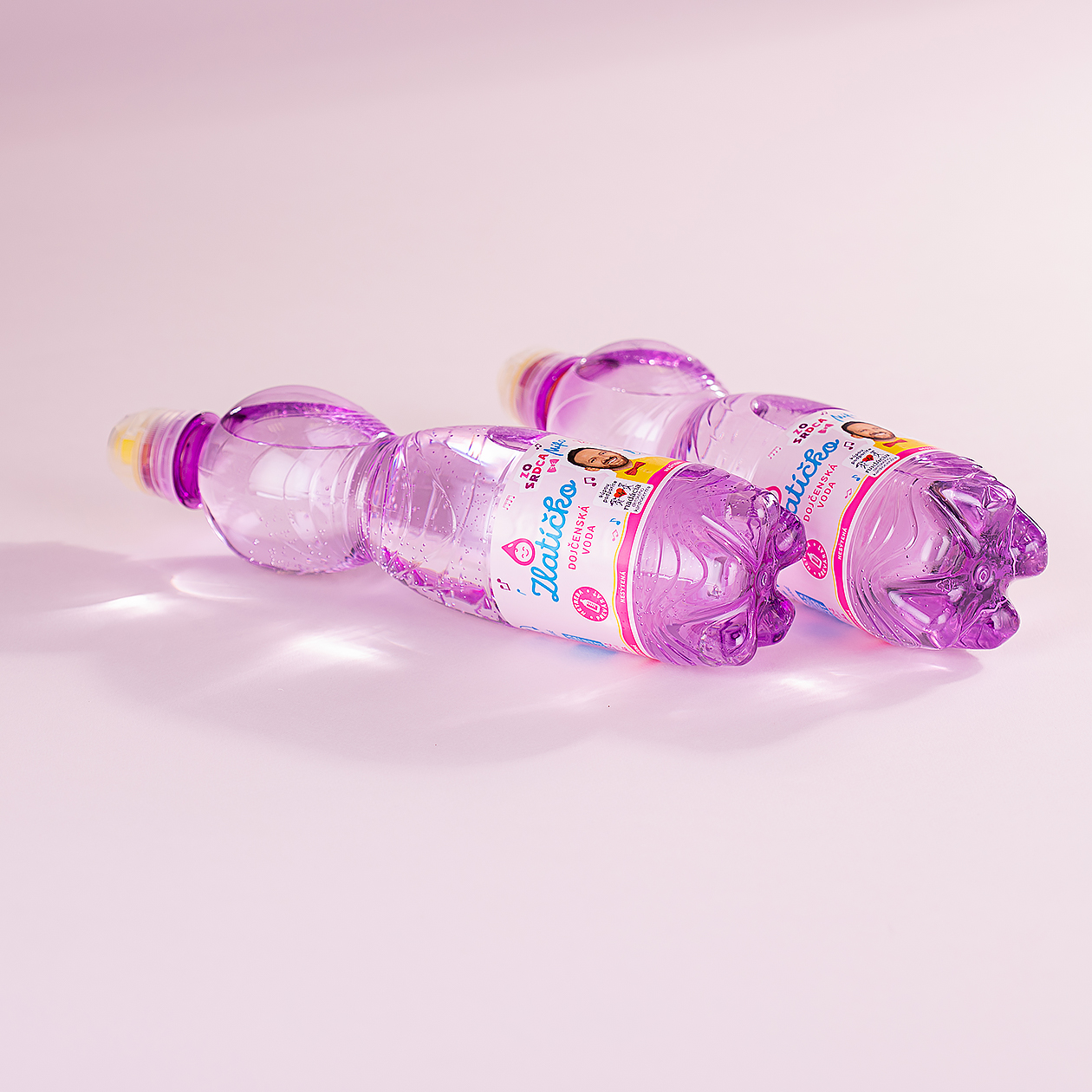
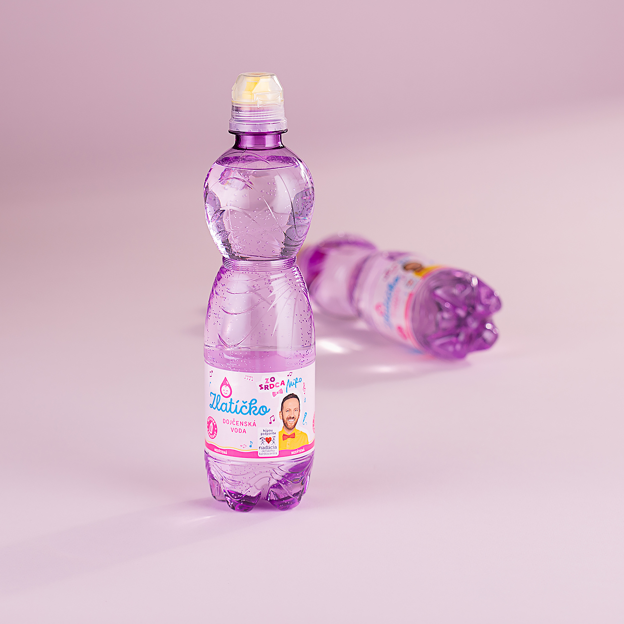
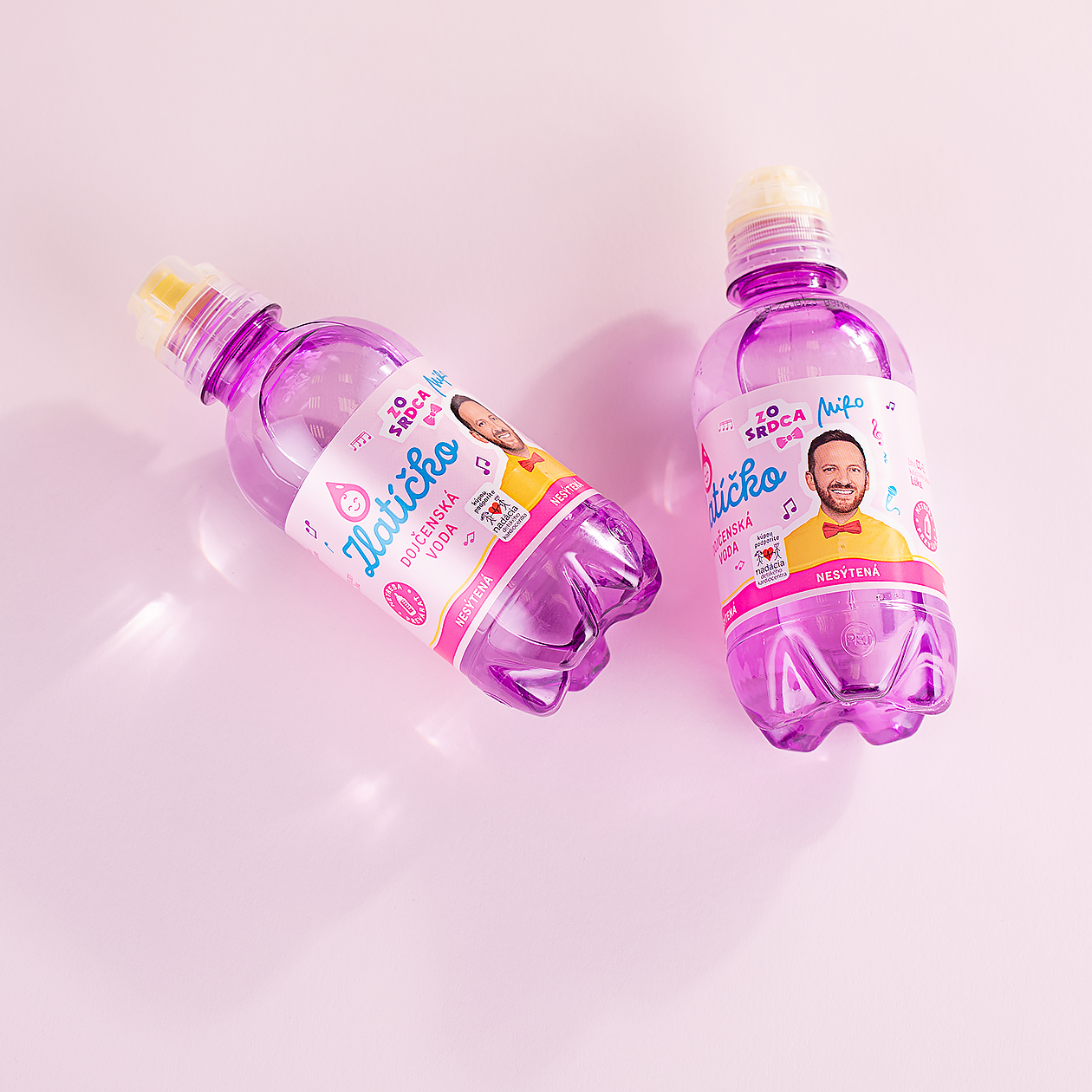
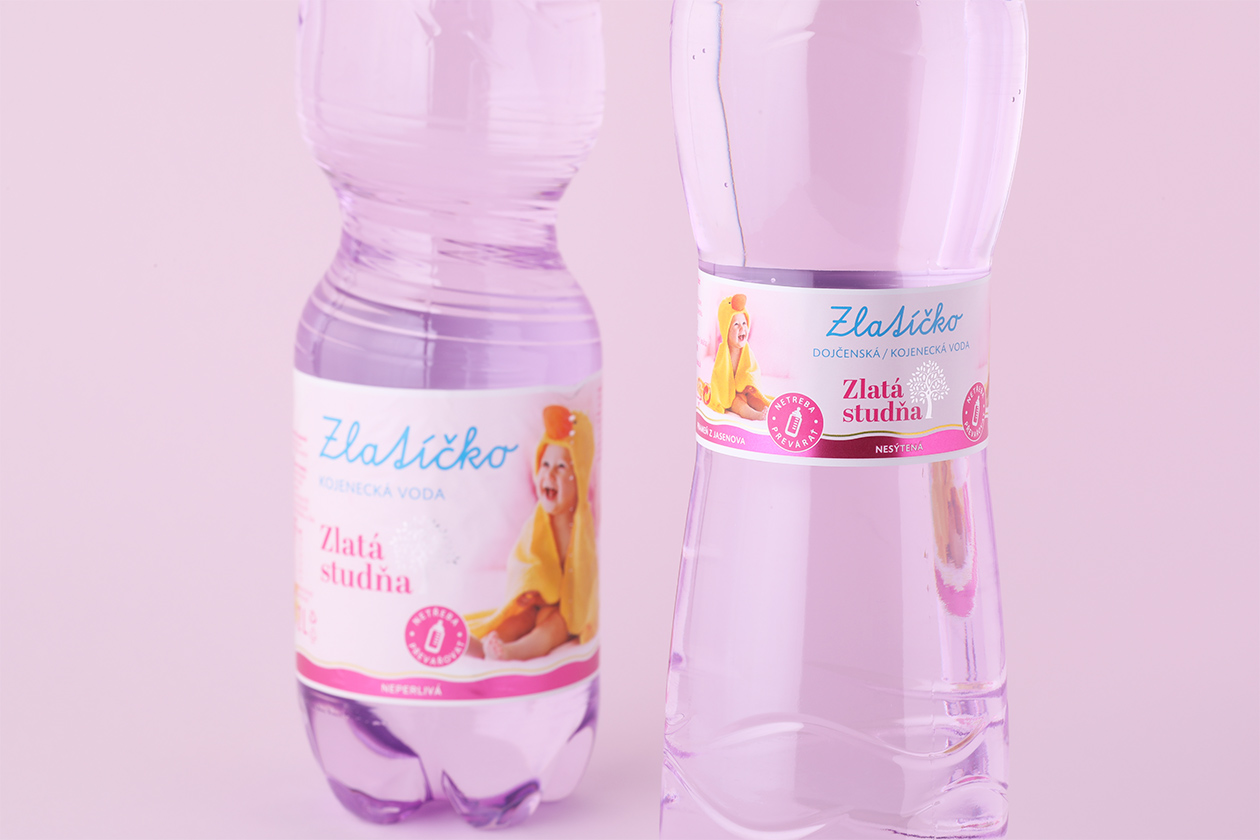
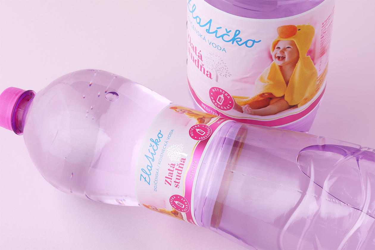
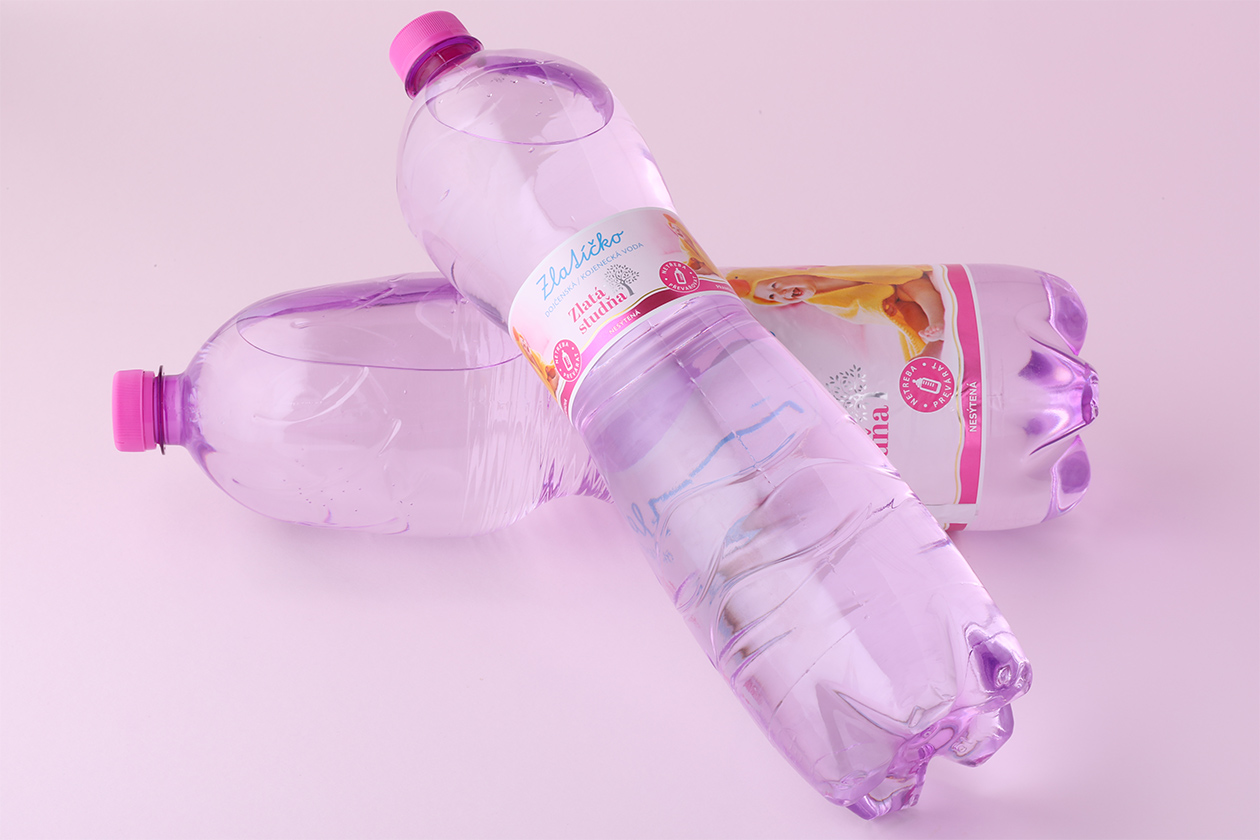
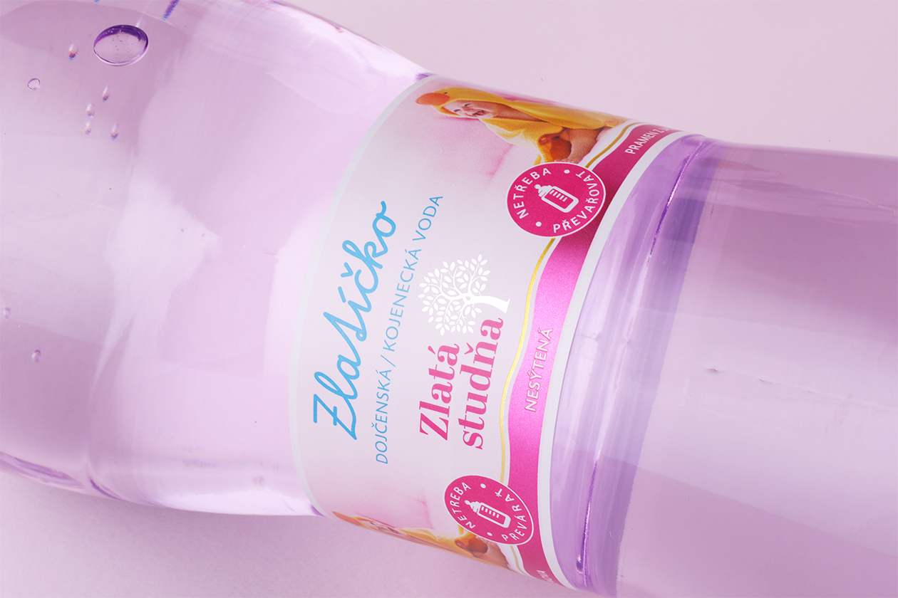
The Zlaticko Darling project involved a packaging redesign for a baby water brand. The design sought to communicate the purity and safety of the water, essential for a product intended for children. The packaging needed to resonate with caregivers, emphasizing the water’s natural origin and suitability for infants. The label was crafted to be visually soothing with playful elements, reassuring parents of the careful consideration given to the product, making it trustworthy for their little ones' consumption.
The logo design for Zlaticko Darling combines playful and nurturing elements, reflecting the product's focus on infants and young children. It conveys a sense of purity and care, aligning with the brand's dedication to providing safe and natural water for babies. The choice of colors and symbols within the logo is intended to resonate with parents, emphasizing the brand's reliability and commitment to health.
The Zlaticko Darling brand leveraged a collaboration with Miro Jaroš, a well-known children's songwriter, incorporating his image and themes from his songs into the packaging. This strategic partnership aimed to connect with the brand's young audience and their parents by associating the product with a trusted figure in children's entertainment. The collaboration is a testament to the brand's commitment to engaging with its consumers through creative and meaningful ways.