We are extremely happy with the new look of the Hamlet prosecco packaging. For one, we were able to create a dreamy almost poetic design for the client, which we love so much. Secondly, we were able to work with a printer in Italy to print the label. It was thanks to the great experience of the local printers and their great communication that we managed, despite the travel-unfriendly times, to complete the look of our packaging design exactly as we wanted.
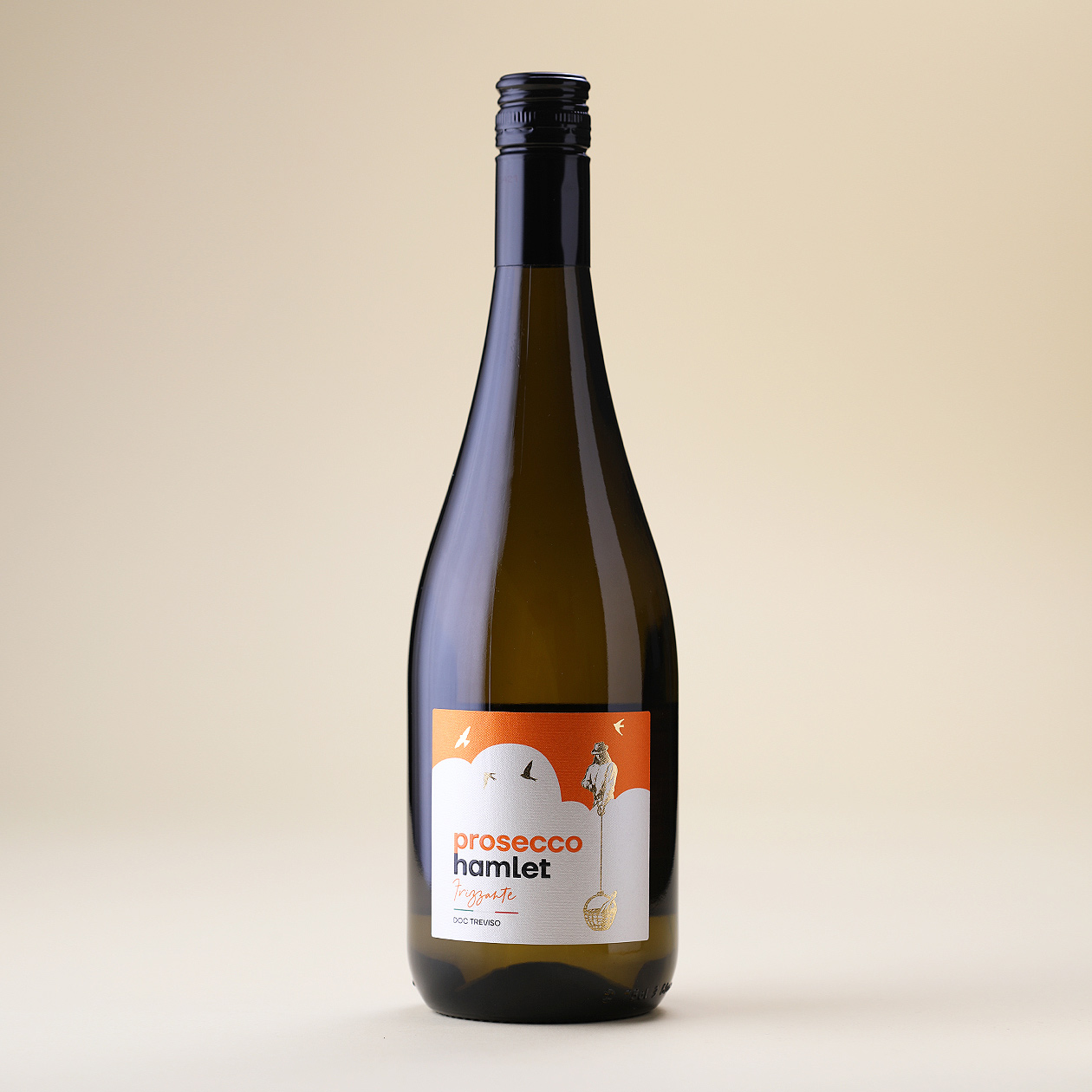
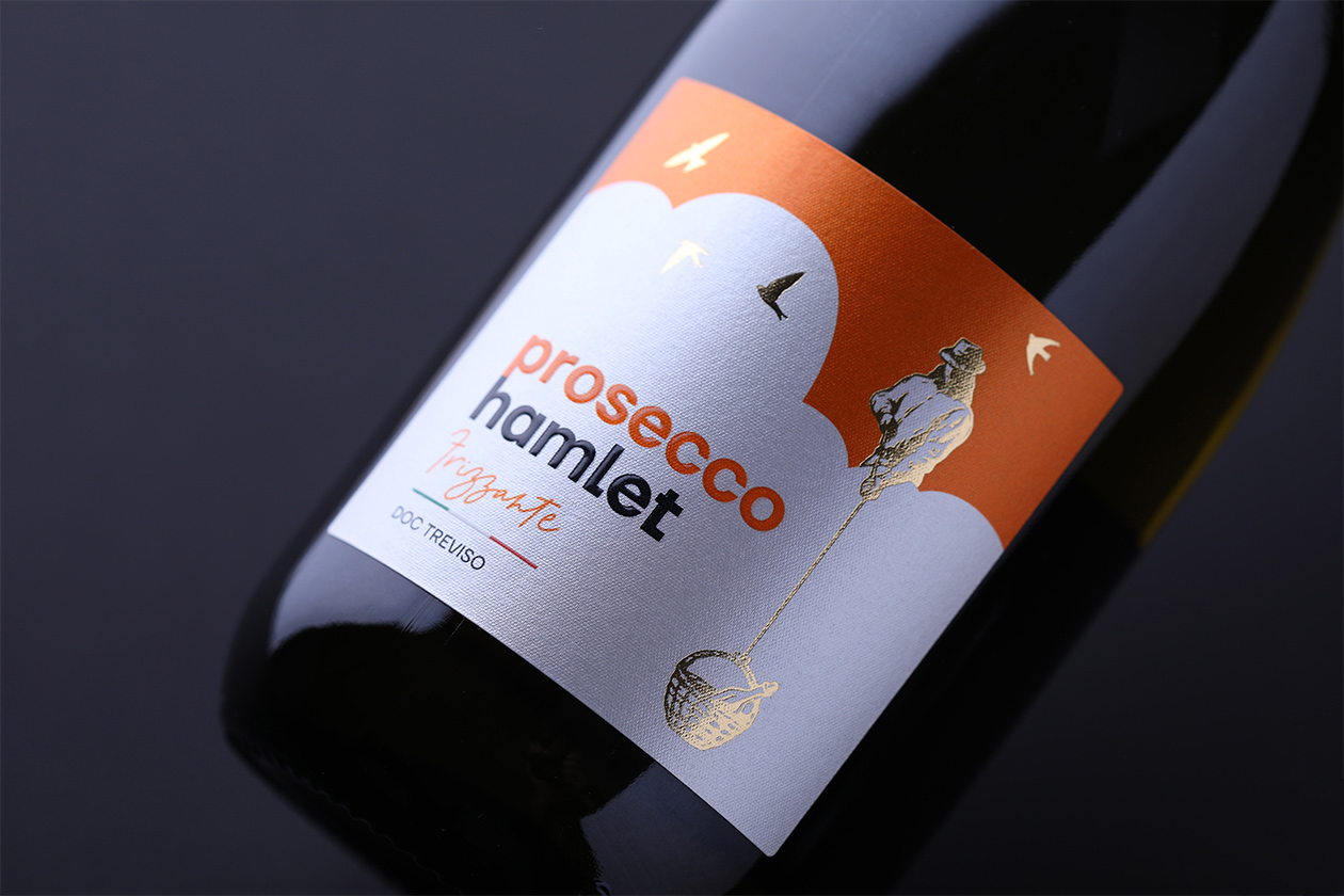
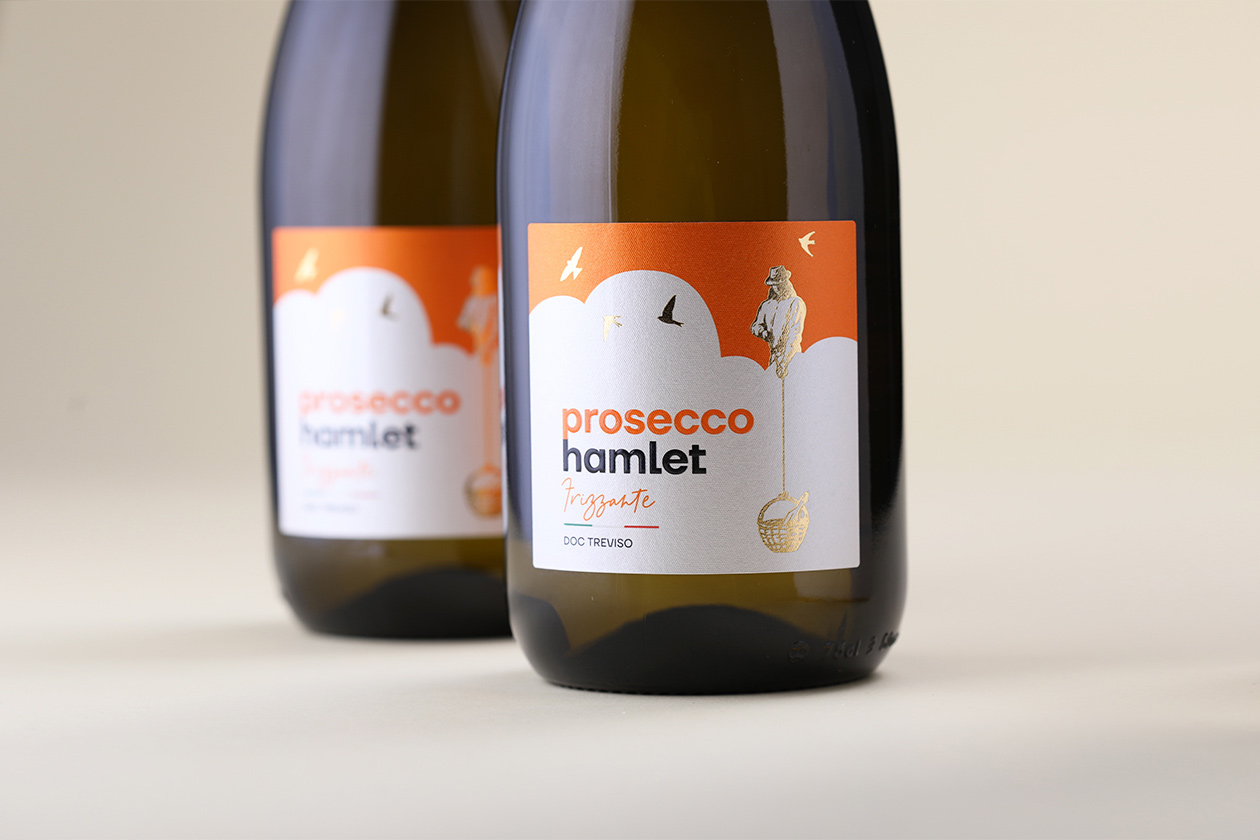
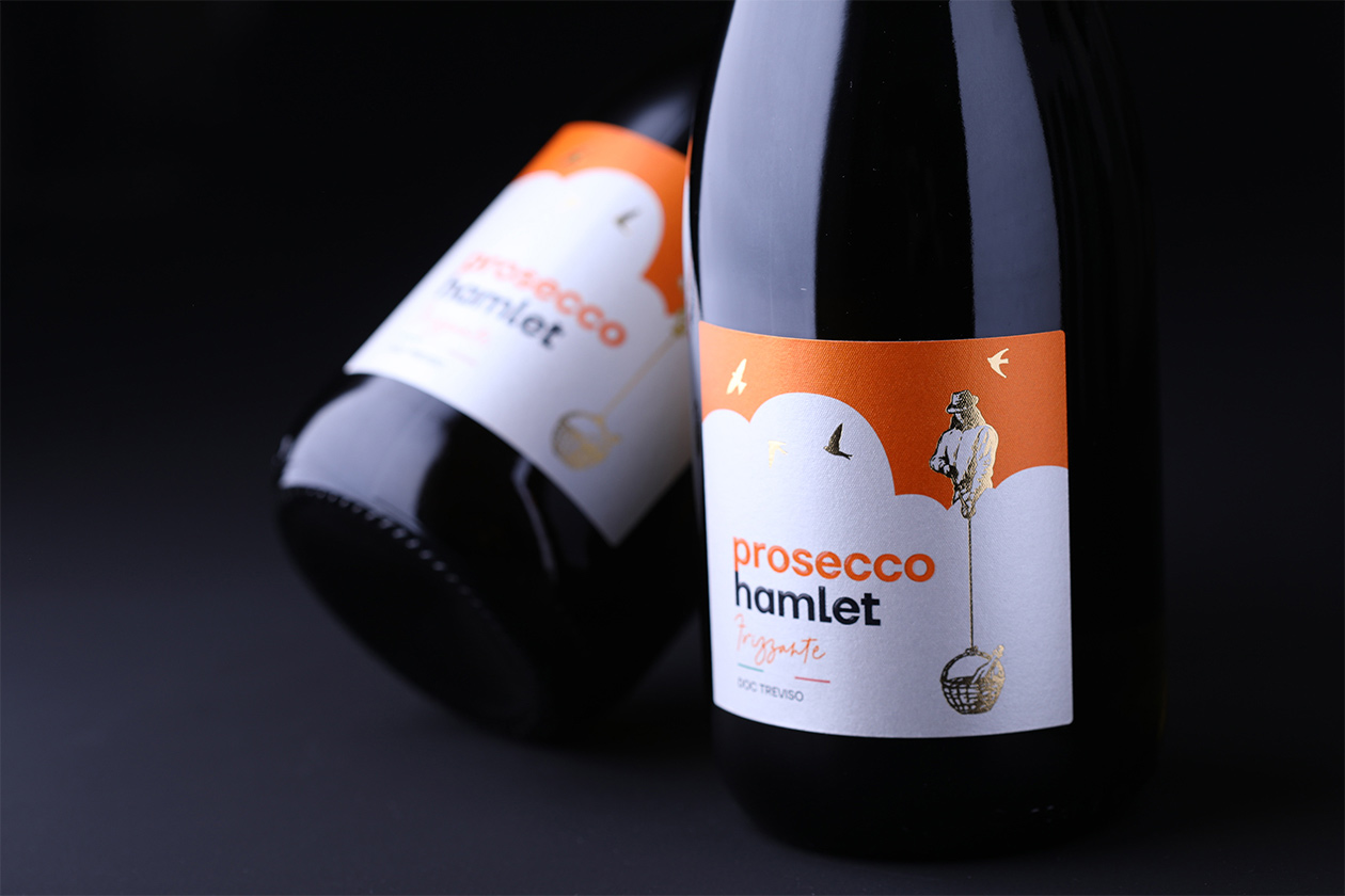
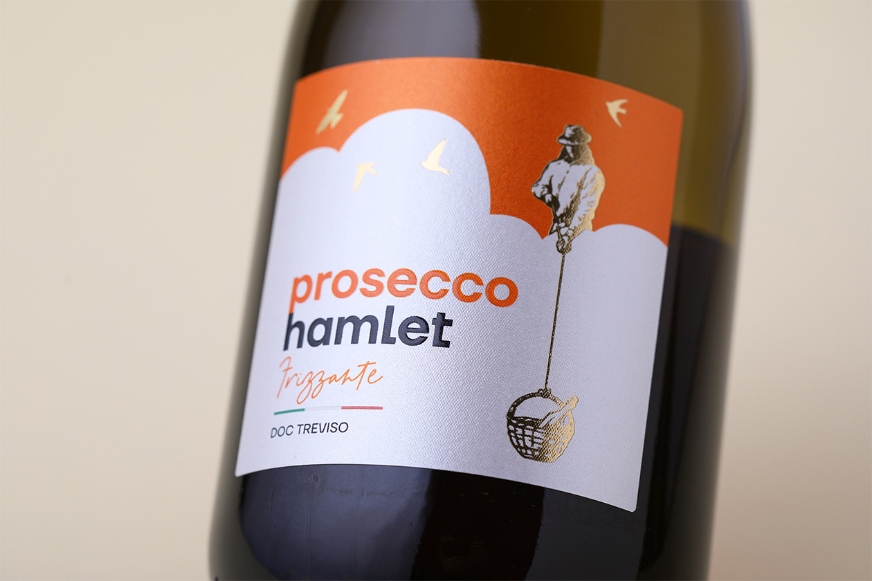
The creative motif of the Hamlet prosecco packaging design is a man in a hat pulling a bottle of this sparkling drink from the ground with a rope towards him – to the sky. The composition of the label is airy and makes no small use of negative space to depict the motif. A complementary minimalist element is the flying swallows. The typography is modern, with a protruding glossy surface thanks to the layered UV lamination. The pearlescent textured paper adds a new dimension to the colours thanks to the glimmer of light.