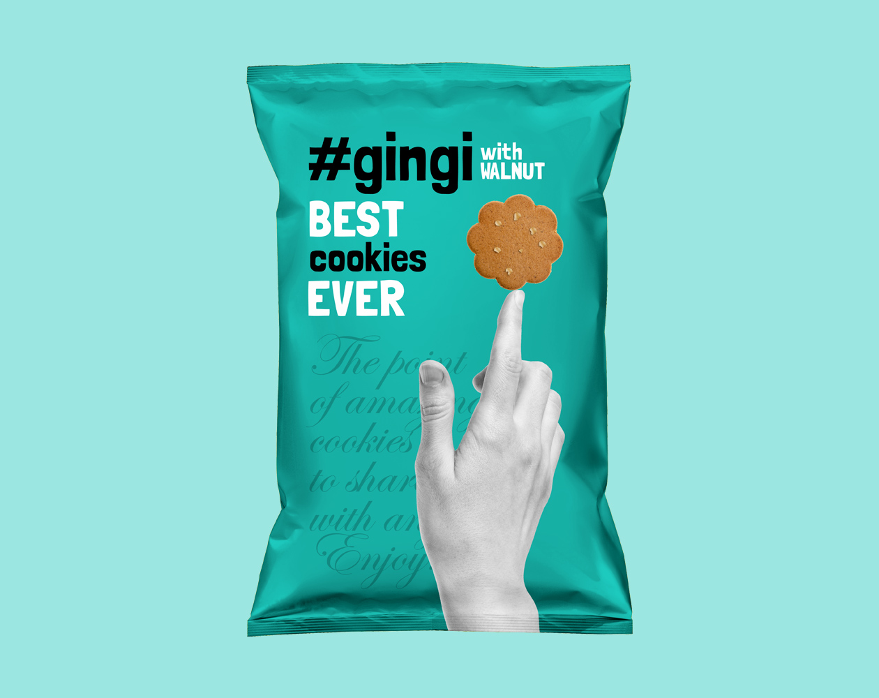
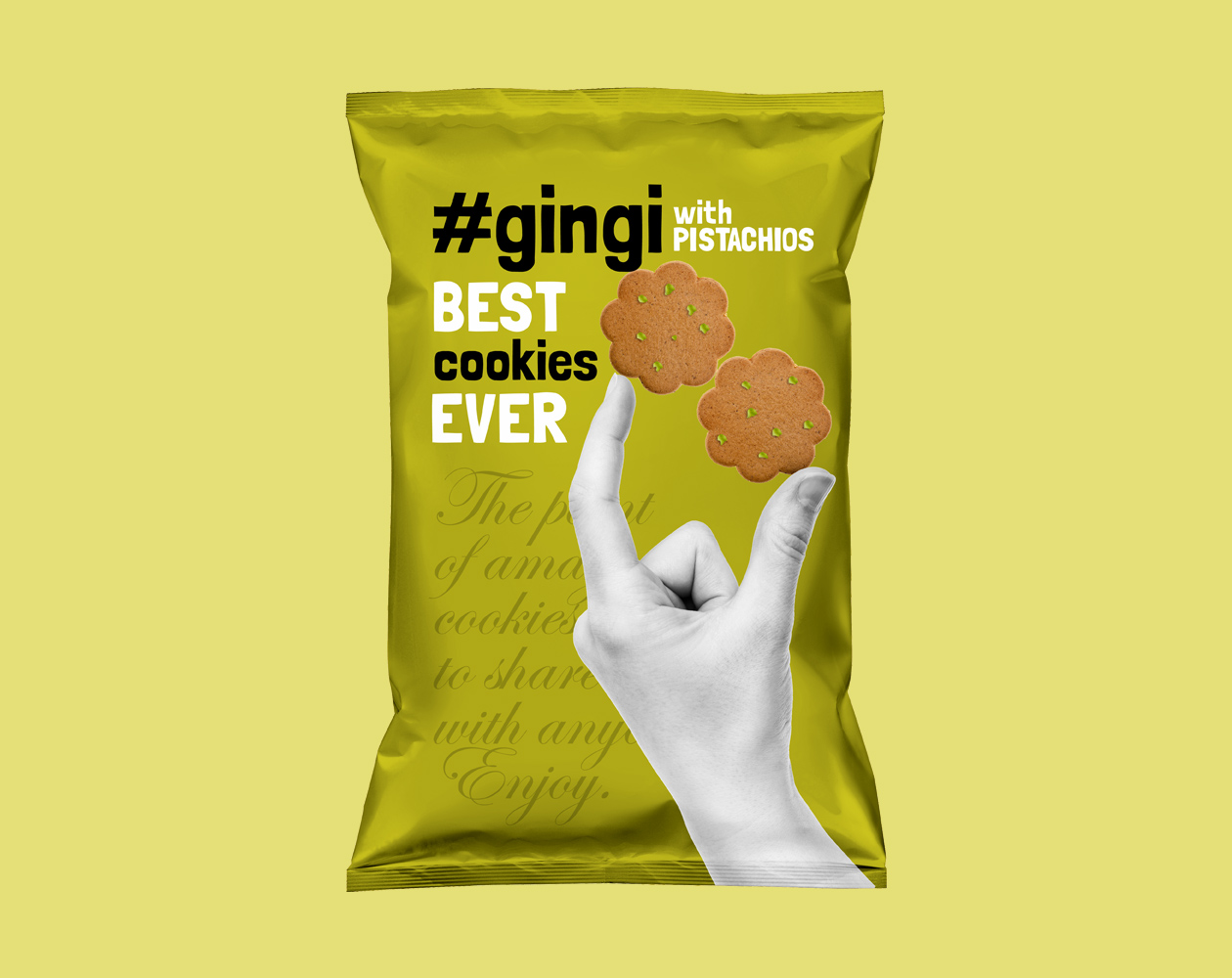
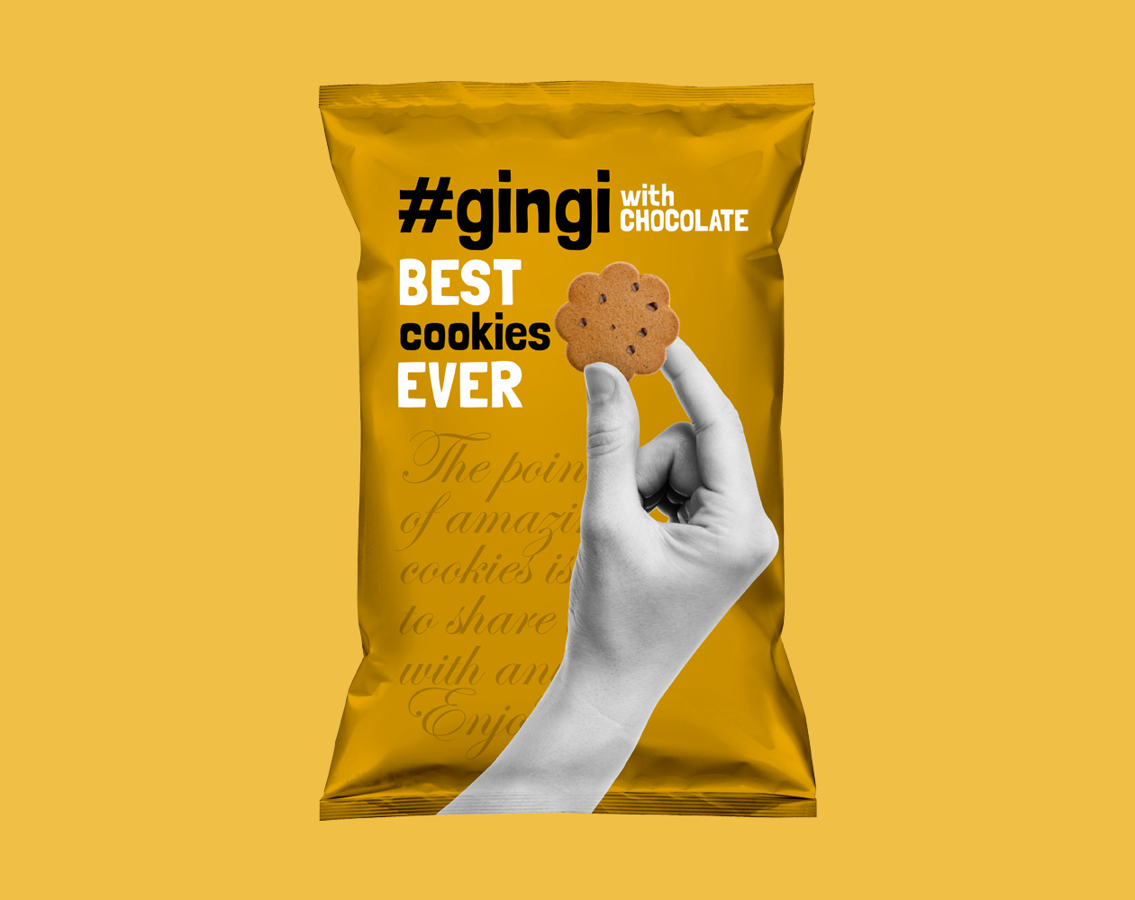
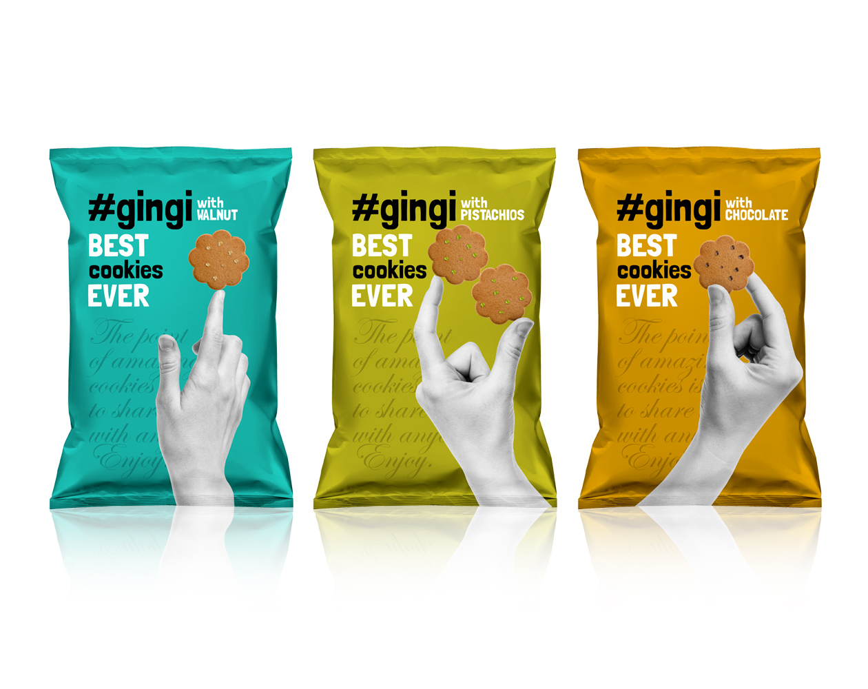
For this project we decided to approach the packaging design with playful combination of vivid colors on background with black and white photography in front. The images of hand are in black and white while holding the product itself displayed in color. We added a handwritten typography to background which serves as a lovely texture. Furthermore it carries a message, serving as a subtle space for brand’s communication.
When we designed the brand name, we chose to add a hashtag to it. Why? Simply to make it more appealing to the young generation with its fingers on twitter constantly. And the result? Fresh, trendy and appealing packaging design.