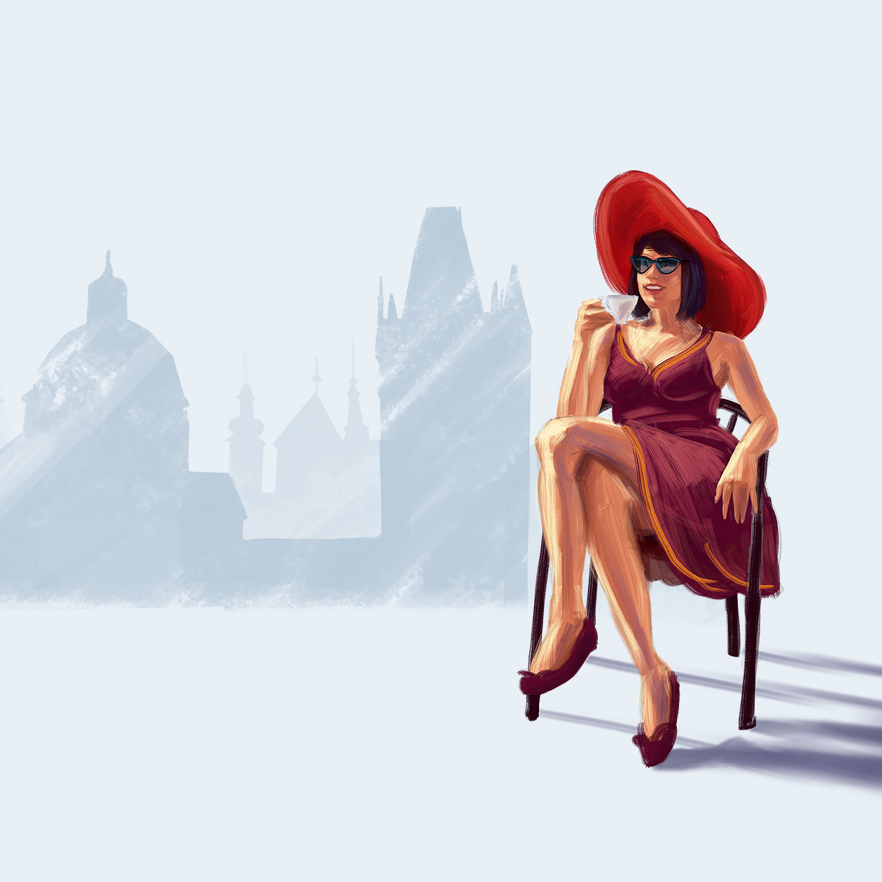
The client approached us with a very specific requirement to create a new visual communication style. Our task was to approach the graphic design of boutique hotels abroad. We took this task as a challenge and built the new brand on a unique typeface and a simple, confident logo. The collaboration with the client lasted over a year, where we gradually changed the look of the entire brand together. While the logo and typography are very elegant and austere, the visual communication is complemented by very colorful and original illustrations from our workshop. Thanks to the very bold decision to base the branding of the brand on unique illustrations, we managed to create a unique visual work with our own signature.
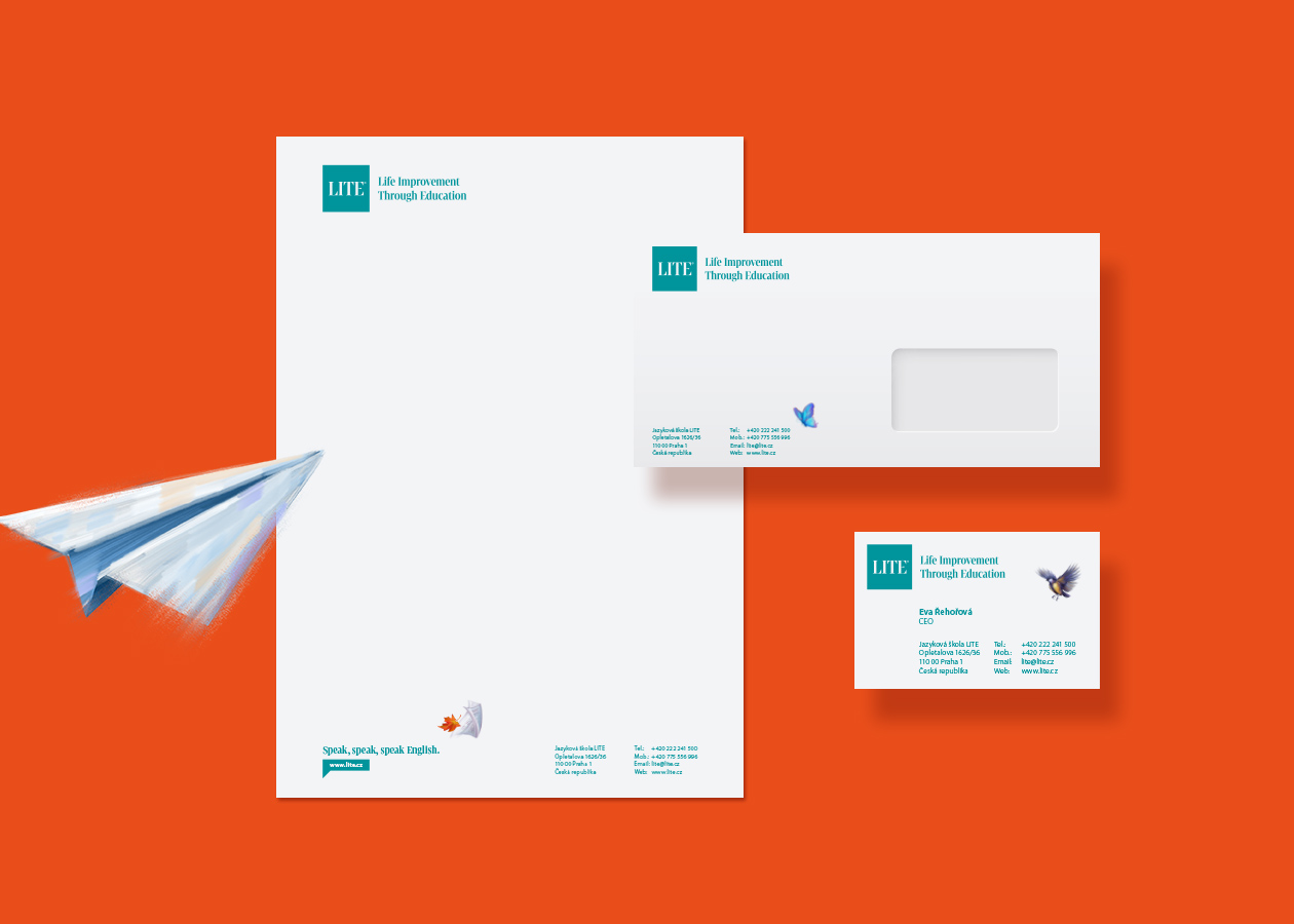
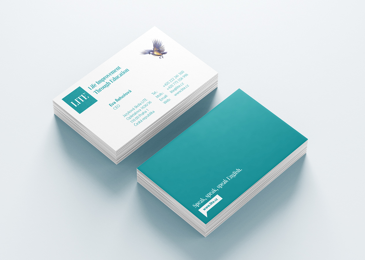
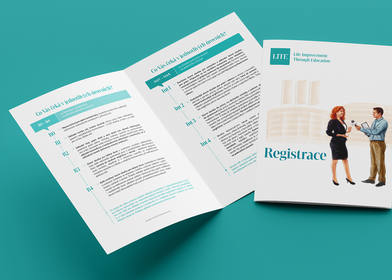
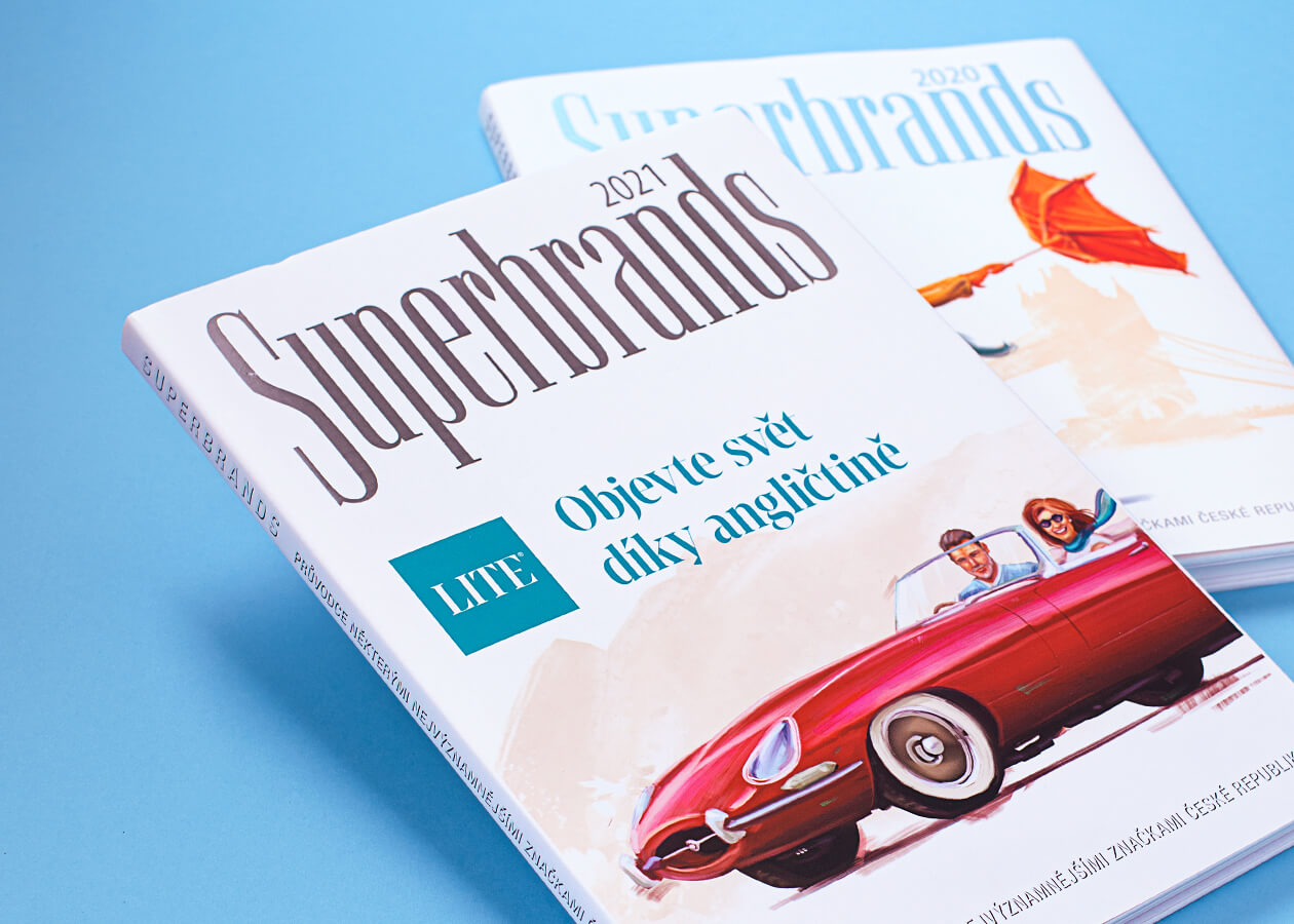
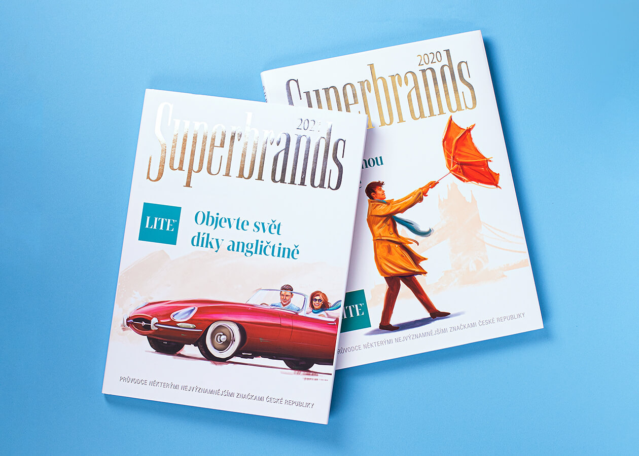
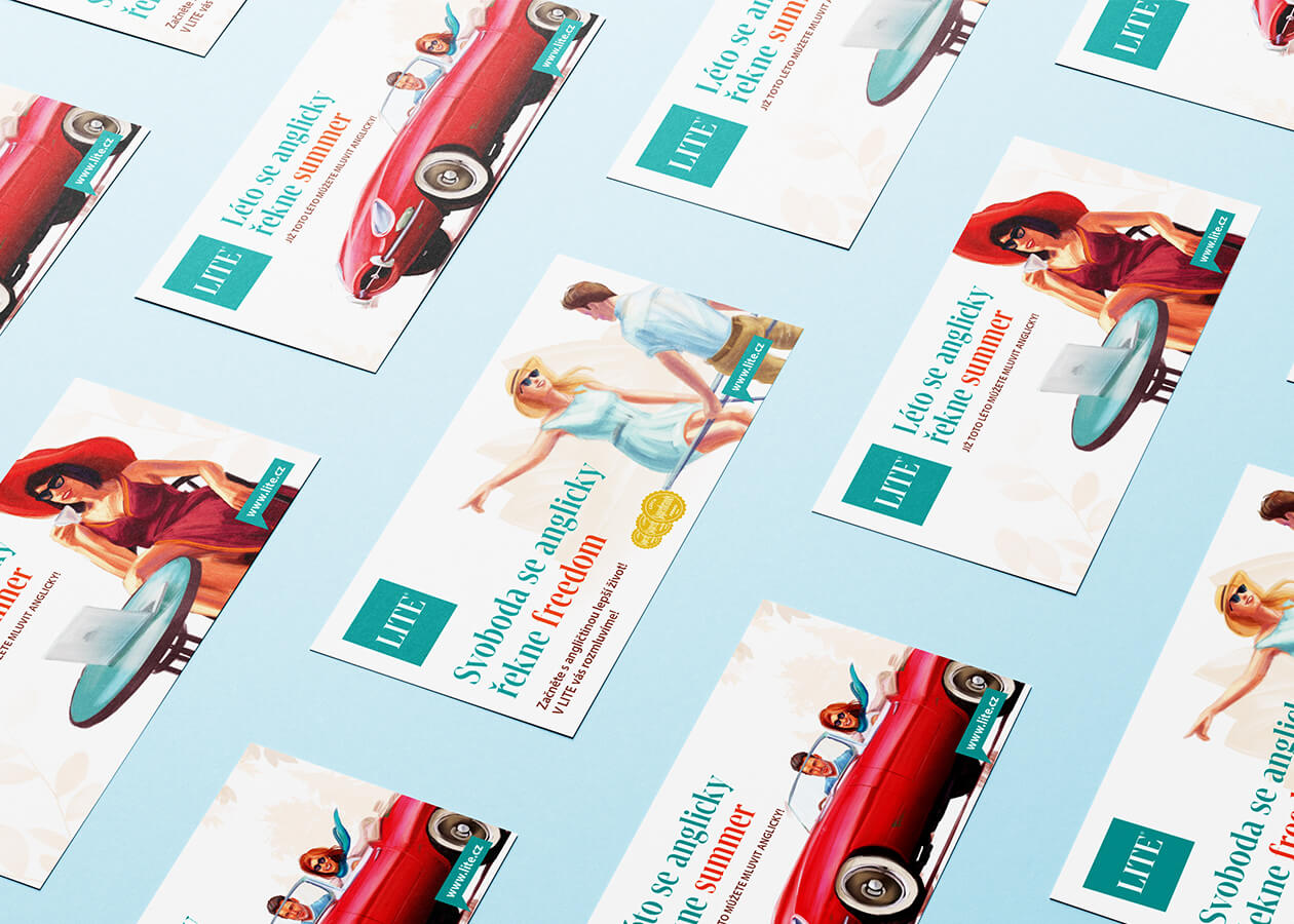
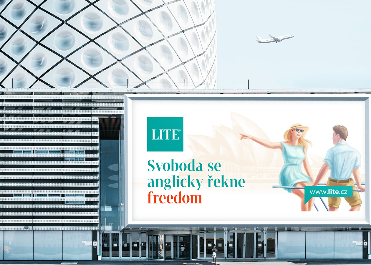
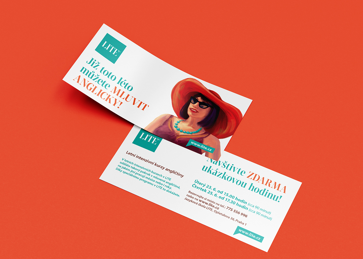
One of the reasons why we decided to paint individual elements into all the materials used by this language school was the fact that all other schools use the same photos from photo banks. This creates a visual noise in which nothing stands out unless someone rolls up their sleeves and ensures the authenticity of each element. Communication in a language school requires a large amount of printed and online material that is easily distinguishable. That's why, at the beginning of this project, we created a series of illustrations that can be used flexibly when creating graphics and campaigns. We implemented a creative communication campaign for the client that used billboards, flyers and radio.