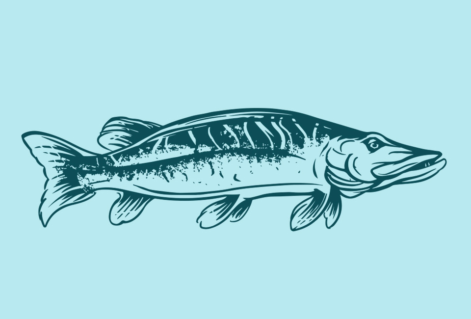
The logo and the visual style of Wild and Free brand
The task of the client was to associate wildness and freedom of fish from the free fishing in pure nature. From the assortment we chose natural predatory and wild pike that our illustrator portrayed in the wild stylization as the main theme. The logo was extremely enjoyable to the client, which made it easy to choose the correct brand image. The pike symbol is further supplemented with a strong eroded footprint, framed by a fine line. We have geared the logo composition towards the feeling of freedom. The next step was the design of the packages themselves.
Wildfish and Free fish packs
The nature of the product is largely defined by its geographical origin. The city, where the Volga River flows into the Caspian Sea, sounded fabulous to us. We have decided to include maps of this area in the design of the package if someone accidentally takes an interest in this fascinating place.
The packaging is characterized by technical and schematic illustrations of basic product information. In the composition, we were inspired by a simple and purely functional style of record labels, as well as by printing from a depth that produces a hand-painted impression. The lower part forms a series of pictograms that highlights the three major competitive advantages of products.
For the uniqueness of packaging graphics we have also created a number of author illustrations
While the subtle structure of the cramped layer illustrates the connection with the aquatic element, the main message to the customer is, besides the name of the fish, is stylized, yet sufficiently illustrative at the top of the packaging. Our illustration thus created not only the already mentioned map of the area together with the sketch of the cultural monuments of the city of Astrakhan, but also a series of pictures of fish from the portfolio products.
We believe that our packaging avoids clichés in this segment and is targeting customers to meet the intentions of telling a story about the origin and quality of this great brand of products. Listed below is more information about the Wild and Free brand.
Wild and Free fish of pure nature
Did you know that fishing in the Astrakhan region dates back to the 13th century? This tradition is also maintained thanks to its ideal location in the Volga delta along the Caspian Sea. It is in this wonderful and untouched area full of rivers and streams that nature has created unique conditions for fish.
Fish living and hunting in the wild Astrakans are not supplied with anything, and no chemicals or dyes are used in their processing. The only natural preservative is frozen drinking water on the surface of the fish that prevents it from drying out, resulting in fresh fish for a long time.
A true black caviar and a number of fish specialties are also coming from Astrakhan, the world-famous ucha fish soup, which is prepared today according to the ancient recipe. The symbol of the region is a lotus whose magical flowers cover the Caspian Sea every year with the largest lotus leaves in the world.