Lilly The Bulldog – Branding and Packaging Design
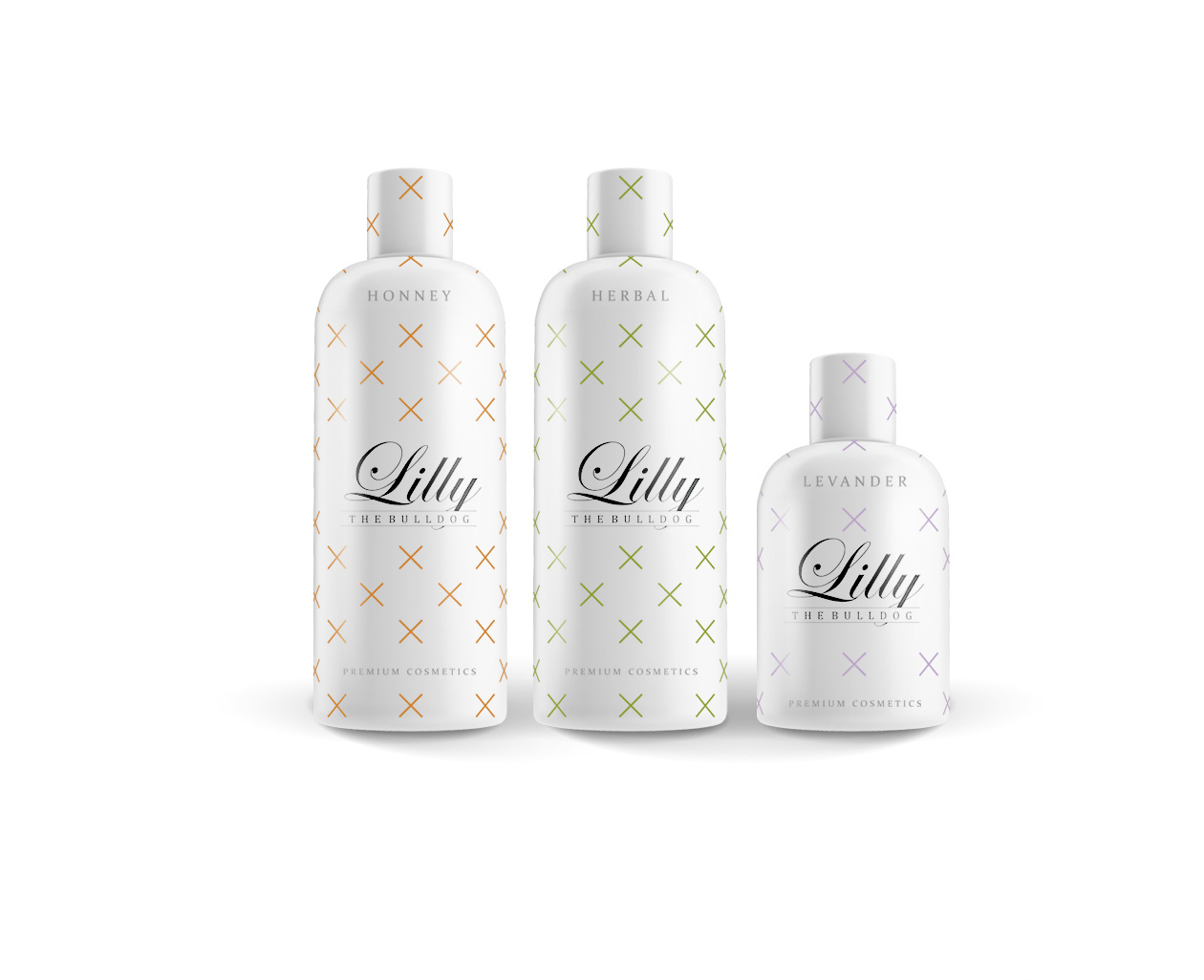
The conceptual study of the upcoming brand for a premium cosmetics importer focuses on playfulness, sophistication, and a sense of advanced aesthetics. The brand name combines two contrasting elements in a humorous way – the flower Lilly and the dog breed Bulldog – referencing a brand story that remains hidden for now. The visual and technical design of the logo follows a pragmatic approach to ensure it can be applied easily on different surfaces and materials later. The simple logo composition is created by combining the words Lilly and The Bulldog, complemented by subtle horizontal lines that underline the elegant overall design concept.
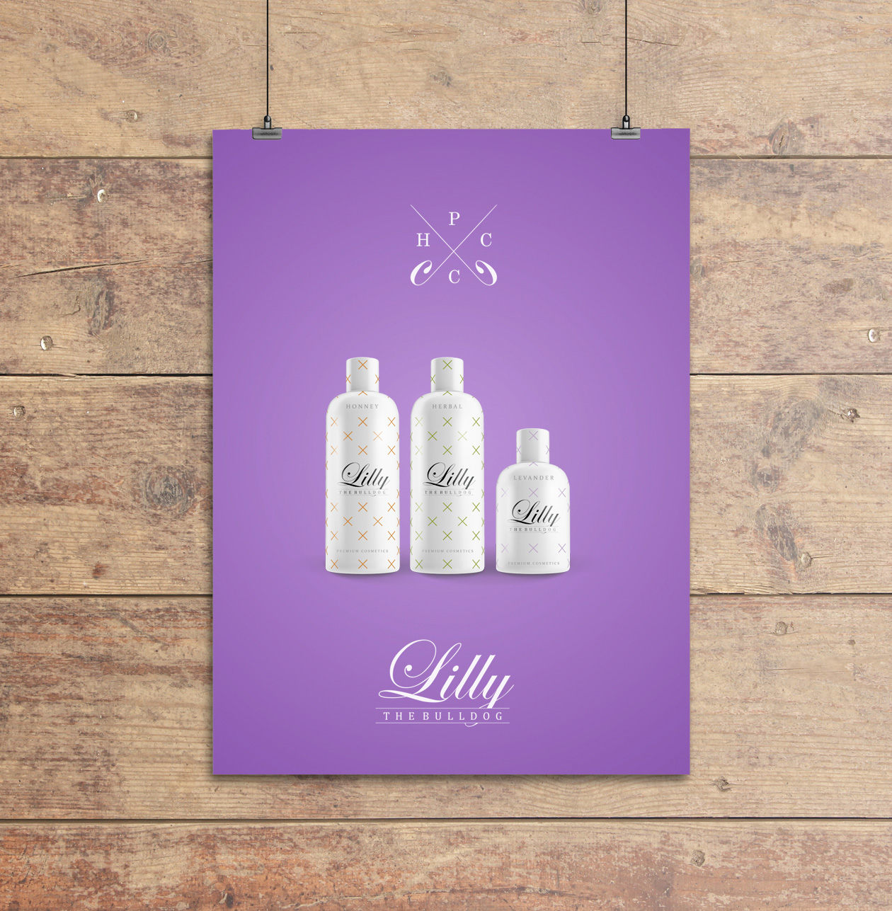
The packaging design uses the logo in its basic black-and-white version. The concept presents three packaging solutions – for lavender, honey, and herbs. The base is a clean white background with a pattern of small crosses that also carry the color identification of the product line. This adds a colorful yet sophisticated and minimalist graphic element to the overall visual. For the brand’s visual communication, a soft purple tone was chosen, which gently appeals to the target audience and clearly positions the product within the cosmetics segment.