#logo #branding #design #fruit
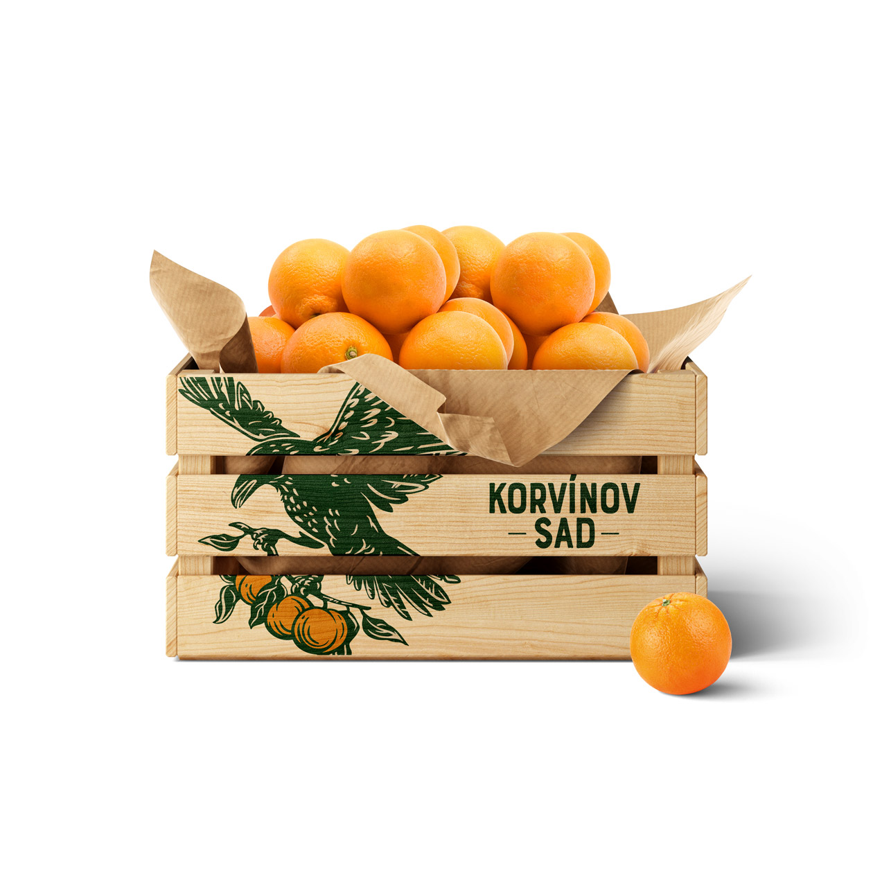
The branding is likely characterized by earthy tones such as browns, greens, and muted yellows, creating a warm and inviting atmosphere. These colors are often associated with nature, agriculture, and sustainability, aligning with the values of a small farm.
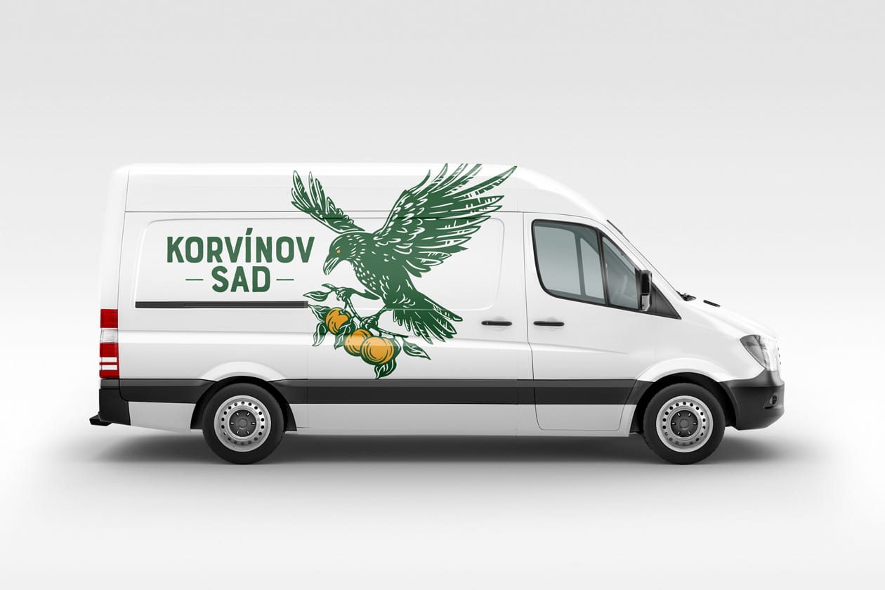
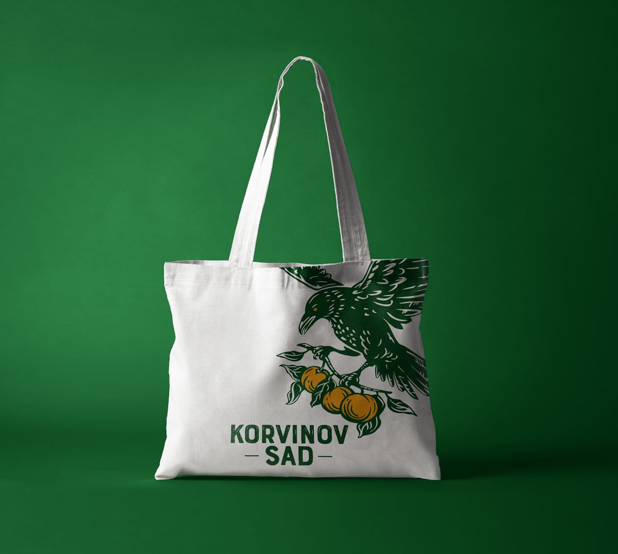
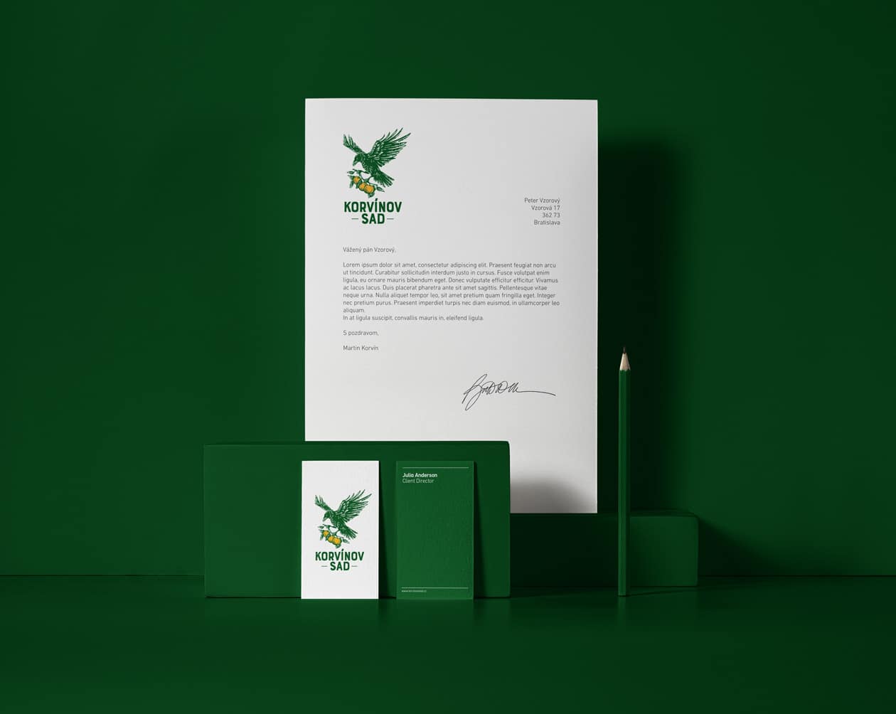
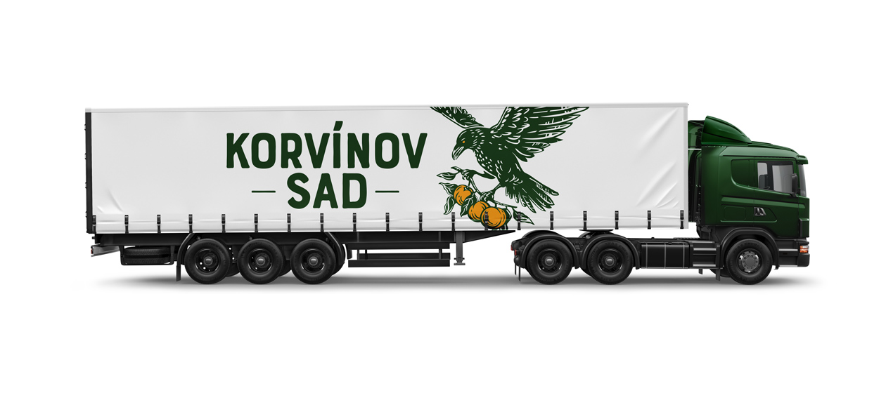
The logo design, featuring a woodcut illustration with a raven motif, adds a distinctive and memorable touch to the branding. The use of a woodcut style gives the logo a handcrafted and artisanal feel, suggesting a connection to traditional farming practices and craftsmanship. The raven motif adds a whimsical and mystical element to the logo, evoking images of nature and the outdoors.
Typography is likely to be simple and straightforward, with a font that complements the rustic and natural aesthetic of the branding. The choice of font may be serif or sans-serif, depending on the desired tone and style.
In addition to the logo, woodcut illustrations may be used throughout the branding materials to further enhance the farm’s identity and tell its story. These illustrations may depict scenes of farm life, orchards, animals, or crops, adding visual interest and personality to the branding.
Overall, the project branding and woodcut illustration for the small farm are likely to convey a sense of authenticity, charm, and connection to the land, making it stand out as a unique and inviting destination for visitors and customers alike.
