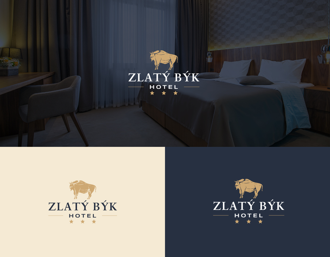
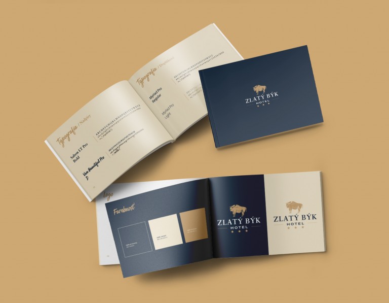
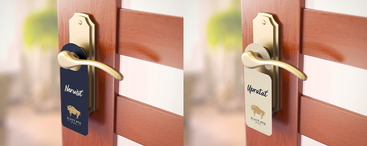
The visual identity and branding of this three-star hotel in South Slovakia are characterized by a harmonious blend of blue and cream colors, exuding an elegant and sophisticated style while maintaining simplicity.
The color palette chosen for the branding features shades of blue, reminiscent of the clear skies and tranquil waters of the region, along with cream tones that evoke a sense of warmth and comfort. These colors create a calming and inviting atmosphere, ideal for a relaxing stay at the hotel.
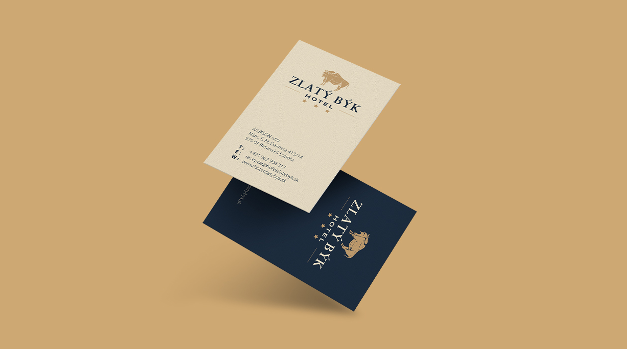
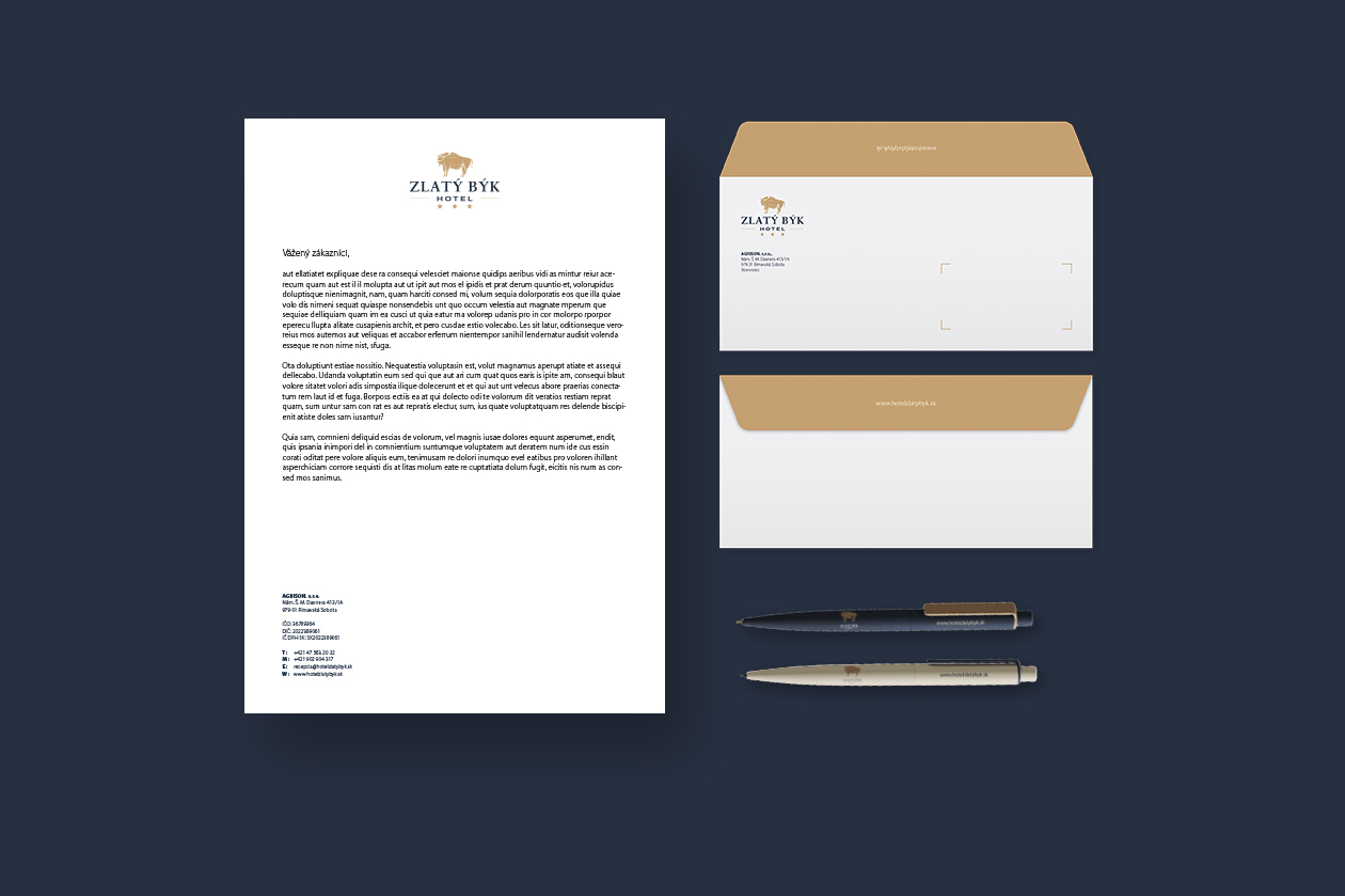
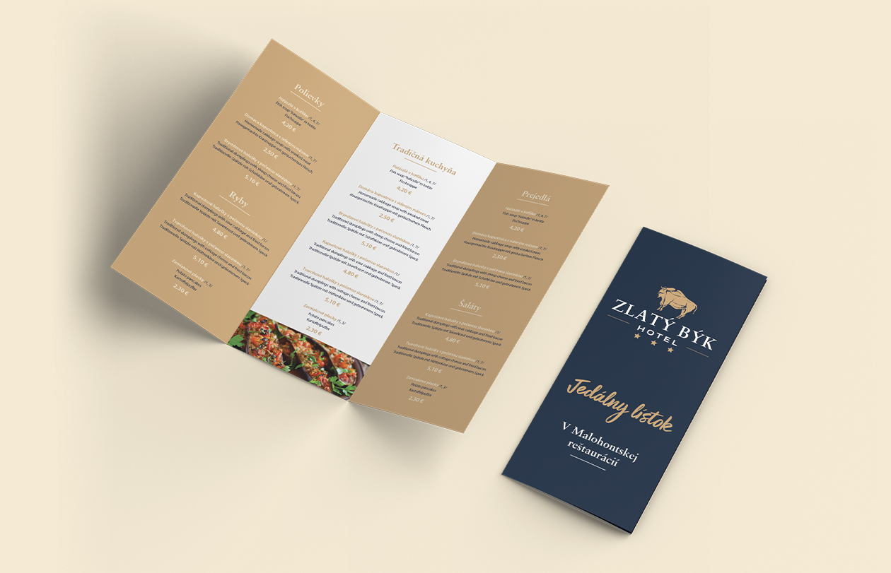
The redesigned logo embodies elegance and simplicity, with clean lines and classic typography. The use of a serif font adds a touch of refinement, while the incorporation of subtle design elements or motifs reflects the hotel's charm and character. The logo design is likely to be minimalistic yet memorable, making a lasting impression on guests.
Typography plays a crucial role in reinforcing the hotel's identity, with carefully selected fonts used across various branding materials. The fonts chosen are likely to be sophisticated and easy to read, enhancing the overall aesthetic and ensuring a cohesive look and feel.
Imagery is also important in shaping the hotel's visual identity, with high-quality photographs showcasing the hotel's amenities, guest rooms, and surrounding landscapes. These images are likely to highlight the hotel's elegant decor, modern facilities, and picturesque surroundings, enticing guests to experience the beauty of South Slovakia.