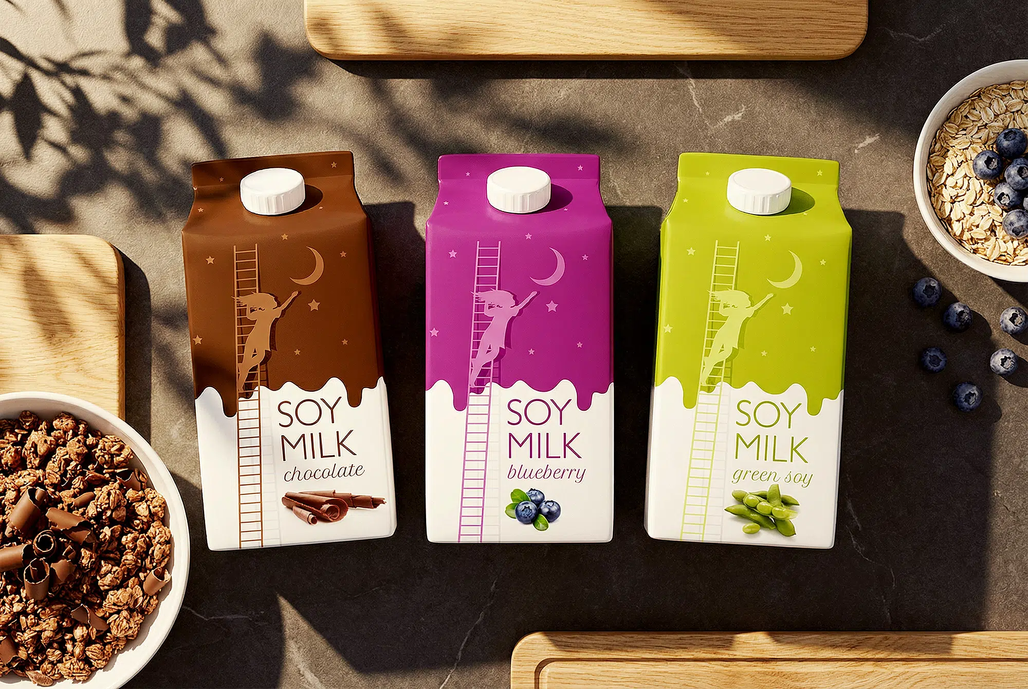
The concept leans into a dreamy, soft aesthetic that elevates what might otherwise feel like a functional product into something visually poetic. The illustrations are minimal yet expressive, with gentle forms and subtle graphic elements that whisper more than they shout. This restrained visual language allows the packaging to breathe — making it feel light, contemporary and calming, rather than loud or aggressive. In doing so, it communicates the idea that this soy milk brand is not just another substitute, but a thought-out, premium experience.
Symmetry, balance and refined geometry underpin the design. The shapes in the illustrations align with the container’s form and layout in a way that feels deliberate and full-circle. The brand’s identity is carried by these clean lines and structured compositions, ensuring the product stands out on-shelf while still feeling gentle and inviting. The interplay of white space, illustrated motifs and dialogue between the graphic and typographic elements builds a sense of quiet sophistication — almost as if the packaging is suggesting, “Take a moment. This is better.”
At the heart of the concept is the product’s promise — soy milk that’s smooth, wholesome, and easy on digestion. The packaging design mirrors this promise through its clarity and visual calm. There’s no over-clutter of messaging or aggressive colour; instead, everything is aligned to a single mood: gentle, elevated, mindful. This dreamy approach invites the consumer to view the product not just as a functional choice, but as an enjoyable, thoughtful addition to their lifestyle.