Ecological branding for a second-chance marketplace
For Envirosource, an innovative Slovak marketplace focused on the circular economy and ecological solutions, we created a complete branding package that reflects the values of sustainability, innovation, and giving old items a new life. The project included logo design, defining visual identity, selecting a color palette, typography, and design elements for both online and offline use.
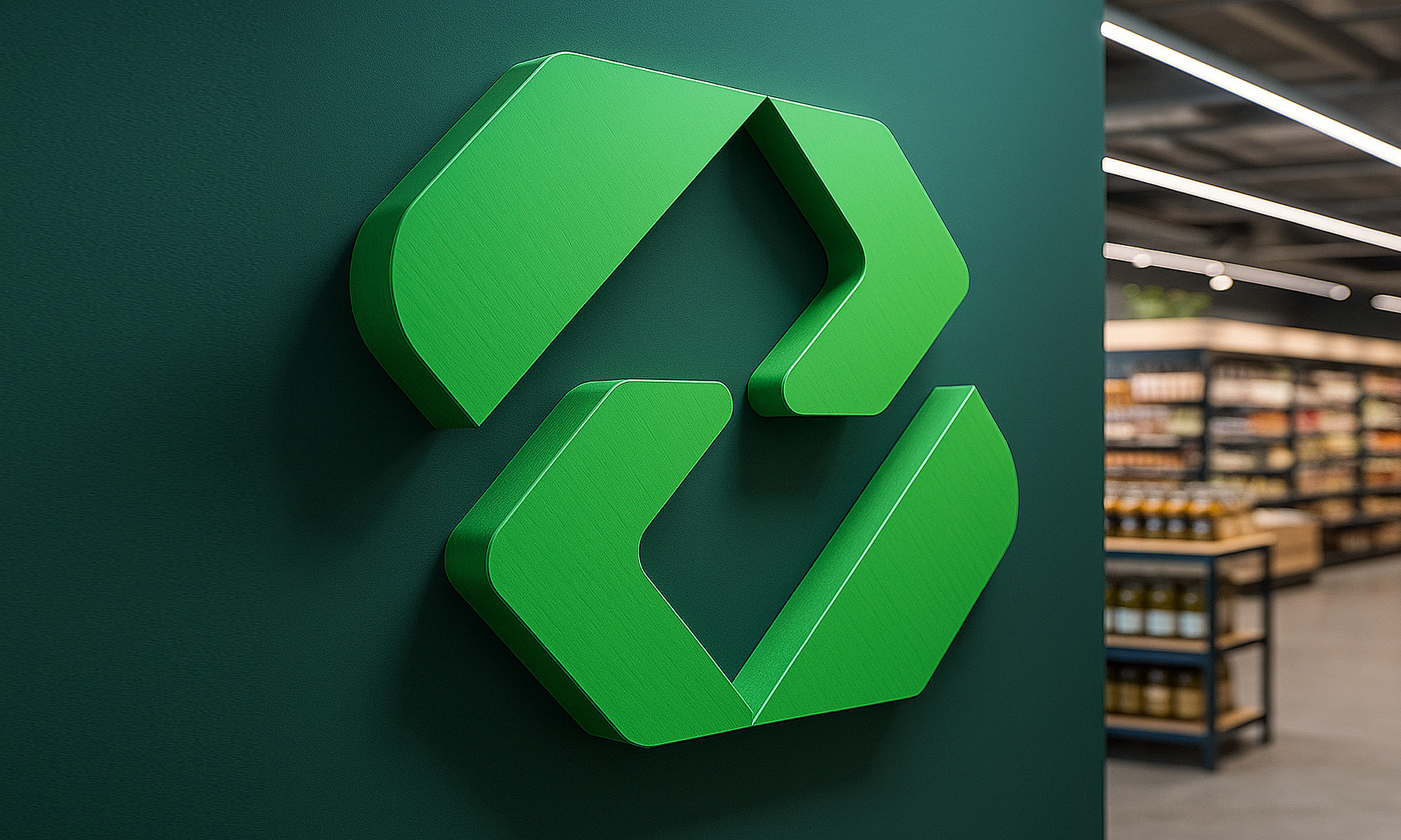
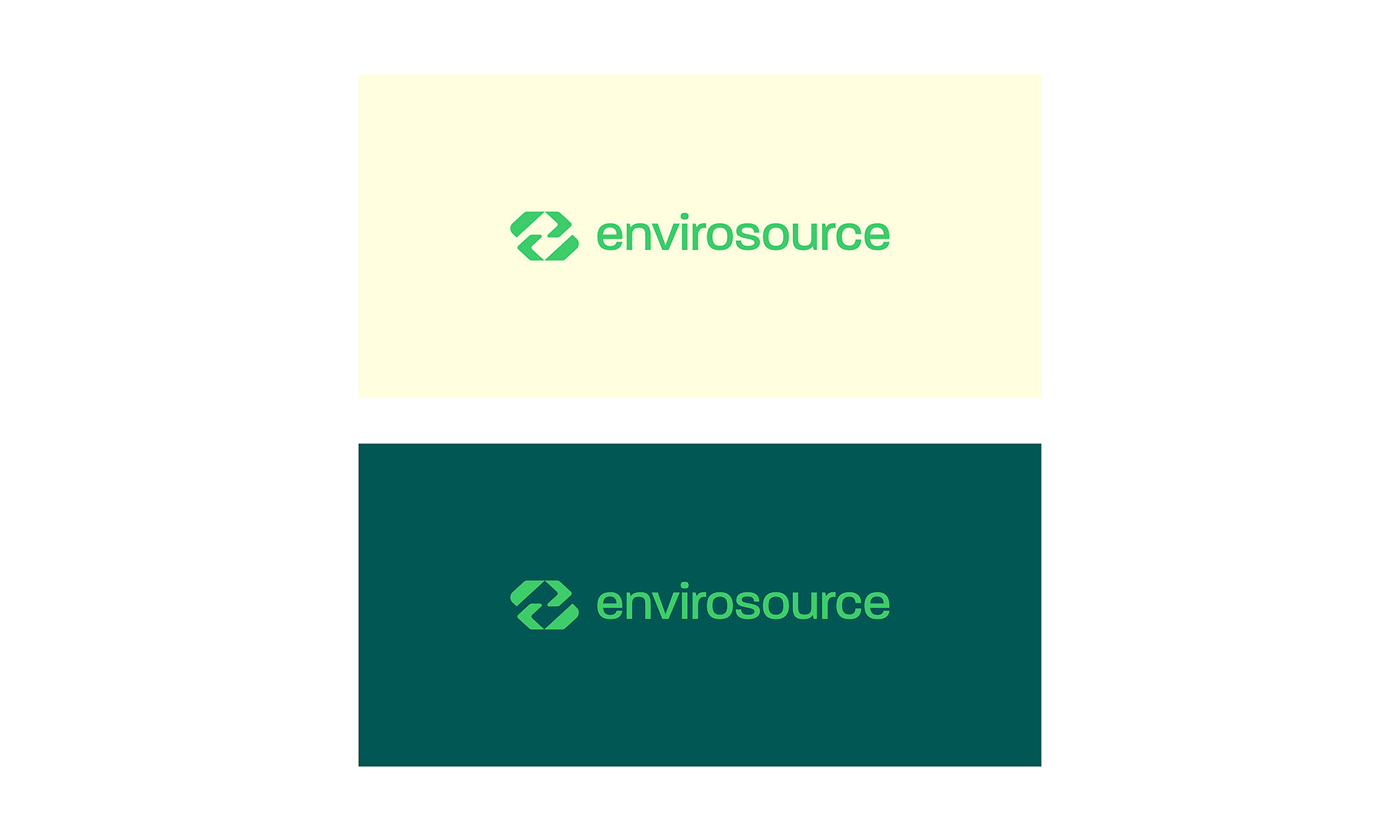
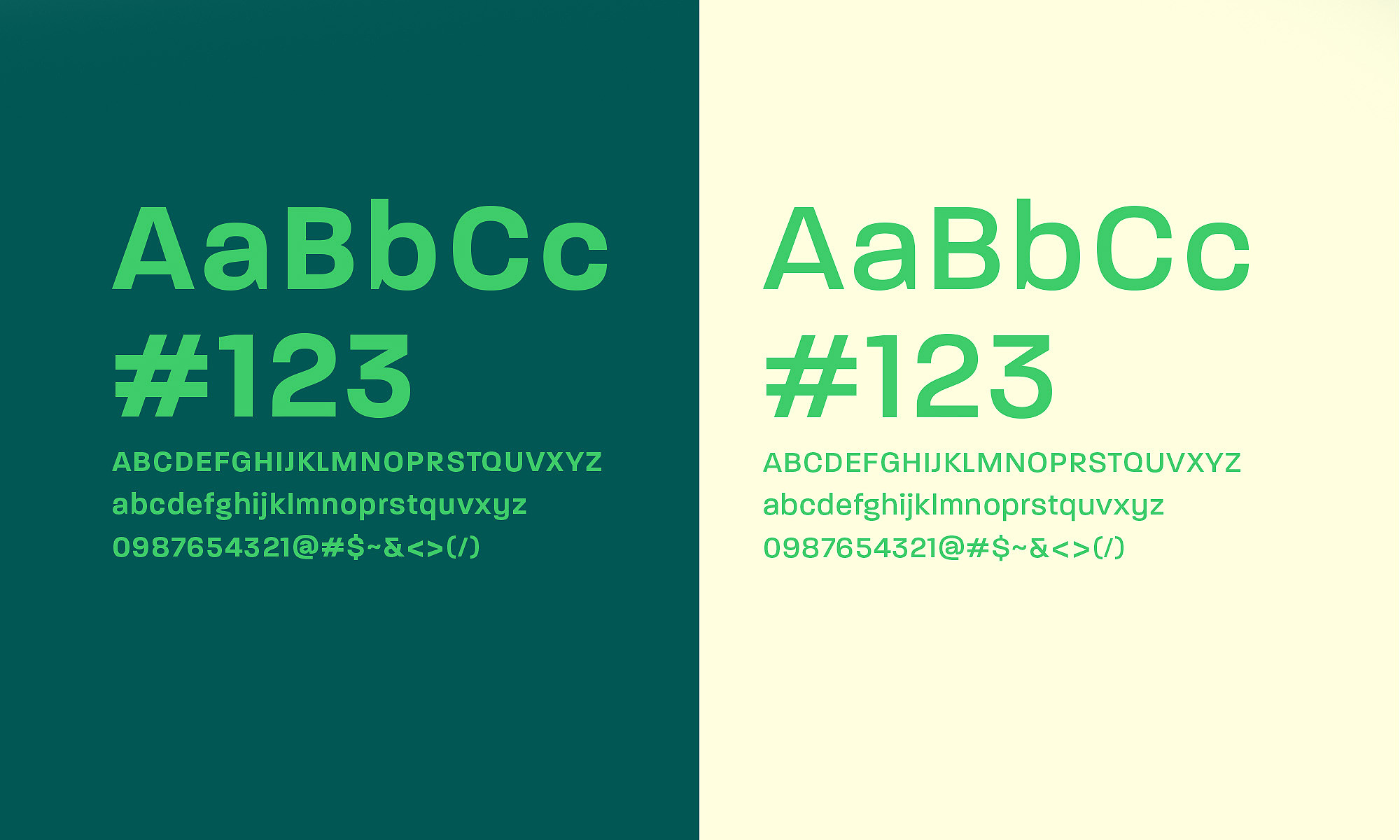
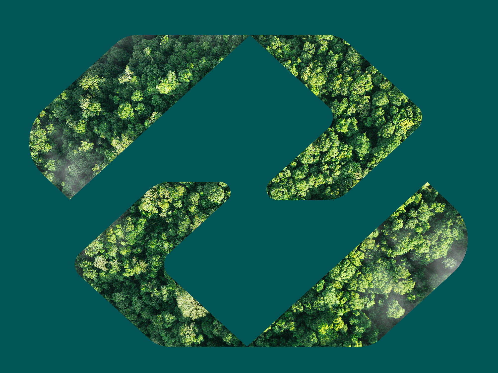
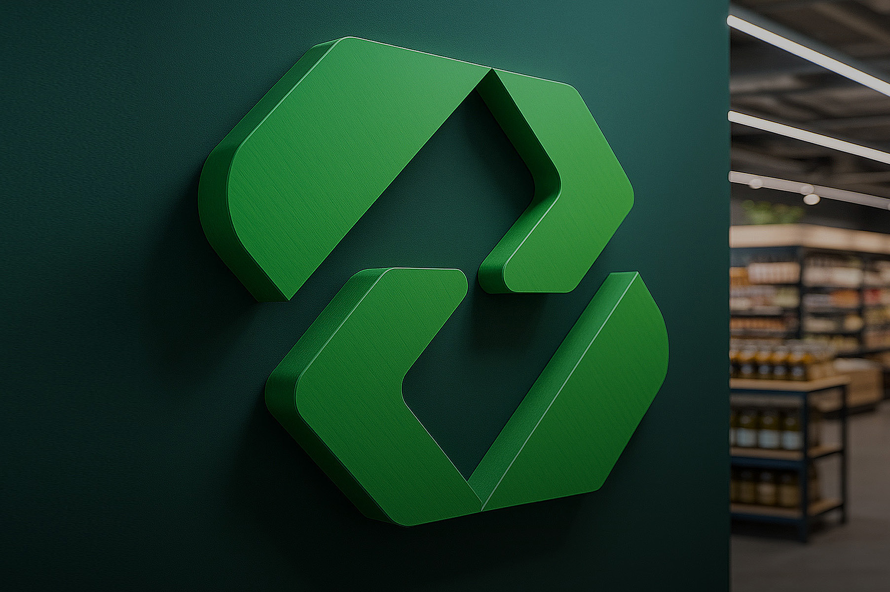
The logo is built on the symbolism of recycling and reuse — it consists of two interconnected arrows forming the letter “E,” evoking an infinite cycle and ecological balance. The chosen green color palette highlights the connection with nature and trust. The typography is clean, readable, and modern, designed to support the brand’s credibility in the online space.
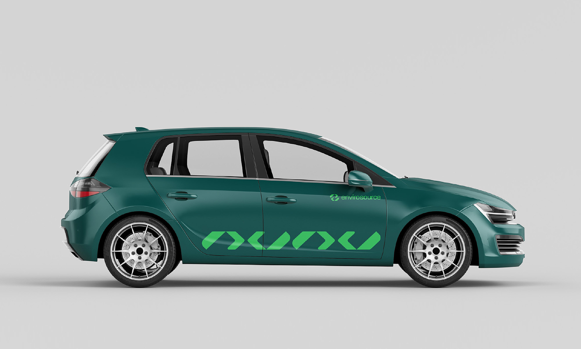
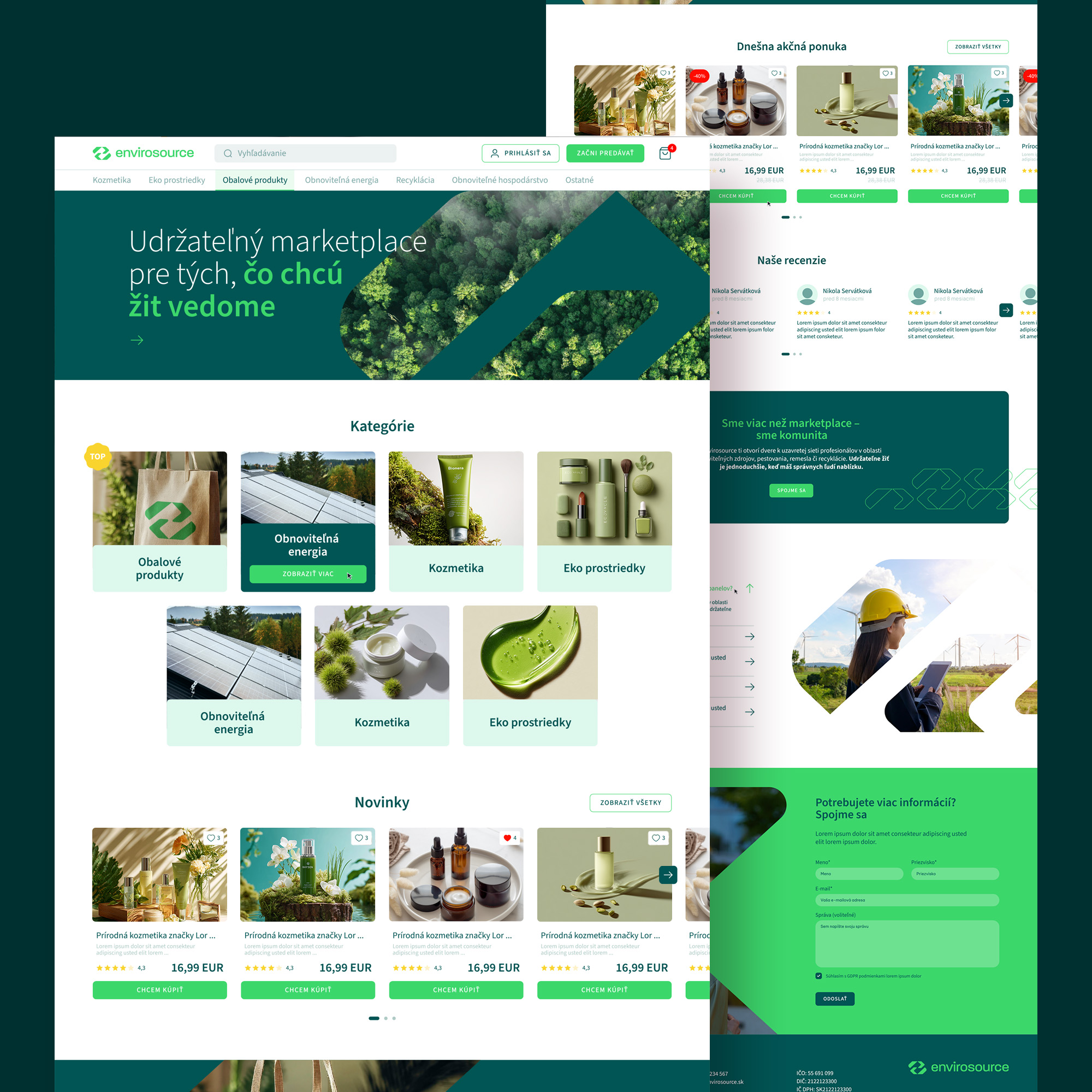
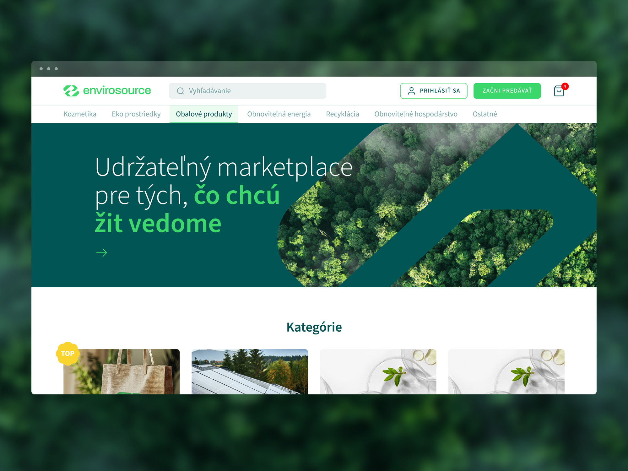
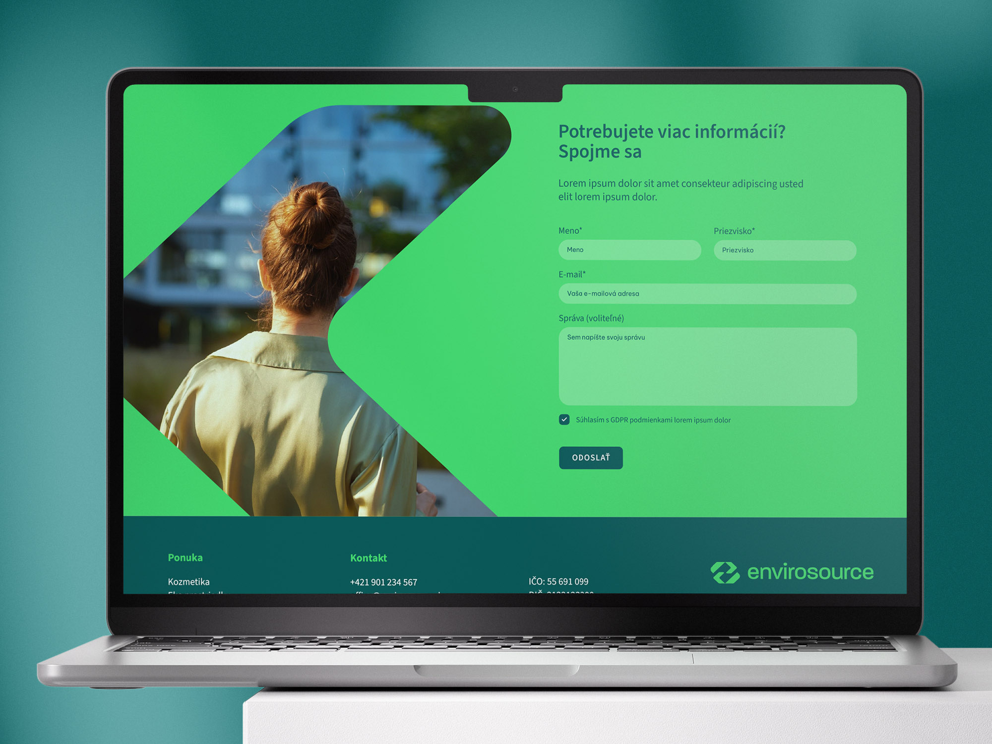
The Envirosource brand’s visual identity is consistently applied across all touchpoints – from branded car wraps and digital banners to the platform’s user interface. The goal was to create a brand that is not only aesthetically appealing but also clearly communicates its mission – giving things a new life. This project demonstrates how logo design and visual identity can directly support a brand’s mission and its positive impact on the world around us.
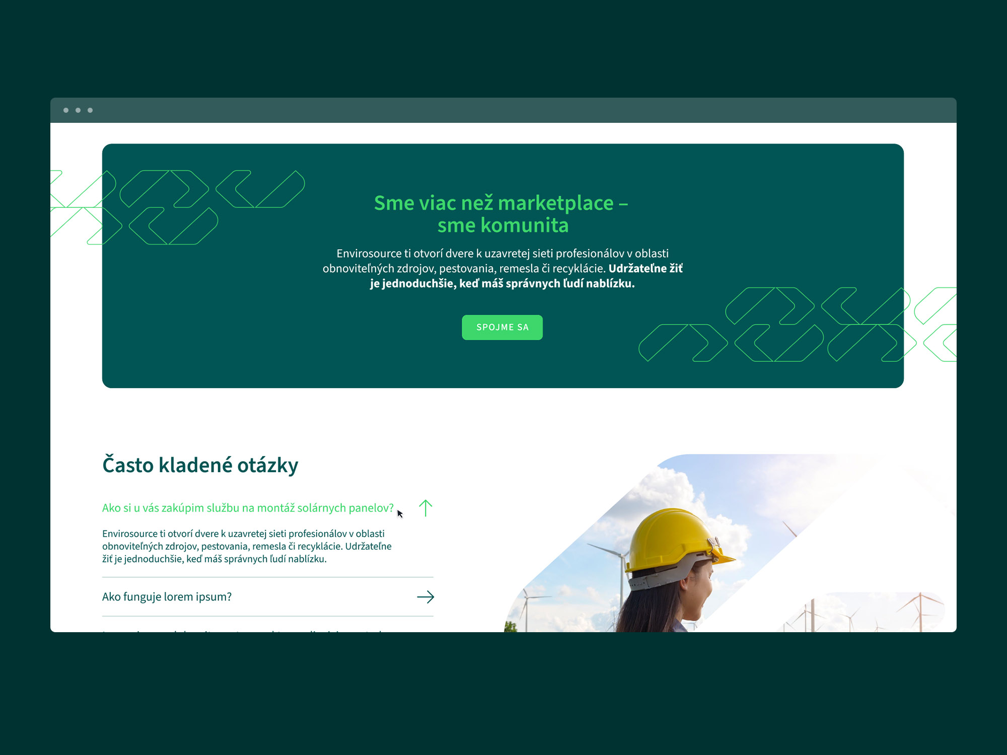
In addition, we designed the complete web platform for Envirosource, emphasizing simplicity, clarity, and user comfort. The design aligns with the brand’s visual identity – clean, modern, and ecologically oriented. The project also included the creation of an intuitive user interface, optimized for all devices, with the aim of ensuring a pleasant and efficient user experience.