Modernization of a leading hygiene products brand
Moracell s.r.o., an established Czech manufacturer of everyday hygiene products, approached us with the goal of redesigning its logo and creating a new visual identity that would reflect the brand’s current character as well as its future strategic growth. Moracell is the producer of several well-known private label brands in the field of paper hygiene and household products.
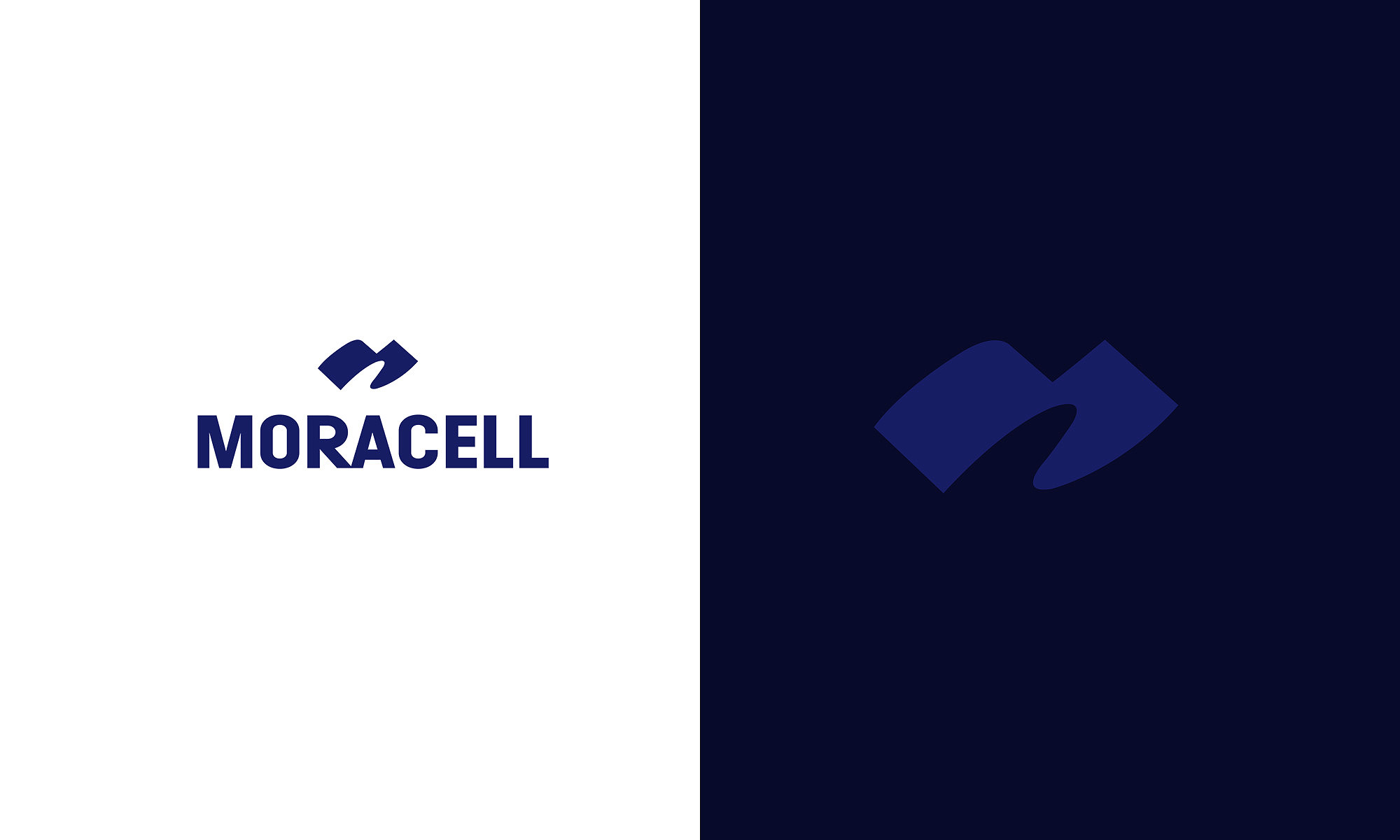
The new logo is built on a modern, minimalist symbol whose form evokes movement, softness, and flow — values closely connected with comfort and care, which are characteristic of the company’s portfolio. The abstract, fluid shape, reinforced by a dignified dark blue color palette, conveys trust and stability while maintaining visual simplicity and high adaptability across different formats and materials.
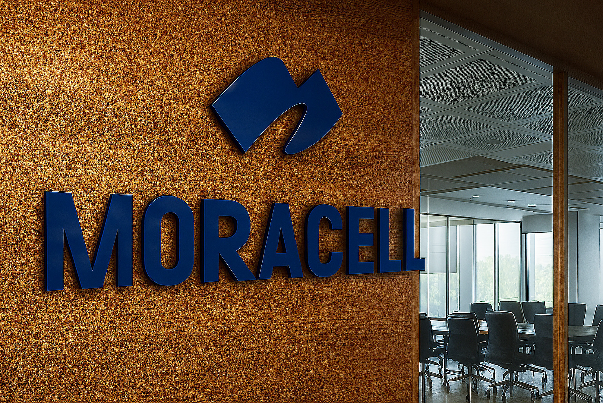
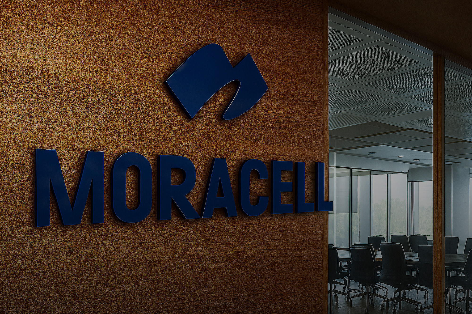
The solution also included the design of a 3D logo application for company premises, digital assets, and a basic brand manual. The aim was to create a long-term sustainable visual system that would work across products, B2B communication, and the company’s internal identity. The result is a professional, timeless logo design and identity that respects the brand’s roots while simultaneously driving it toward future growth.