AGENCY:
MAISON D IDEE Prague s.r.o.
CREATIVE DIRECTION:
Martin Kušpál
3D GRAPHICS:
Vladimír Mrázik
#fattomatoketchup #packaging #design #3dgraphics #byMAISON
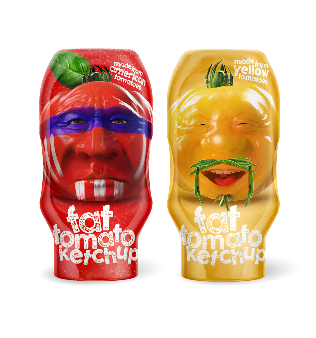
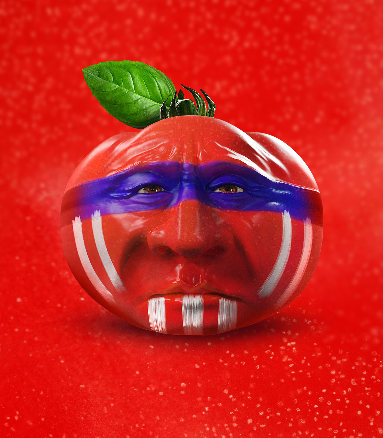
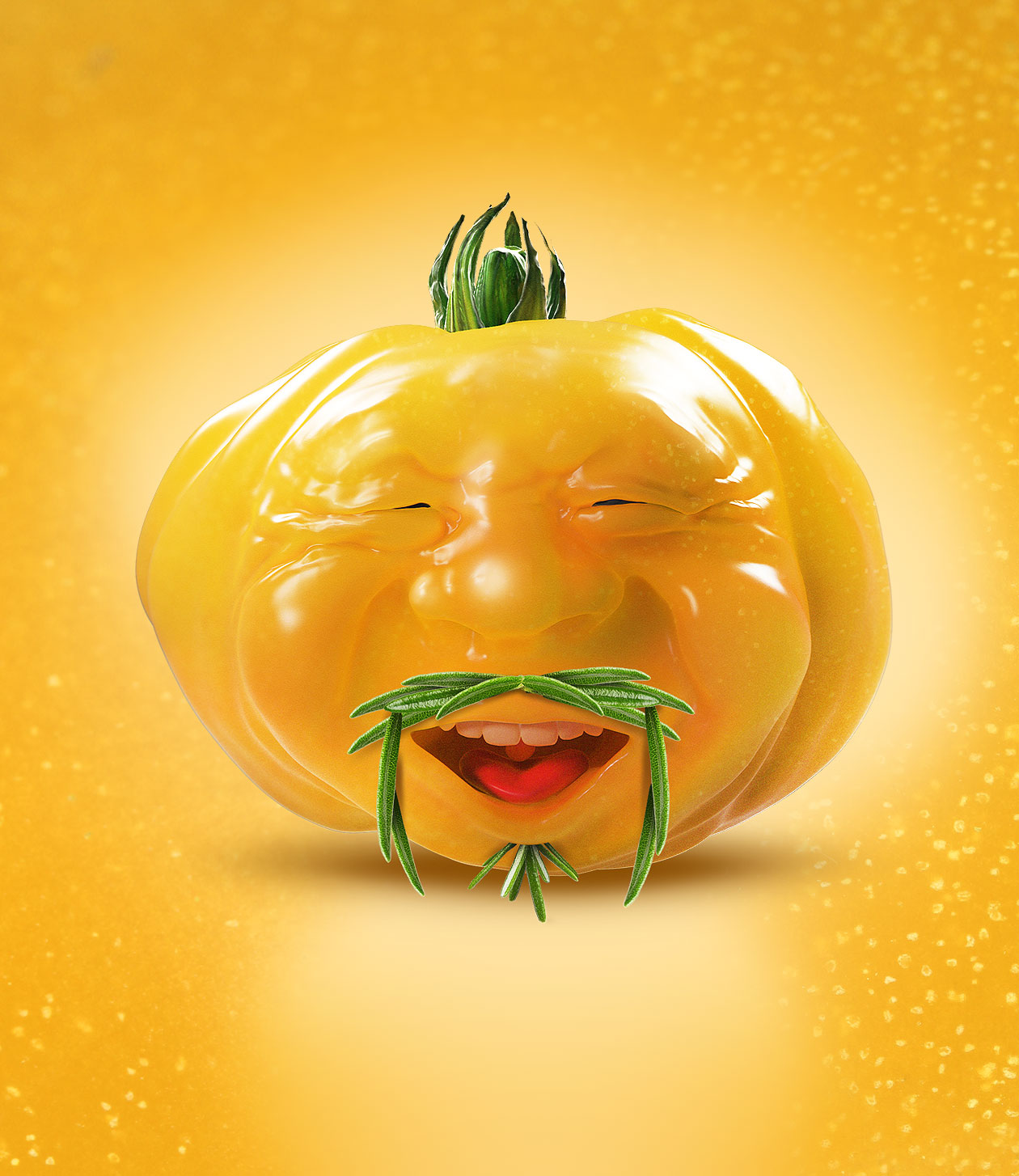
Ketchup packaging which breathes life and personality into tomatoes
We like to get creative with connecting visual motives into new and unusual forms. To create the brand FAT TOMATO KETCHUP we played with the main ingredient, in this case the tomato, simply by making it anthropomorphic. Tomatoes exist in many variations, for example yellow, red, black, cherry and others—by the way, they all taste great—so why should ketchup keep looking the same? We decided to show you the first two examples of the project’s packaging design which fidget with metamorphosis of Pear and American tomato.
Did you know that the word Ketchup comes from the Orient?
We like to dig into etymological dictionary while creating brands and packaging design. Our creative designer likes to read from it even when he’s not working on anything at the moment but we’ll leave that aside.
We were delighted that we could connect the yellow packaging with a oriental character of the tomato. Finally at least something points to the origin of this beautiful westernized word ‘ketchup’. This word of a sauce made of fermented fish or mushroom paste (sources differ) was brought to Europe by sailors (most likely under Eastern Indian’s influence) from China on the turn of 18th century. First written mentions can be traced back to 1701 and 1708.
It used to be a popular food seasoning that became popular in Britain. Phonetically the title was transformed from Chinese (kôechiap or kê-tsiap) to ketchup or catchup (ketjap in Dutch). The ingredients were later swapped for tomatoes and now we have a product whose pronunciation would be understandable by people 300 years ago. Just the taste would be quite different.
(https://english.stackexchange.com/questions/24530/what-is-the-etymology-of-the-word-ketchup)
3D graphics helps us to extent the creativity of packaging design further
At the end we have to mention that the whole packaging works thanks to a great job done by our 3D graphical designer. Above all he loves challenges that we throw at him from our creative department. He handled perfectly the subsurface refraction of light that gives tomatos their significant translucent and organic feel. Of course, Vlado didn’t let technical aspects of the problem hinder his efforts and was able to sculpt beautiful character caricatures.