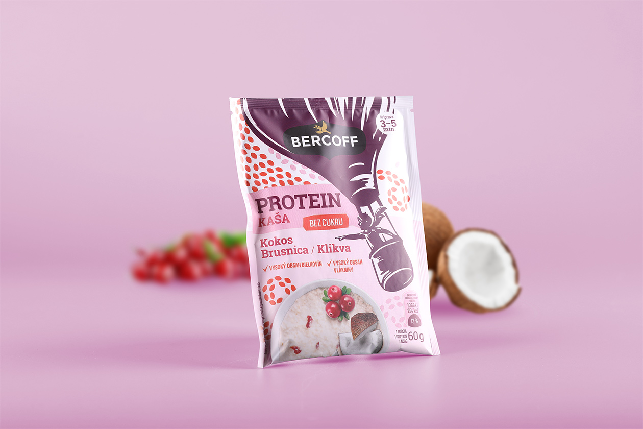
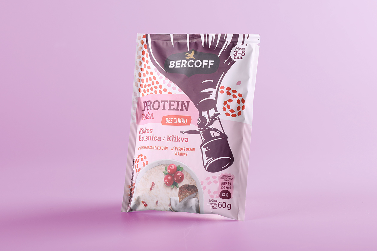
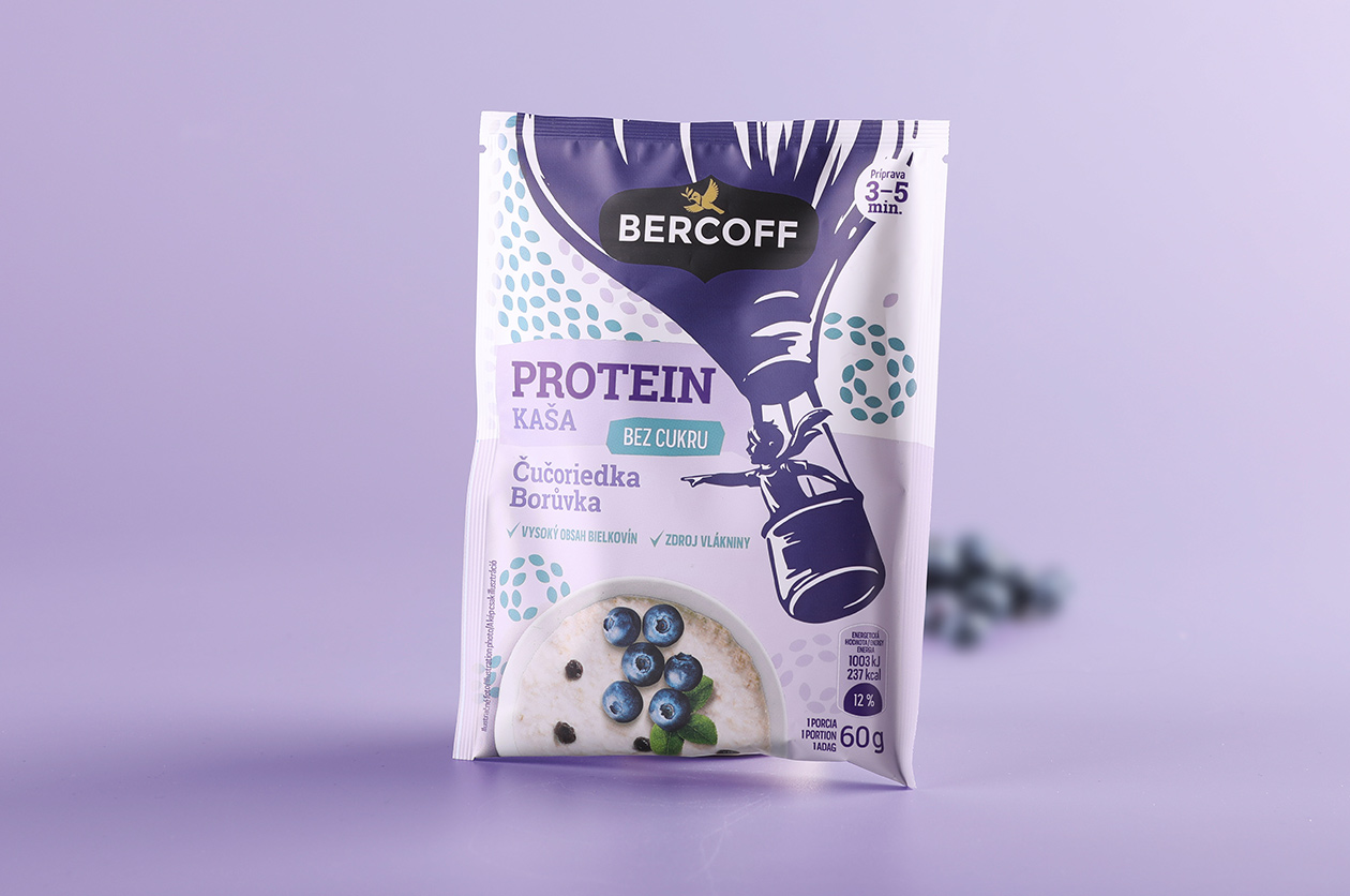
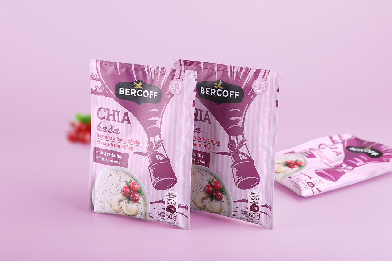
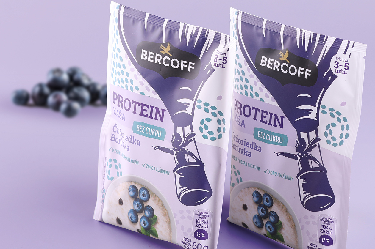
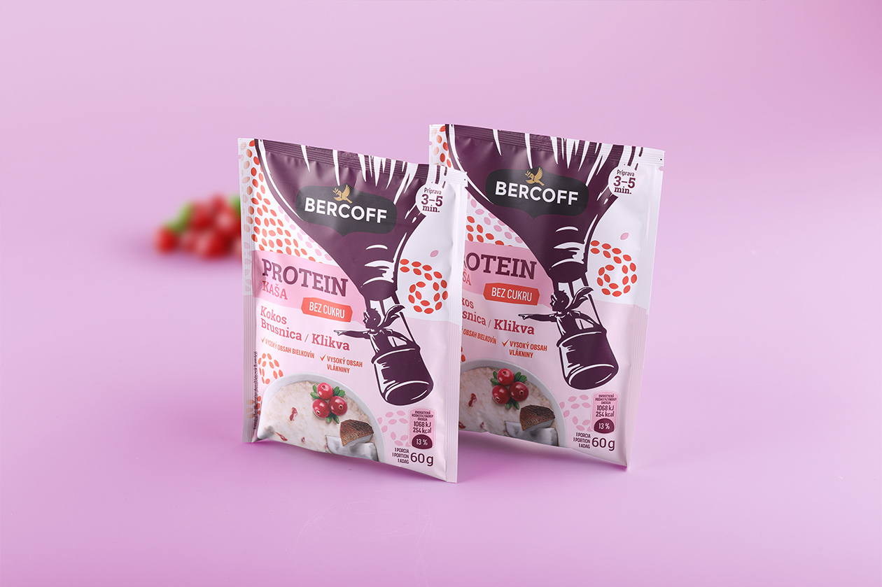
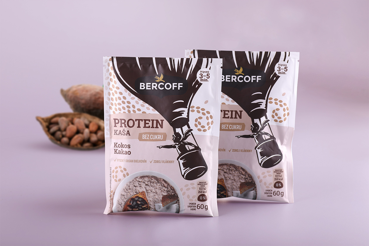
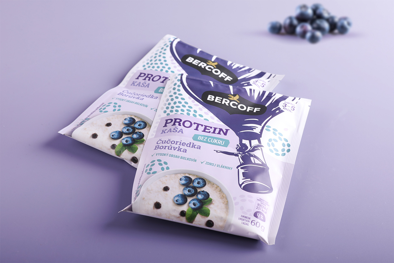
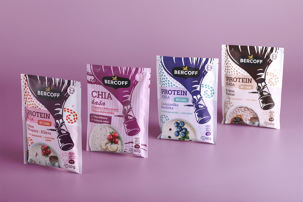
The series of packaging design for chia and protein porridge is based on the common vizual motiv of the boy flying in the air balloon. Our goal was to create warm, engaging and soft design with characteristic and clearly recognizable elements. Our client demanded to avoid all the visual cliche, which is nowadays often presented on the Slovak market. With great pleasure, we have avoided all the wooden textures and arranging ingredients into the playful shapes. We have decided to create the packaging whose visual identity will be adjustable to the current trends in the visual communication and will serve as a timeless element, which will be used as a cornerstone for the brand.
Why did our creative director choose the motive of the boy flying in an air balloon for the packaging of the instant porridge?
The instant breakfast packed in the small doses is ideal for every adventure. That where we see the connection with the reading of the stories by Jules Verne, which were the part of our childhood. The short novel
was the inspiration for our ilustrator, who decided to put the boy in the balloon, instead of the victorian travelers.The handmade ilustration gives the packaging the certain feeling of the craftmanship, which is always a beneficial factor for any visual work.