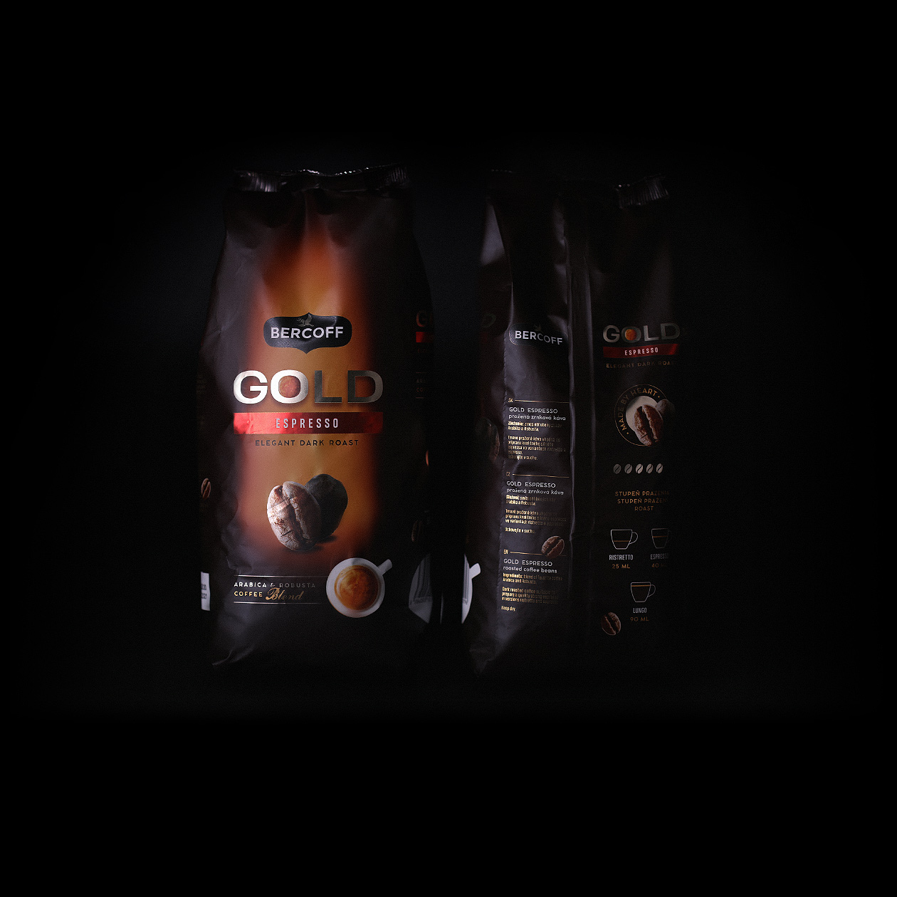
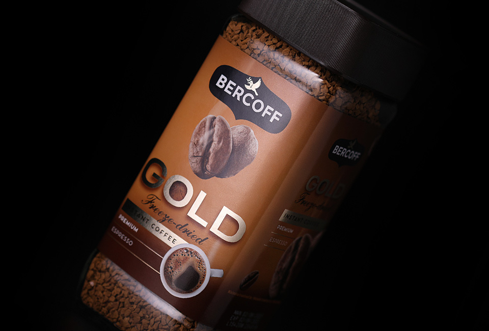
We've used several types of metallic effects on this delicate coffee packaging.
This project led us to carefully balance mainstream trends in packaging design while avoiding any shift towards craft styling. The goal of this packaging design was to evolve current product design into the future while keeping its consumers capable of recognizing their favorite coffee. Our approach was to utilize all the possibilities coming from flexible partial white underprint on metallic foil, giving shine to selective visual elements as needed.
We used our macro photography and retouching skills on the central coffee bean, which is dominant to the whole packaging concept. We enjoyed amazing communication and collaboration with the foreign print house which led to the achievement of the perfect balance of color and material.