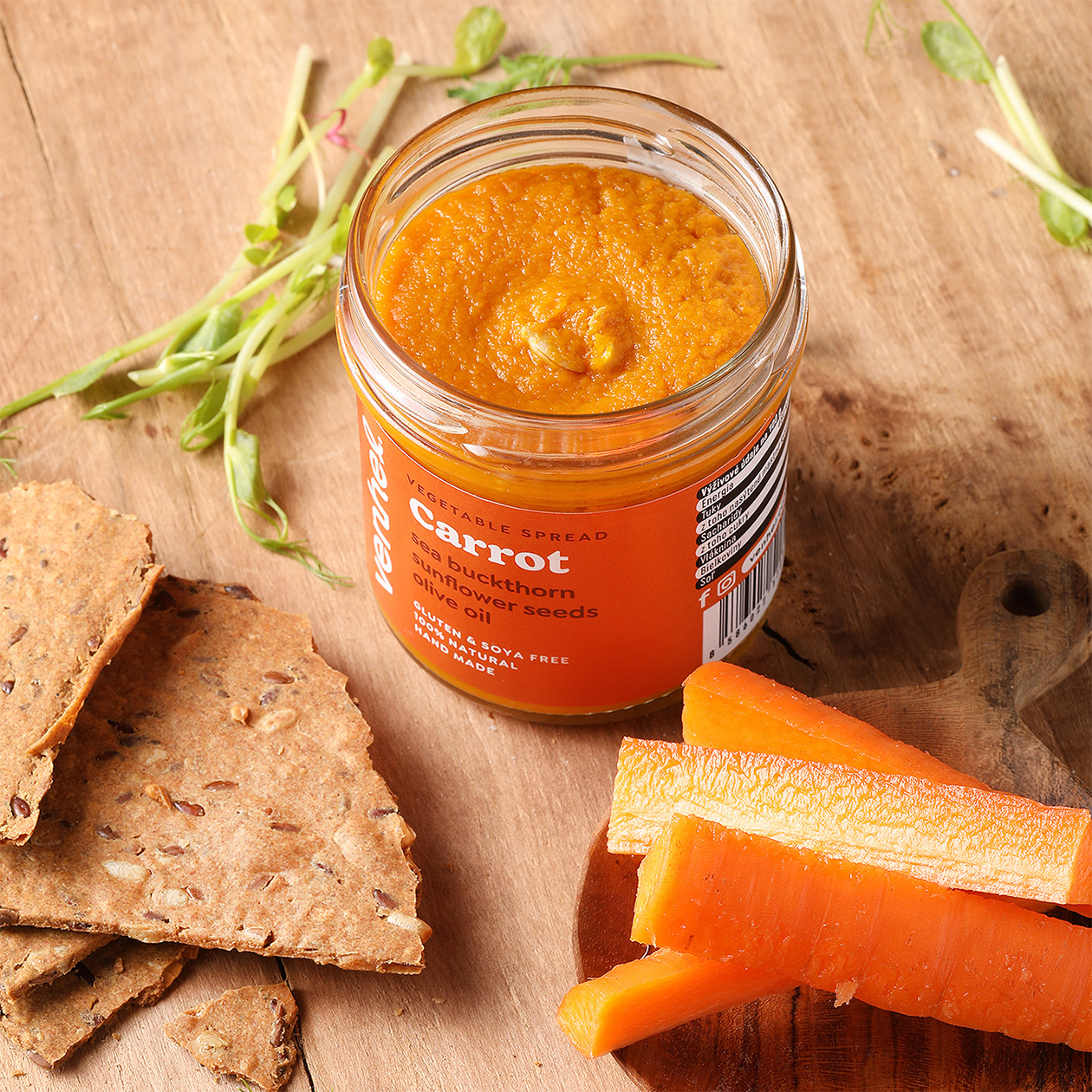
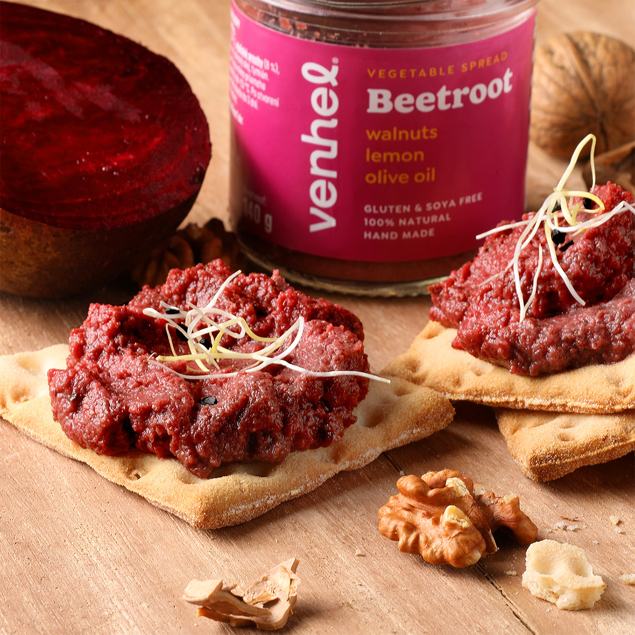
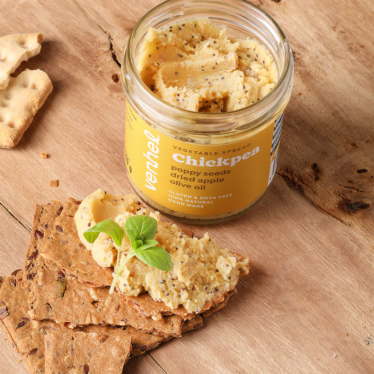
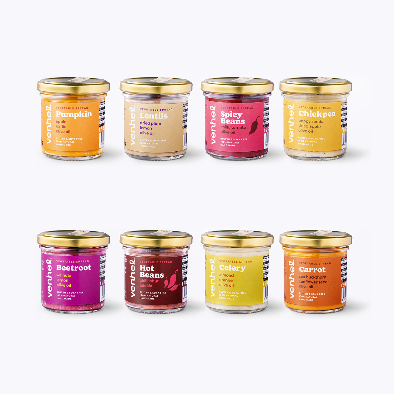
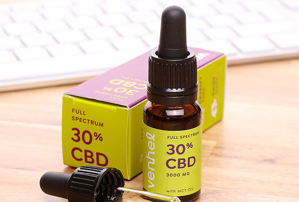
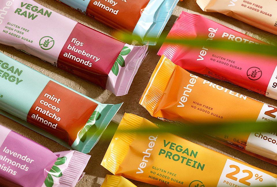
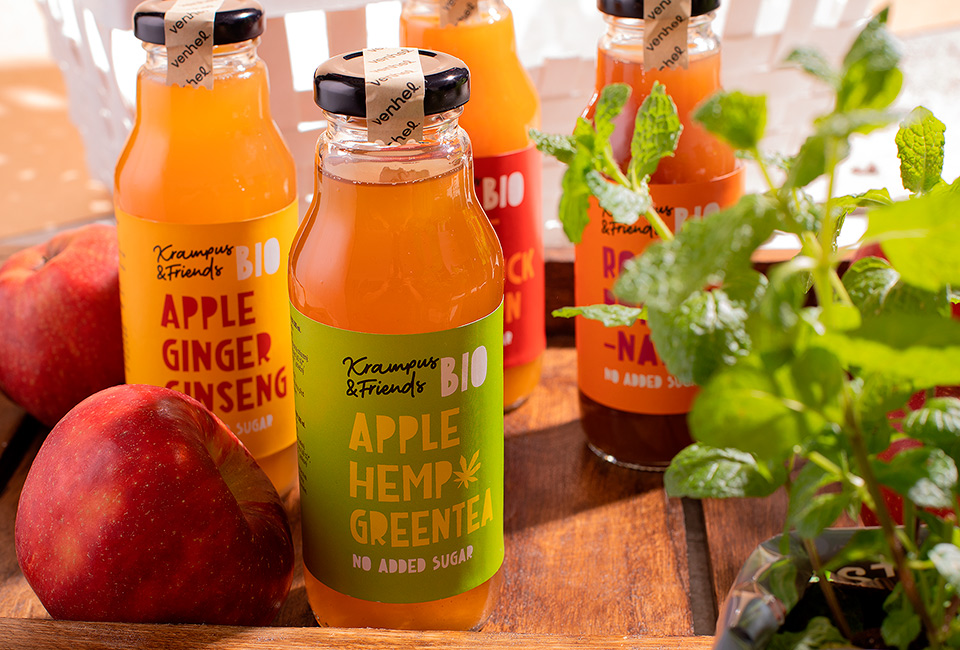
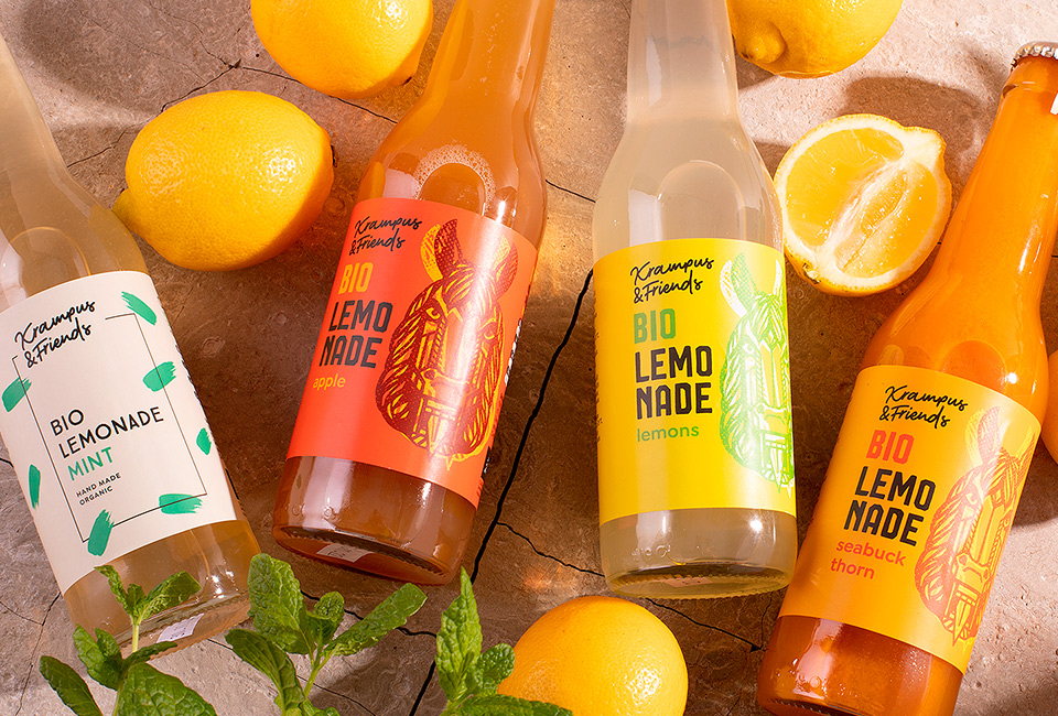
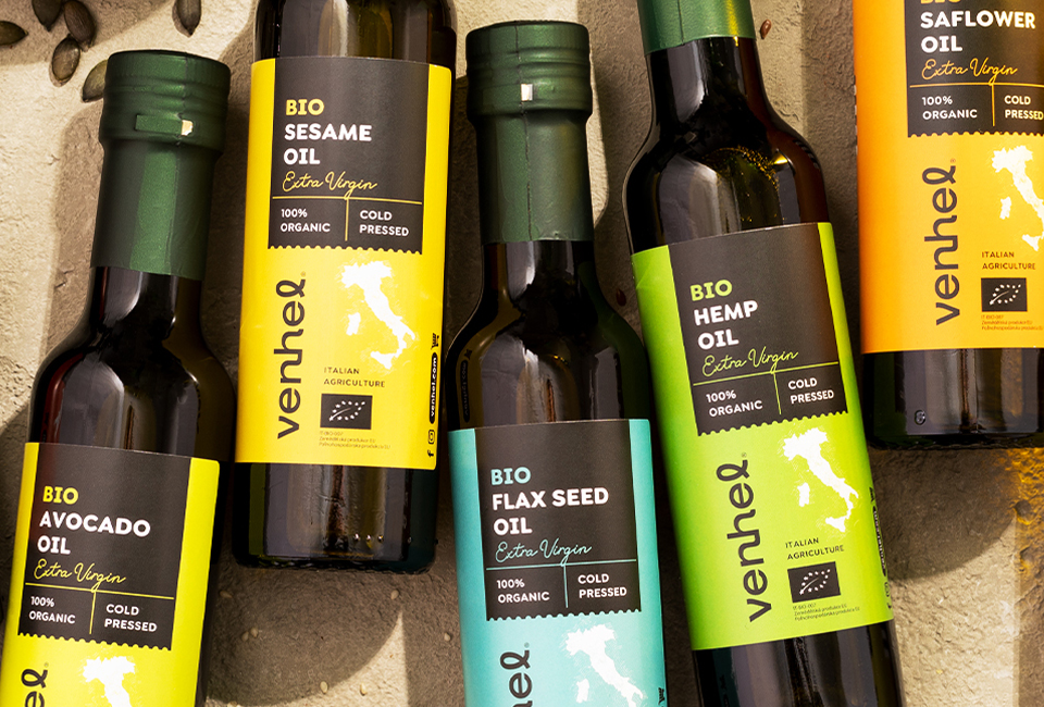
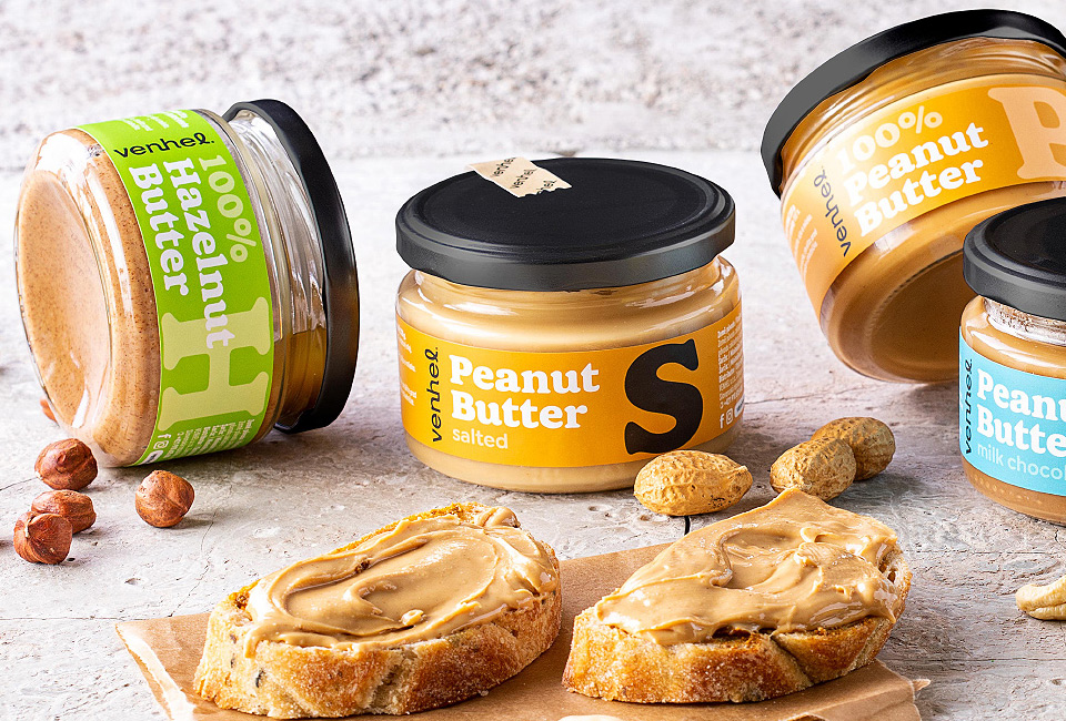
Sometimes, less is more. We love our typo and this design makes it stand out.
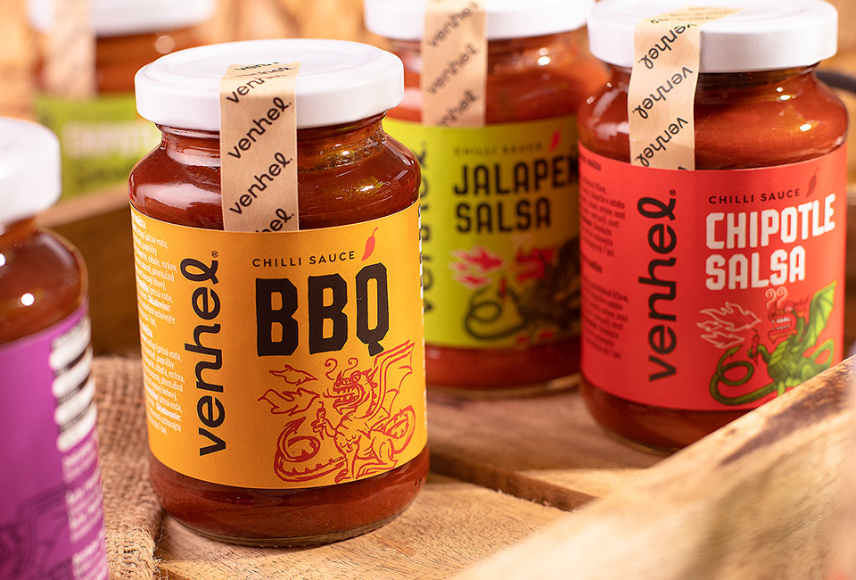
We have developed a traditionally simplistic packaging design, based on typography and color. While looking simple and easy to make, it took a long time and a lot of effort to balance out proper typography and composition. We stood strongly against any use of illustration, photography, or any other visual elements on these labels. It paid off well! Of the whole 300 SKU product portfolio, our vegetable spreads became immediately the best selling item! Consumers appreciated the packaging design and felt that the product has been elevated from its category.
From a designer's point of view, we have used a very traditional approach to packaging design. Once again proving the point that the consumer's eye is sensitive to even the slightest evolution of typography, which in the end contributes to the overall perception of the entire packaging graphic design.