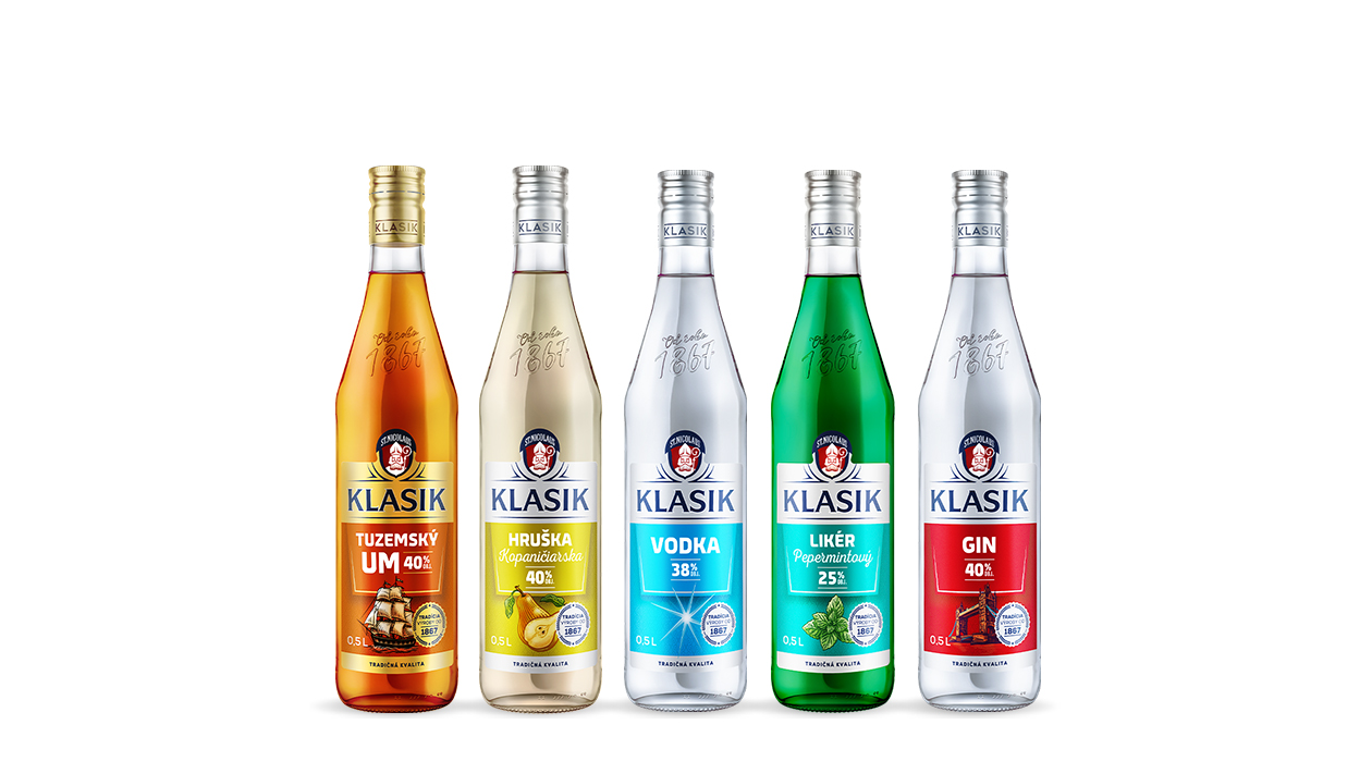
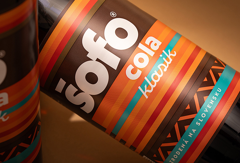
The largest spirits producer in Slovakia, asked us to. The range consists of traditional and popular spirits that pride themselves on a balanced quality/price ratio and have a stable consumer base.
Our task was to sensitively build on the existing, but at the same time shift it into a form that best corresponds to the established market position of this product line.
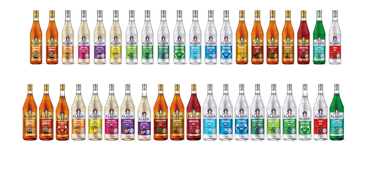
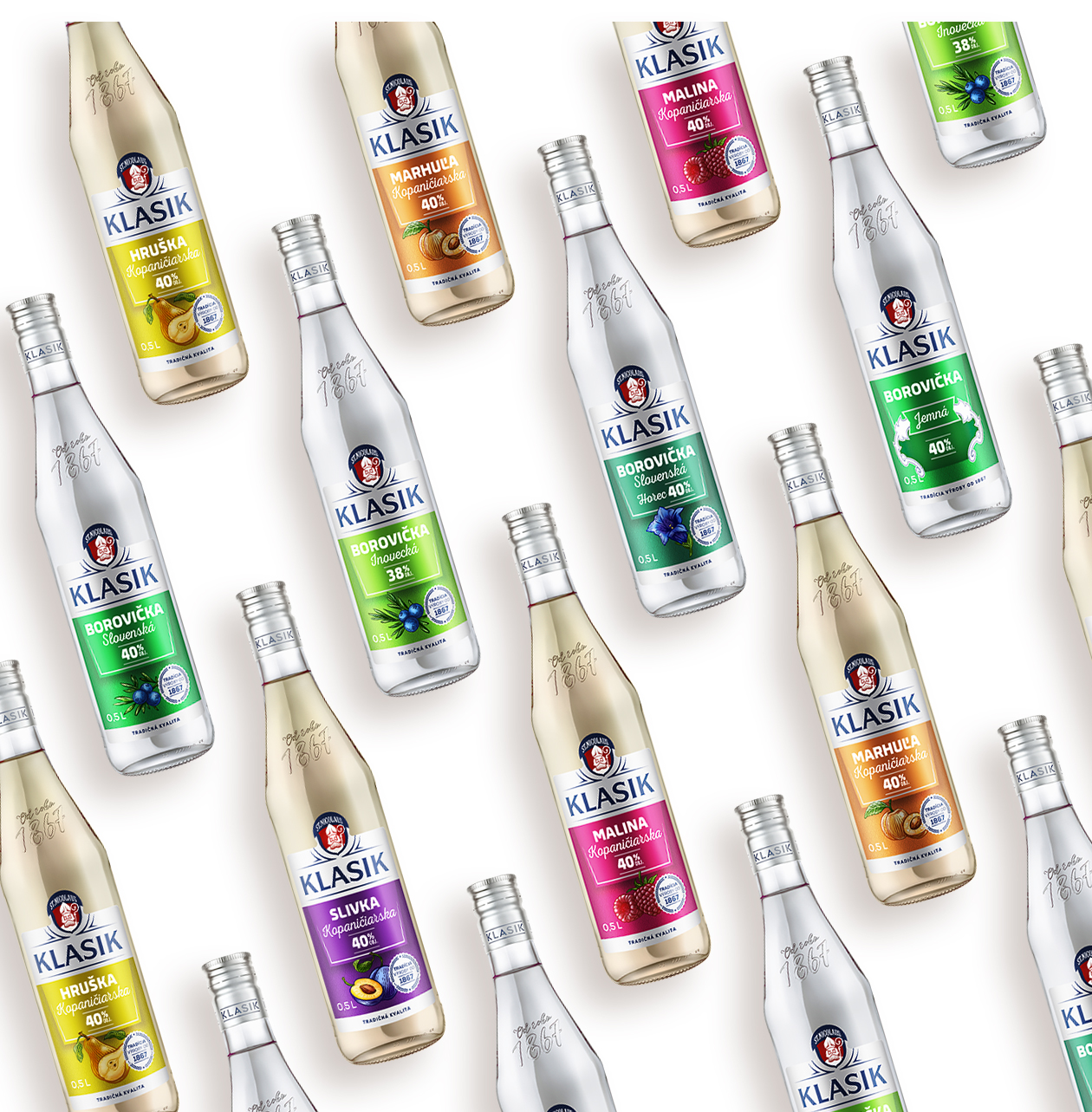
It was a to the whole issue of. We were faced with the challenge of a diverse range of products that needed a, in a variety of sizes.
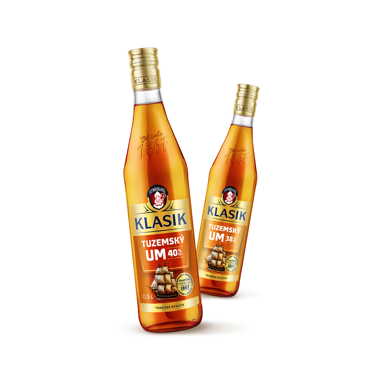
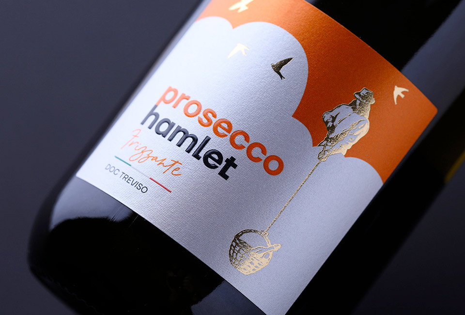
Original label illustrations
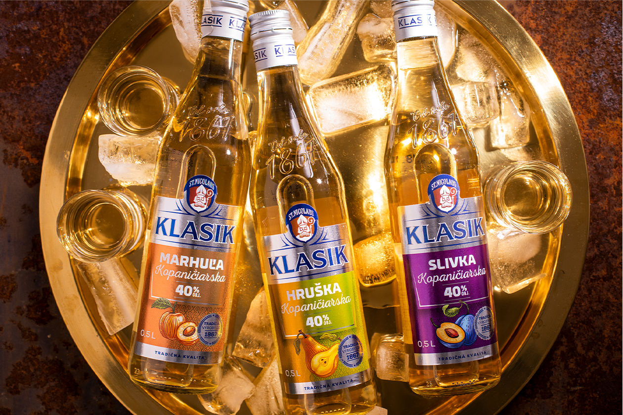
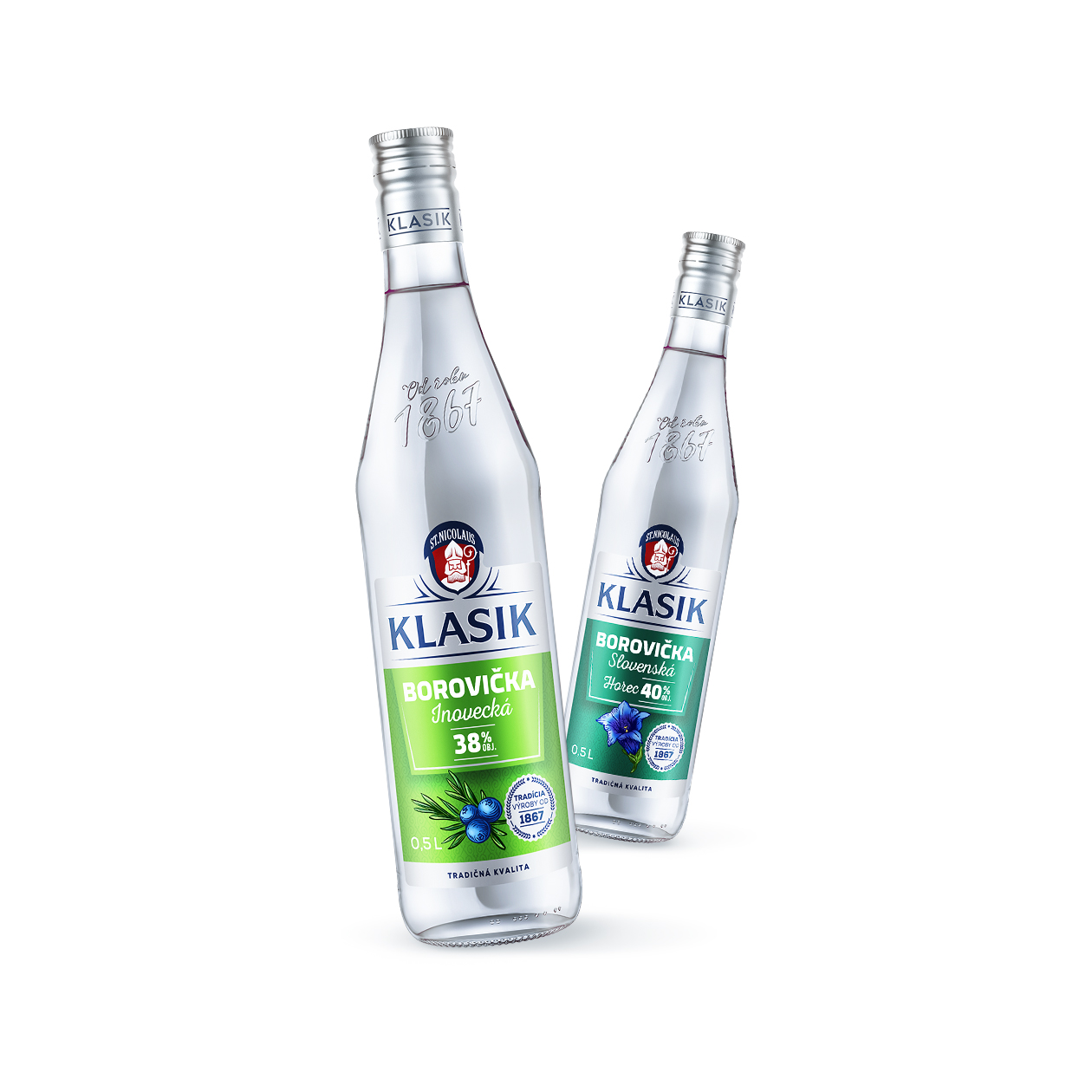
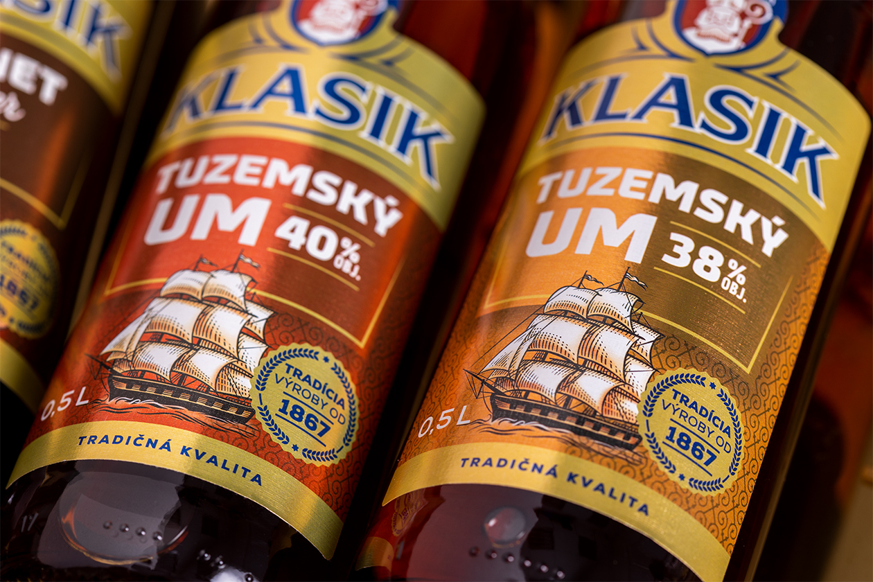
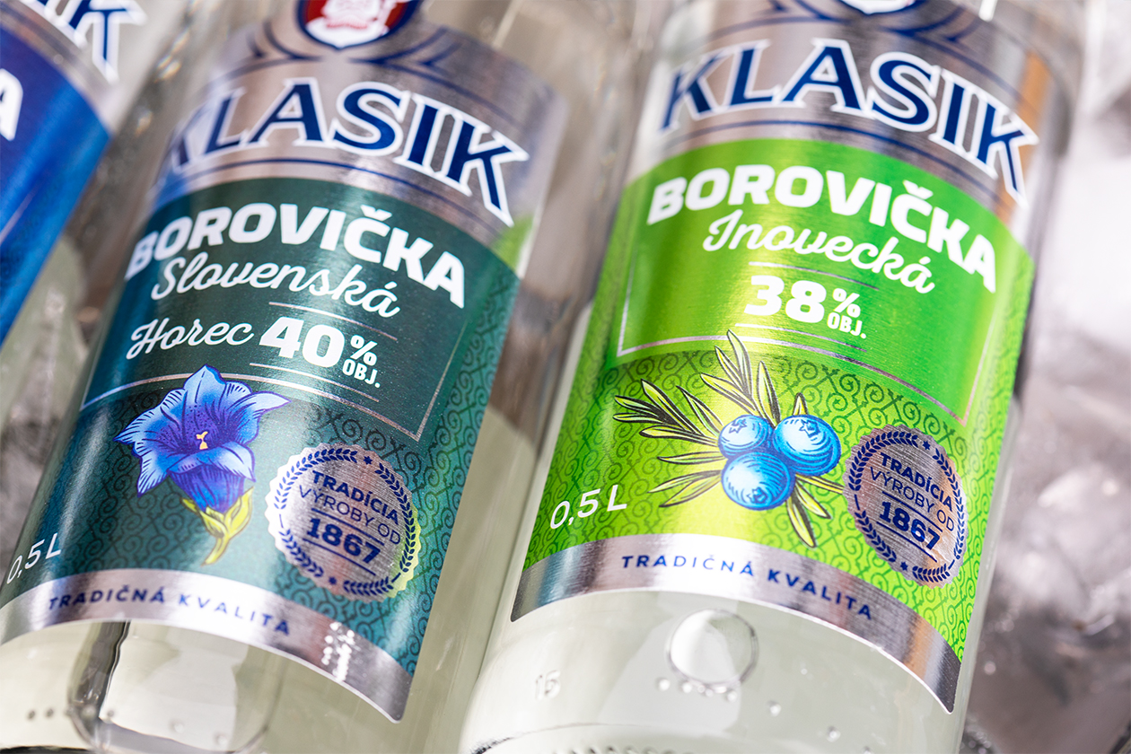
We created several in which play a crucial role. These depicted either the typical raw material that goes into the product or referred to the places and symbols with which these traditional products are associated.
Also because of the original original illustrations, it was worth planning the whole carefully from the outset. In order for the final impression of the packaging design to be what we intended, it was also necessary to choose.
The main goal: not to underestimate anything
This was a classic in a combination of CMYK and Pantone colours. For the labels we chose silver paper. It was clear at that moment that the different levels of would also need to be addressed and how the individual colours would behave would also need to be taken into account.
We didn't want to underestimate anything, so we carefully mixed and matched the colours to get the best possible coverage and avoid potential problems with colour drying.
In the print shop in the role of supervisor
In order to achieve the desired result in packaging and maximum satisfaction on the part of the client, the printer and us, we agreed together to solve the first prints in directly at the printer.
We were not discouraged by the fact that this phase of the packaging solution occurred in the first wave of the lockdown. Under strict security and anti-epidemic measures, we were physically present when the labels were being printed using the so-called.
In this case, it was also evident that careful preparation paid off in the packaging design. Even though there were a involved, only minor corrections were made in the printer. This part of the packaging project also took place without any major complications.
Intensive communication between all parties
After mutual agreement with the client, the entire job was extended to include and the in which the products are packed. We followed the historical logo of logo, which we linked to the Klasik product line with respect to the current label cut.
We were delighted when the largest spirits producer in Slovakia appreciated that they received a from us for this job, from the first graphic designs to the final print supervision.
In the end, the client received a product that was the joint result of the efforts of all three components, i.e. our agency, his and the printer. All the while, he was able to rely on a who were able to guide him through this challenging packaging design process.
In the case of, we dare to say that we have jointly achieved that, thanks to the intensive communication of all three parties, everything turned out as originally intended.