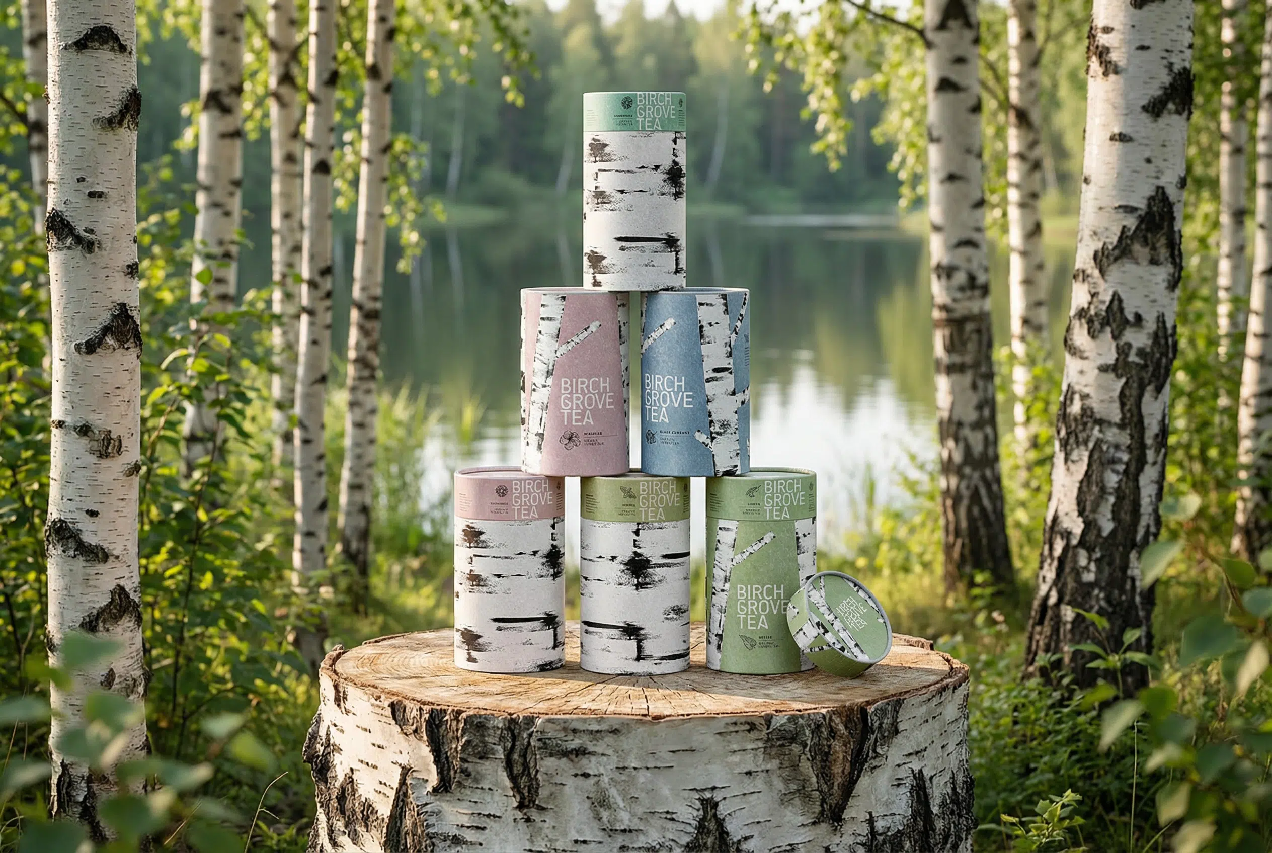
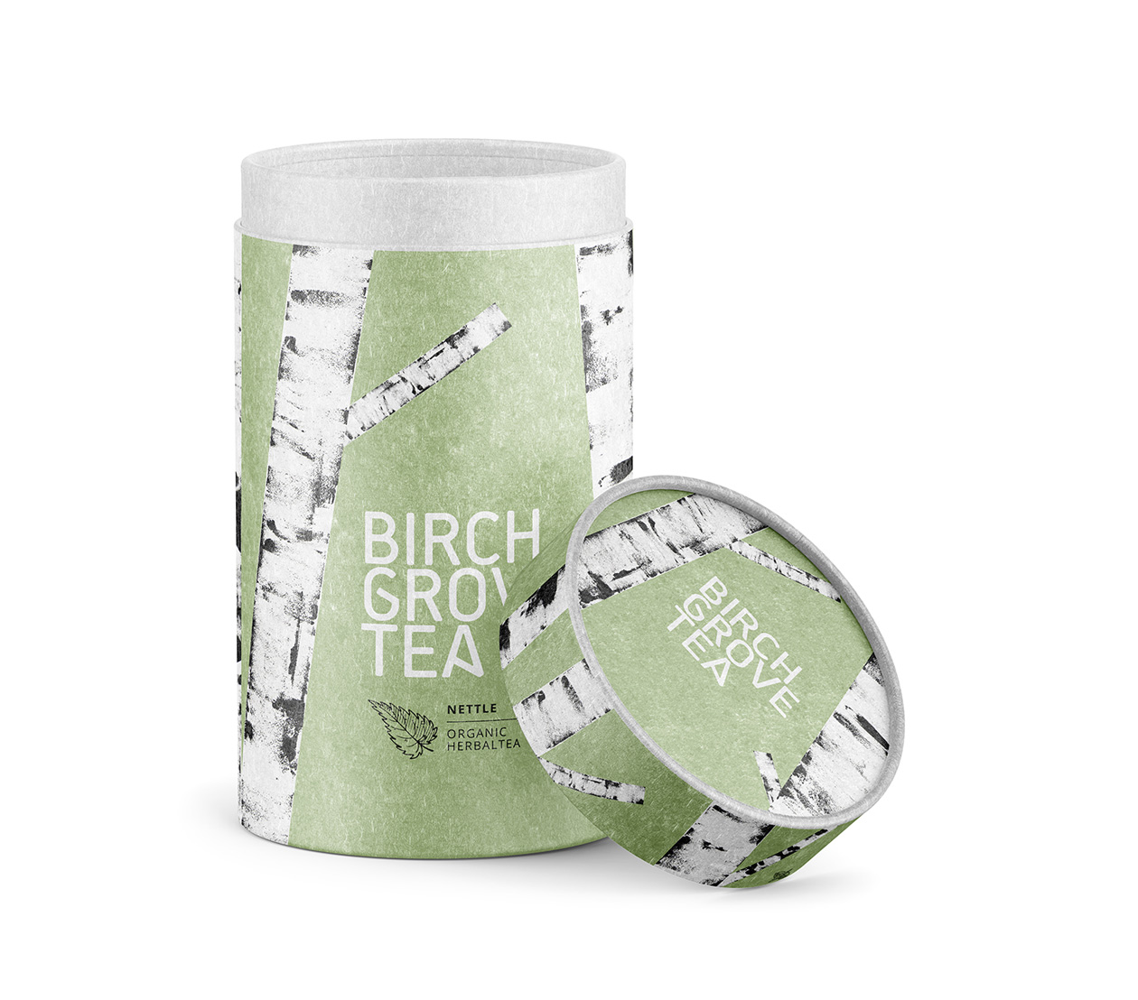
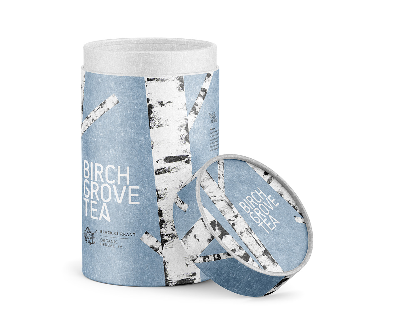
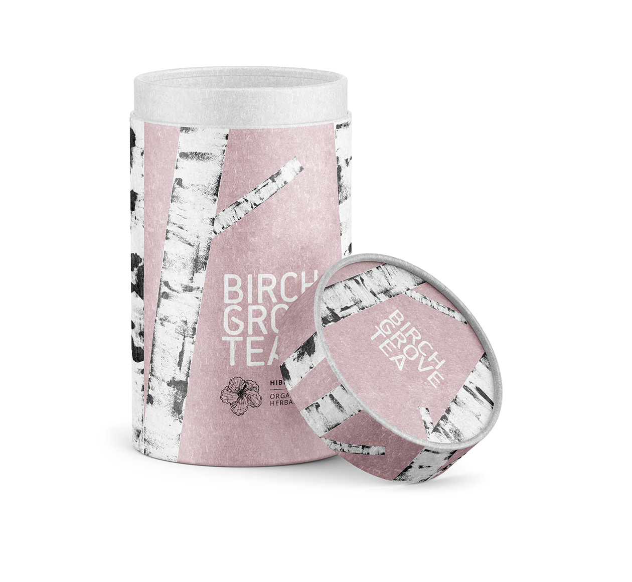
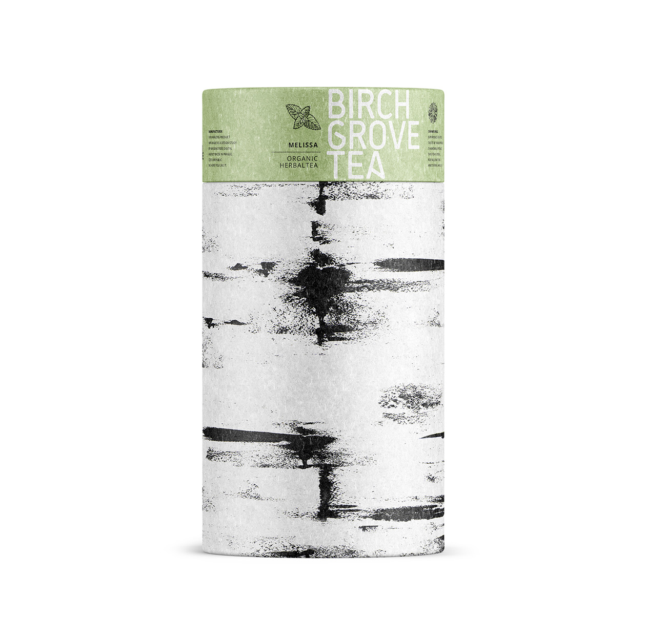
This packaging has a super chill, earthy vibe that instantly says “yes, I am that calm, herbal tea you drink when life is too much.” The soft sage green sets a relaxed, wellness-first tone, while the birch bark graphics feel intentionally artsy — like something you’d see in a cozy cabin aesthetic moodboard. The brand name is set in a clean, no-drama sans-serif font that feels modern and honest, like it’s not trying too hard. Overall, it gives off organic, slow-living energy without being cliché or overly “eco crunchy.”
The whole thing is minimal in the best way—no clutter, no loud claims, just quiet confidence. The pattern flows seamlessly from body to lid, which makes it lookcurated and premium, almost like it belongs in a Scandinavian-inspired café or a “soft morning” TikTok flatlay. The little leaf icon adds a quick visual cue that it’s plant-based and natural, but still feels stylish, not overly rustic. It’s a vibe for people who care about what they consume and want their packaging to look good sitting on open shelving.