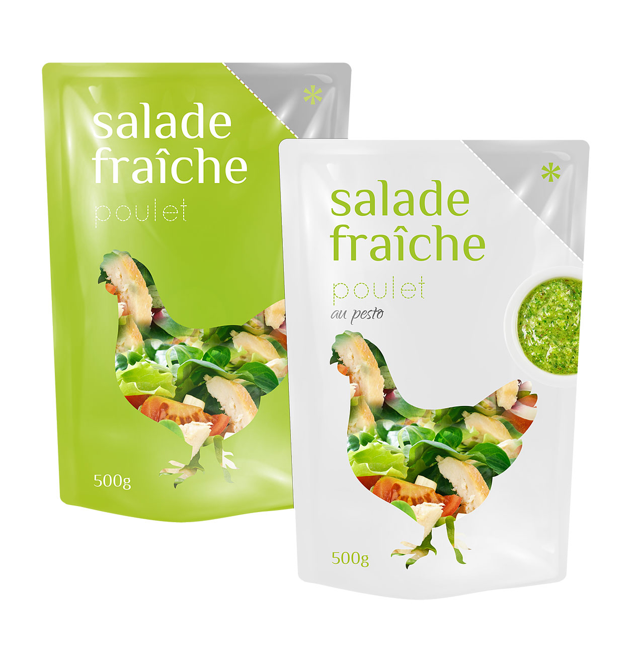
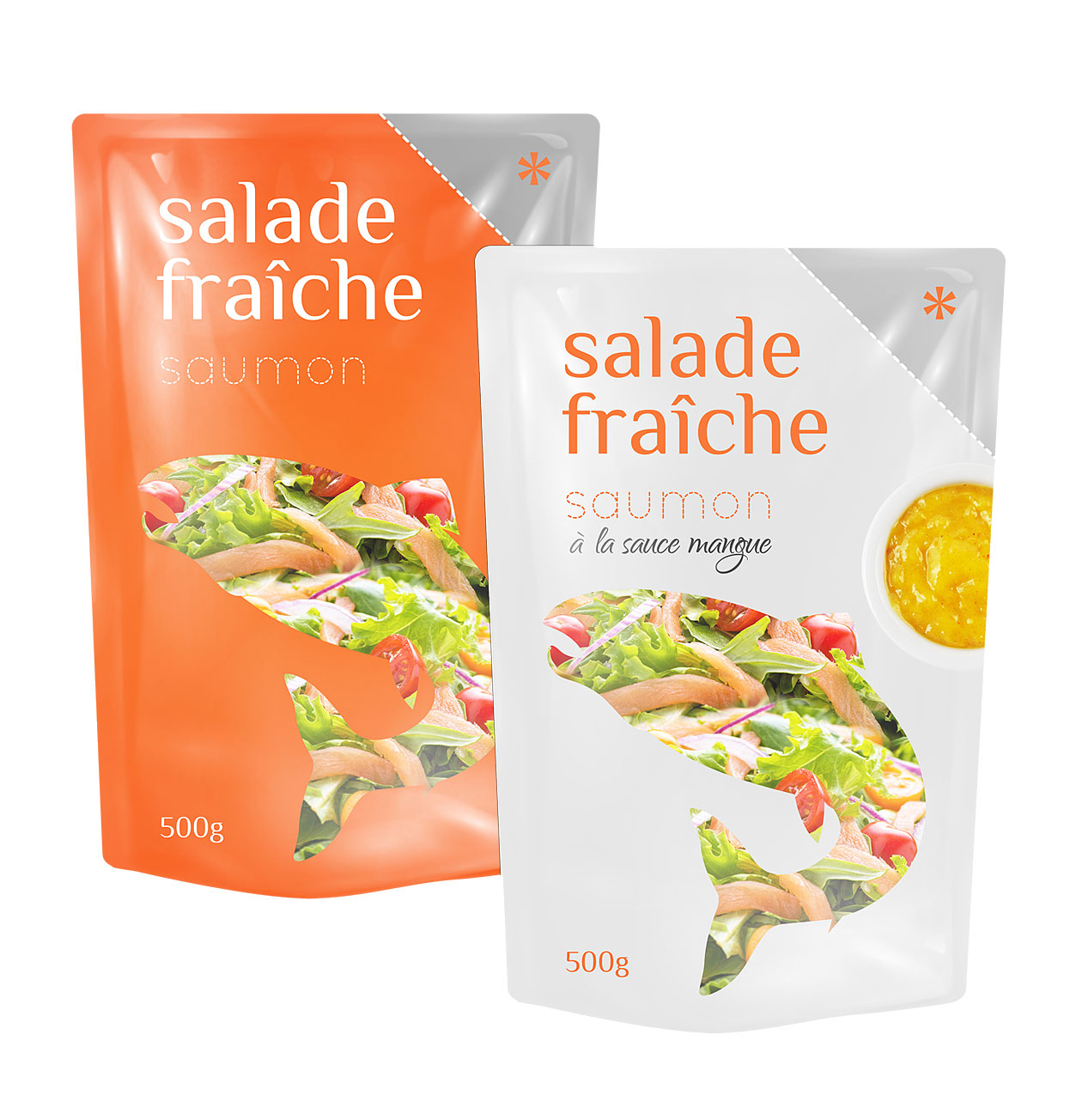
At our studio, we designed the packaging for the salad line with minimalism and practicality at the forefront. The clean plastic tubs carry just enough graphic detail to differentiate each variety, while the transparent product window lets the fresh leaves and vibrant ingredients speak for themselves. The typography is simple and straightforward—no clutter, no confusion—making the packaging feel fresh, credible, and easy to navigate.
The structural choice of the tub emphasises both convenience and visibility—lightweight, easy to handle, and designed to stand out in a competitive chilled-produce aisle. The layout respects the product’s freshness: elements are evenly spaced, colors are restrained but distinct, and the overall impression is one of calm control rather than over-complicated design. The result is packaging that doesn’t distract from the product but enhances its appeal through thoughtful simplicity.
Because the visuals were designed to be both timeless and practical, the solution remains in use and effective years after its launch. The brand continues selling this range successfully in its category, with the design system supporting both everyday variants and limited-edition formats without losing coherence. This long-term consistency highlights how a minimalist, well-executed packaging concept can perform reliably in retail environments over time.