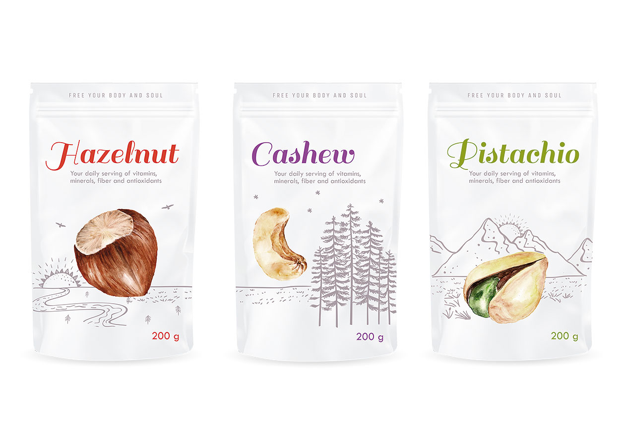
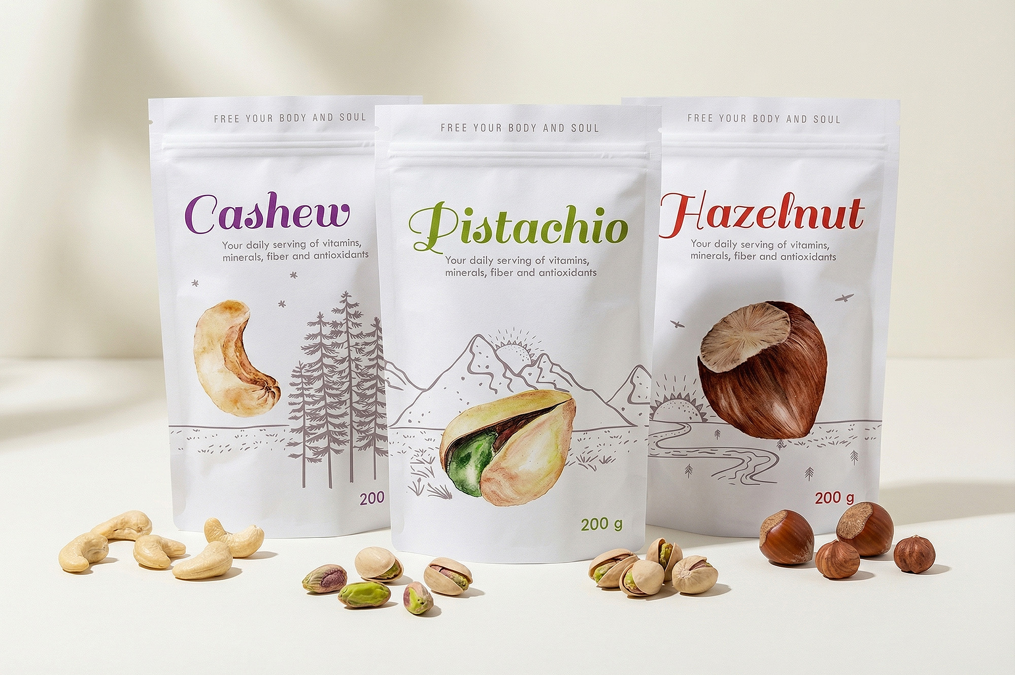
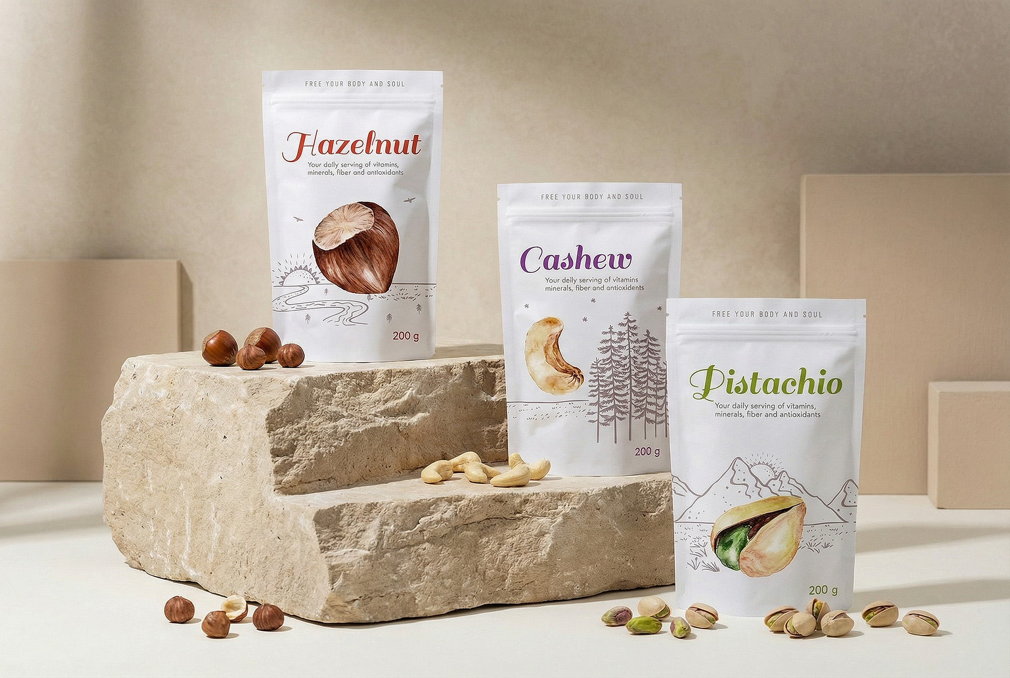
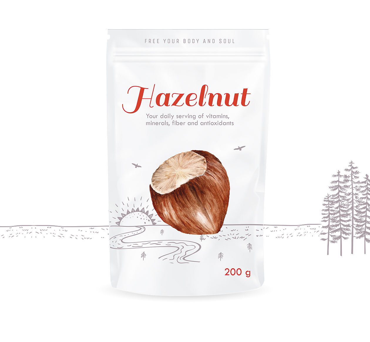
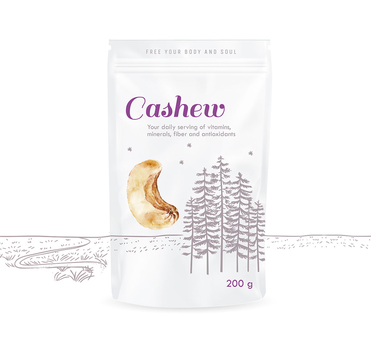
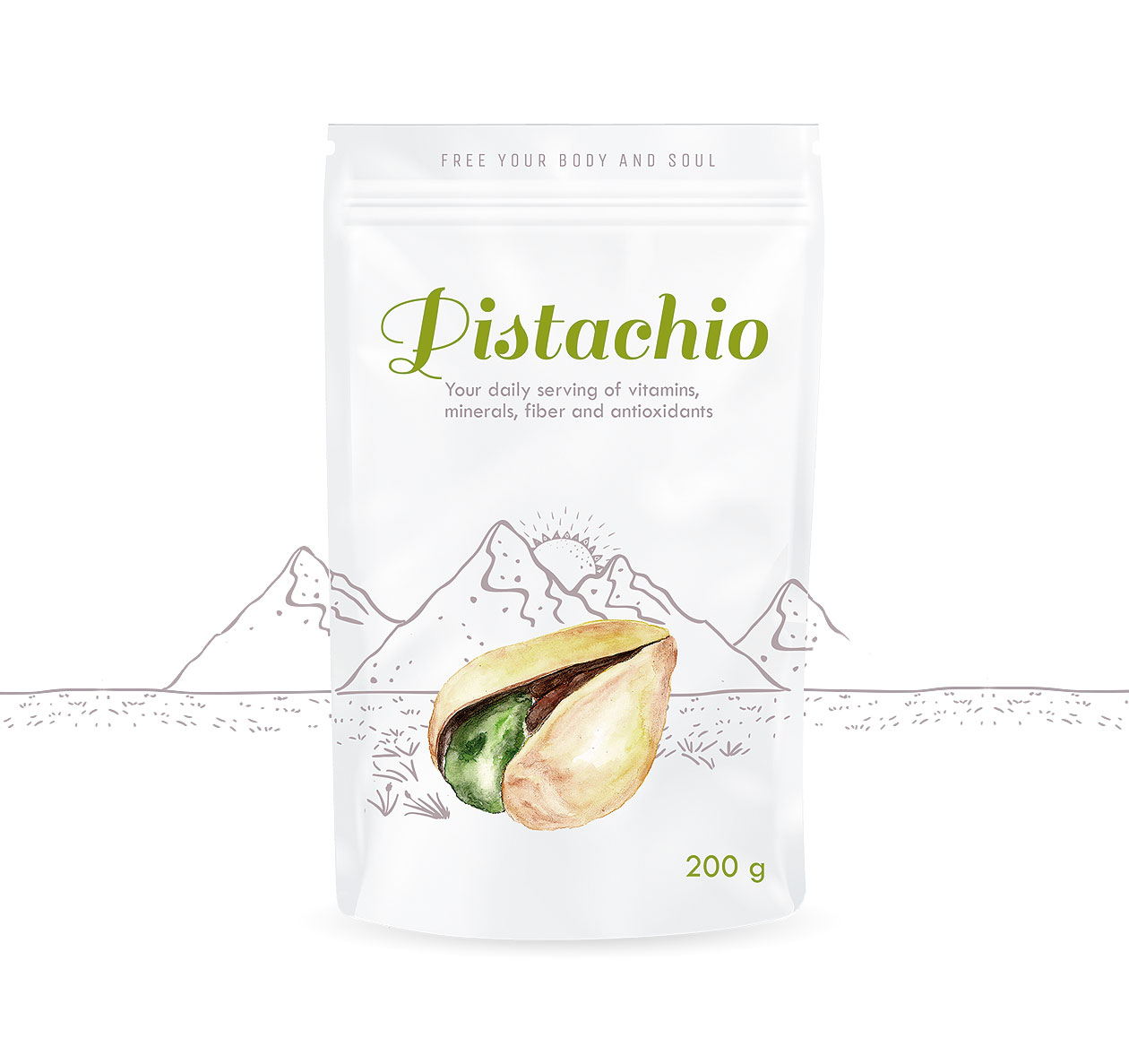
In this packaging design for a variety of nuts (cashews, pistachios, hazelnuts), the design approach emphasizes minimalism and subtle natural cues rather than overwhelming health-claim graphics or dense ingredient lists. The landscape motif is used as a secondary graphic element—with matte metallic paint adding texture and sophistication—while the primary aesthetic focus lies on simple watercolor illustrations and clean presentation. By toning down the typical clutter of the “nut snack” category and leaning into visual calmness, the design invites the consumer to experience the product as something wholesome, light, and premium-yet-friendly. MAISON D’IDÉE Prague
The result is packaging that balances playfulness and refinement. The soft, hand-painted watercolor touches bring a charming, almost artisanal feel; the metallic accents add a contemporary edge; and the restraint in messaging shifts attention back onto the product itself—raw, gluten-free, healthy. With this design solution, the brand positions its product line as honest, natural, and visually refreshing within a crowded snack market.