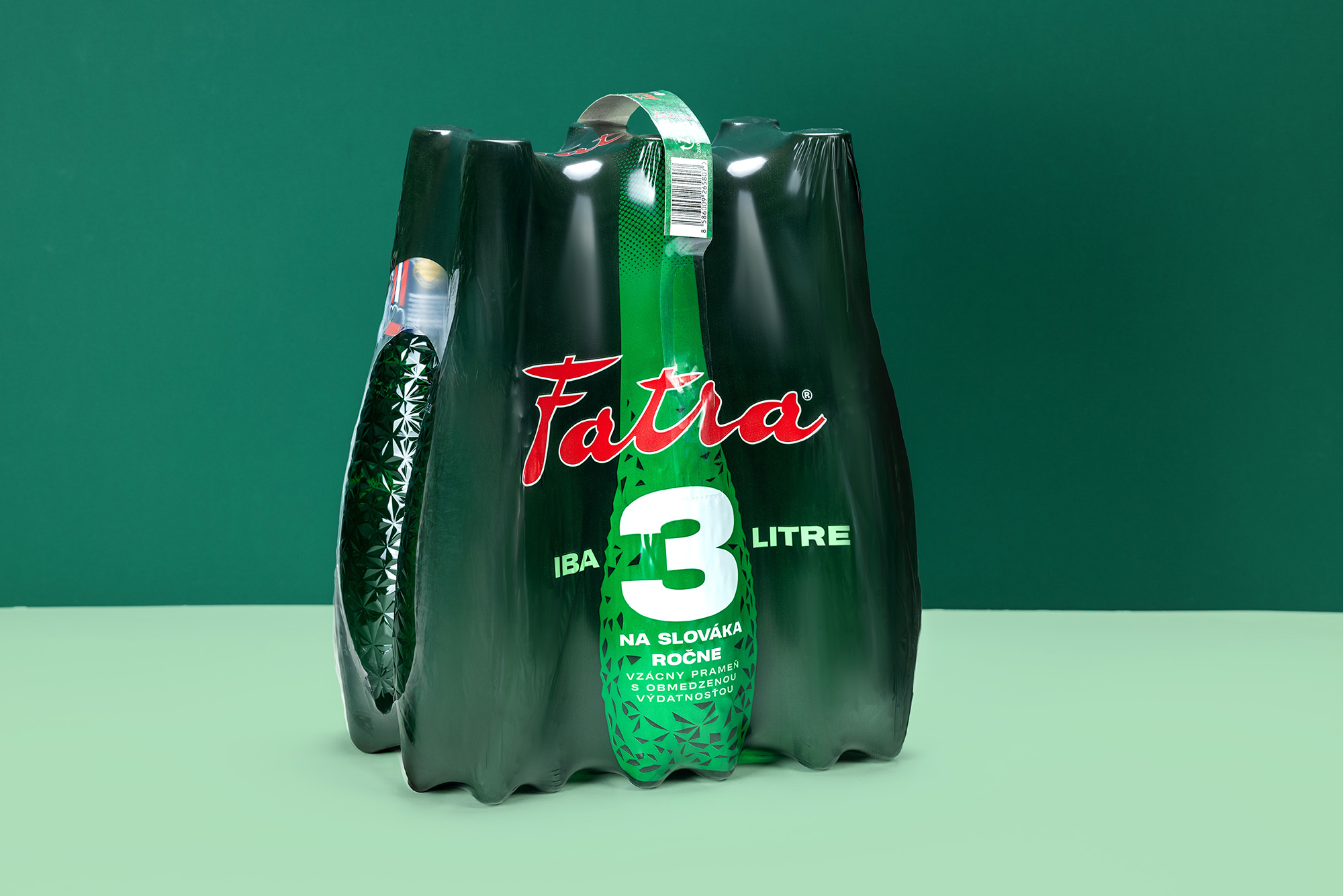
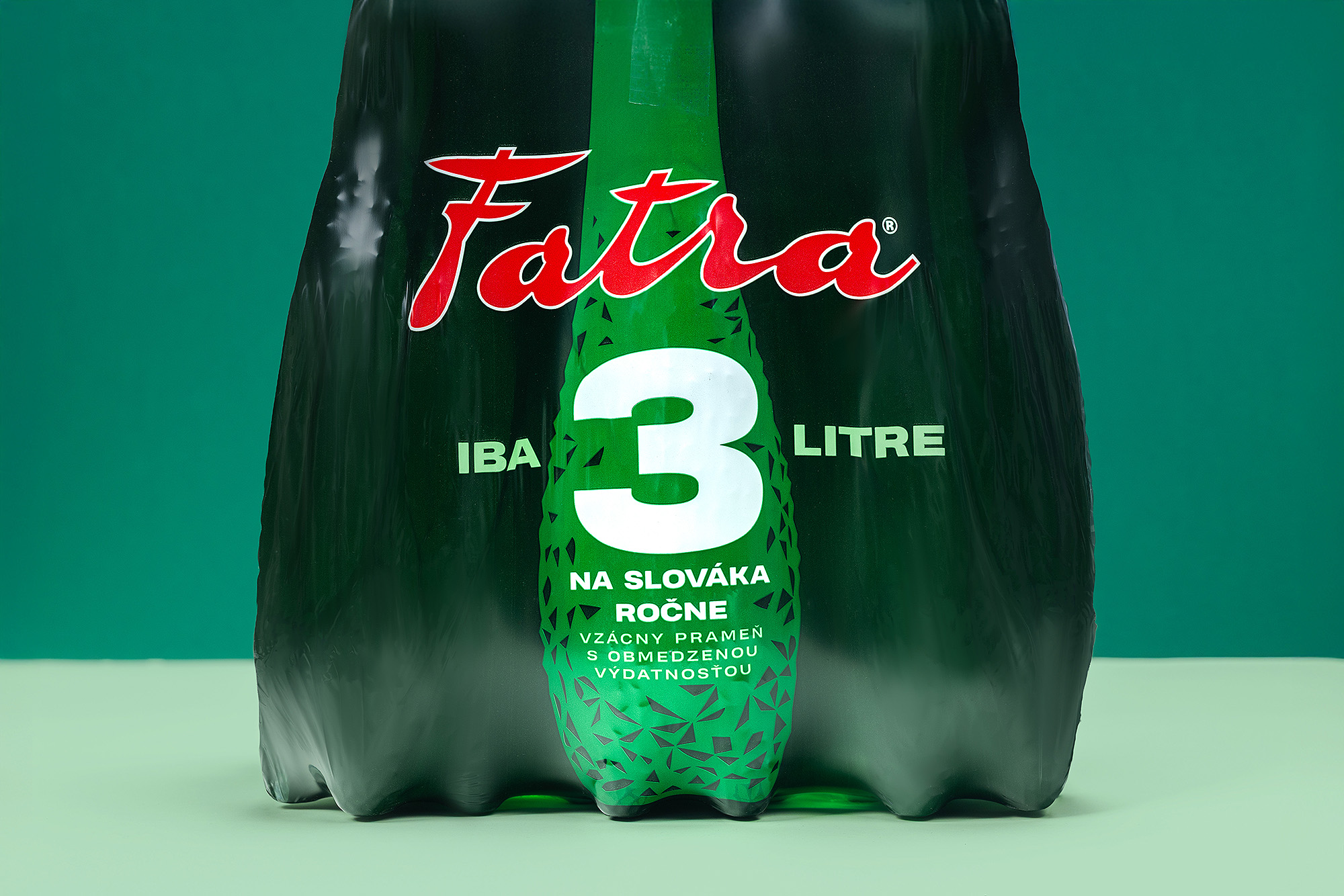
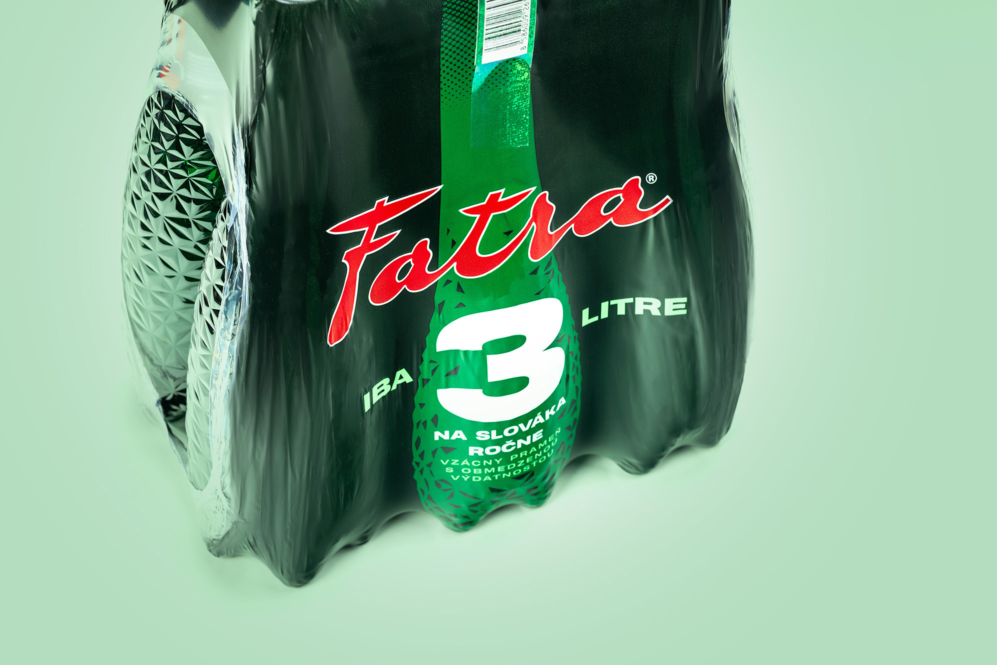
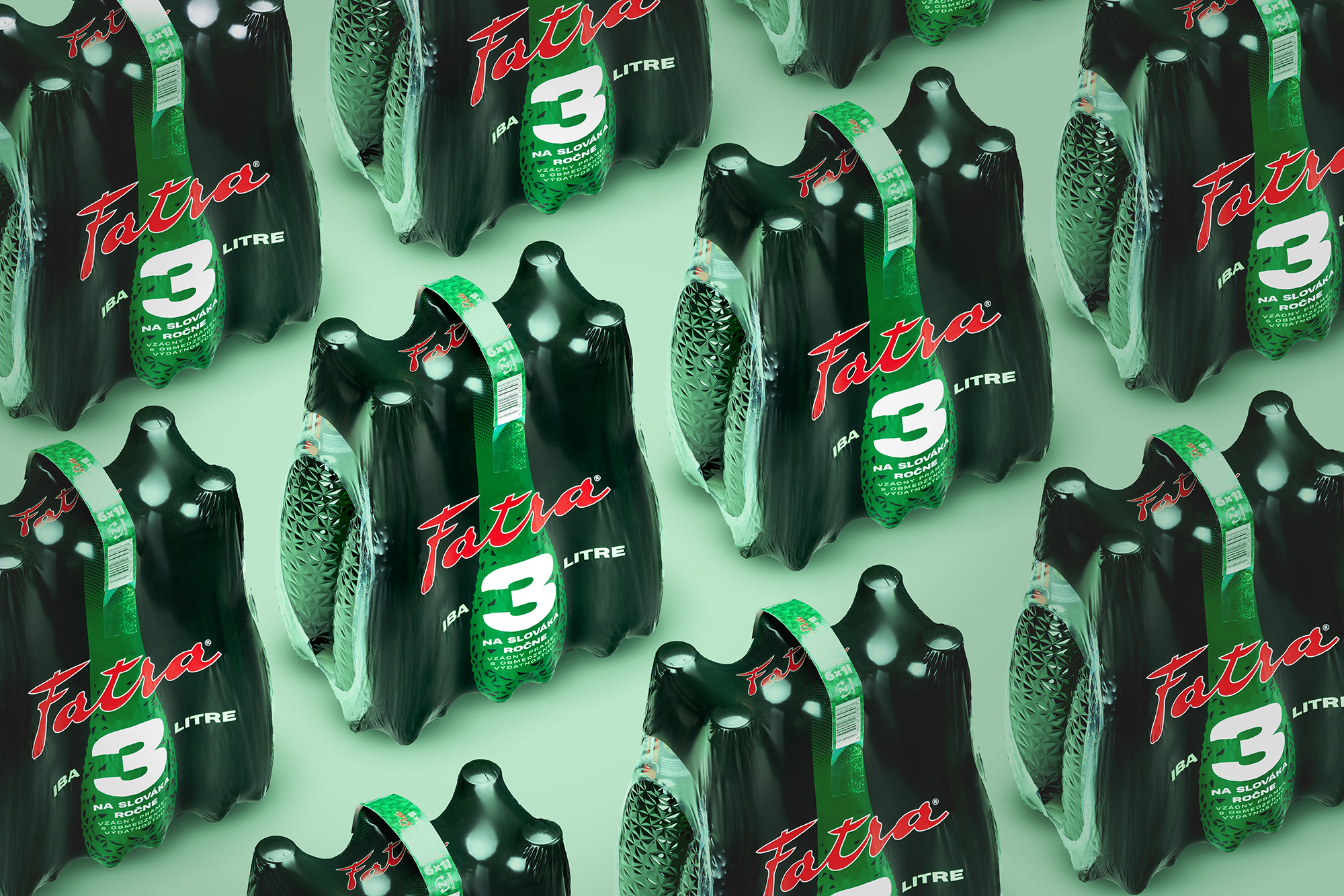
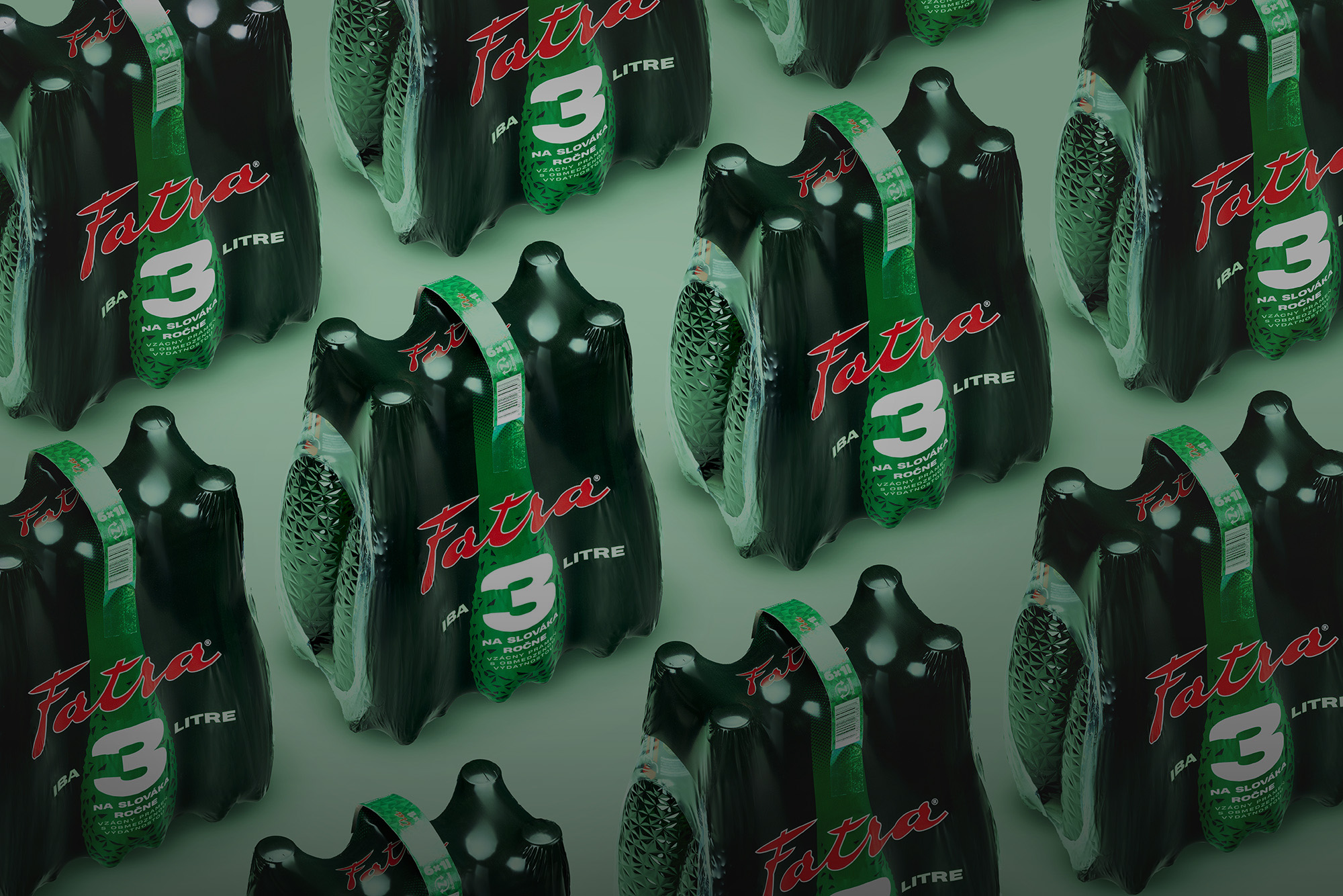
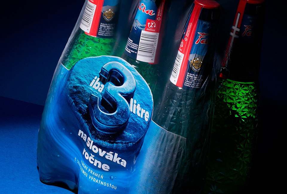
This packaging concept celebrates the instantly recognizable silhouette of a six-pack, turning it into the central visual motif. The deep green sleeve wraps around the bottles like a uniform, creating a cohesive block of color and form that stands out on the shelf. The tensile carry-handle, with its textured and graphic detailing, reinforces both practicality and visual punch. The repeating arrangement of the units highlights the rhythmic sculptural shape of the bottles, making the bundle feel like a single strong, memorable object.
Fatra is a traditional Slovak mineral water brand known for its balanced taste and natural origin. This is already the second version of the six-pack sleeve packaging our agency has created, building on the original while pushing the brand toward a more contemporary and dynamic aesthetic. The updated design keeps Fatra’s signature personality—bold red logotype and green natural cues—yet sharpens the overall visual presence to better resonate with modern consumers looking for authenticity and everyday confidence in their choices.
