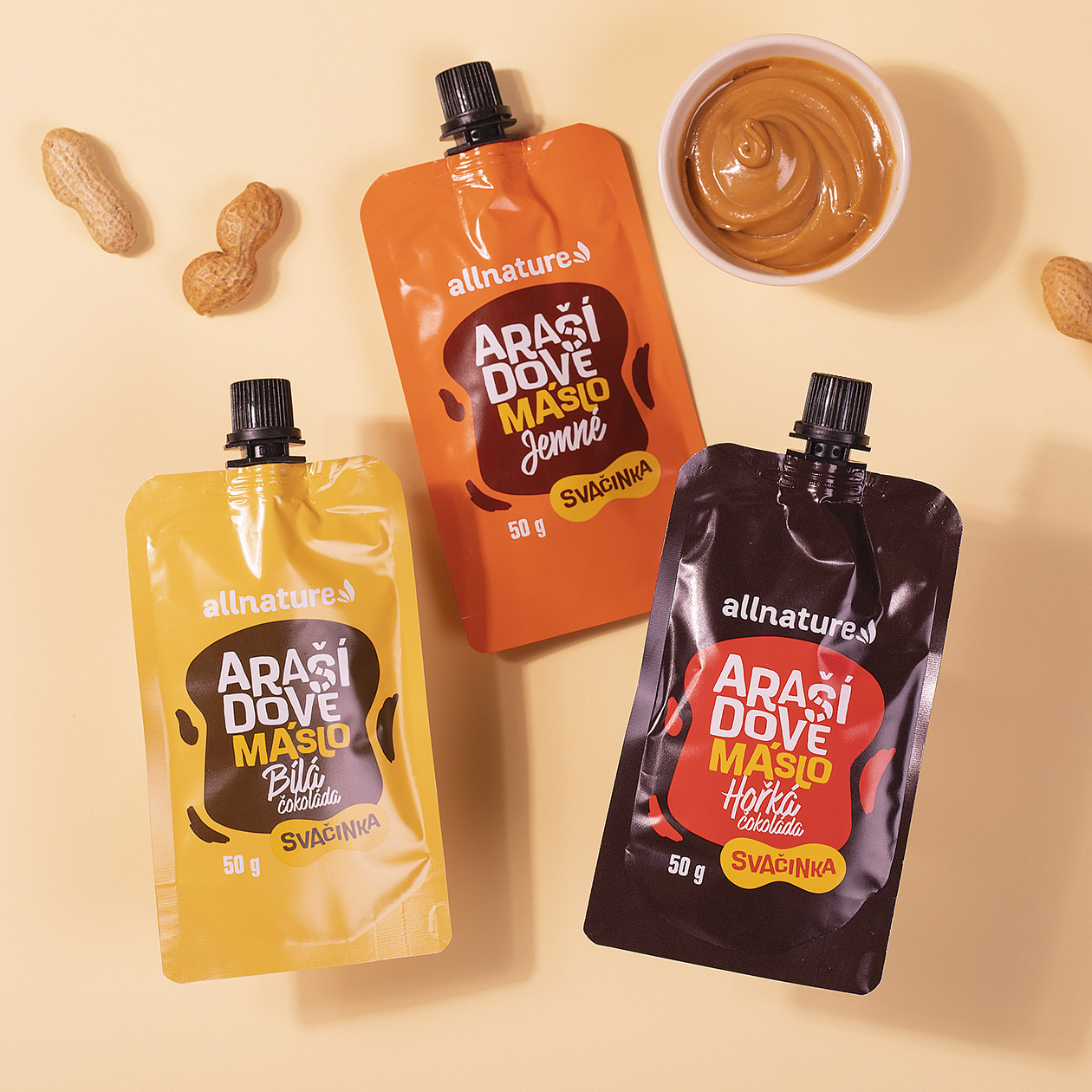
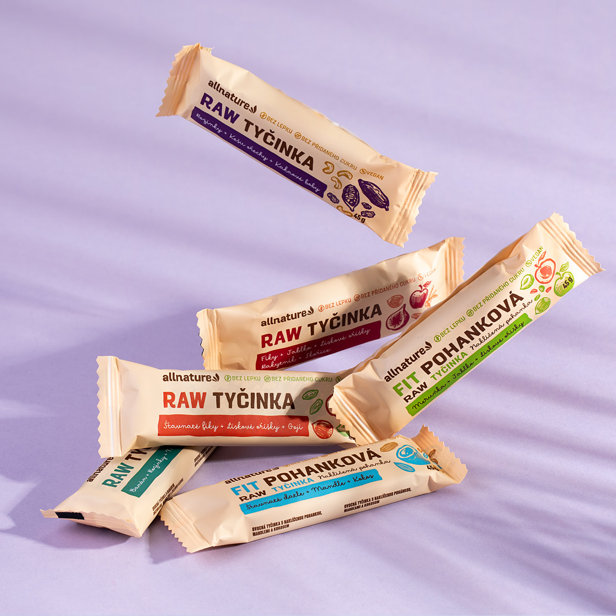
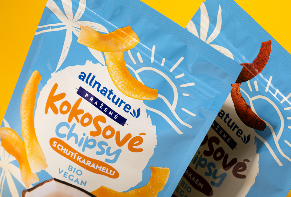
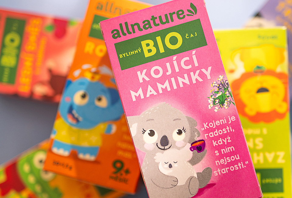
Our brief was to create a unique visual style and apply it to several different product lines. We adapted the packaging design to the overall brand concept and the technological possibilities of printing individual products. The packaging works with playful typography that is heavily stylized with irregular shapes to evoke the imperfection of nature. All products under this brand are entirely natural without the use of any chemicals. The packaging design follows this characteristic but also works with modern and bright colours. It is the variety of colours and the creation of distinctive packaging for each line that plays a key role in distinguishing cereals from nut butters, oils from bath salts or chocolate from lentils. According to the client's needs, we enriched some of the packaging with original illustrations, giving this packaging design a higher craft value. The brand received not only a new packaging design from us but also a redesign of the logo itself and the entire visual concept.
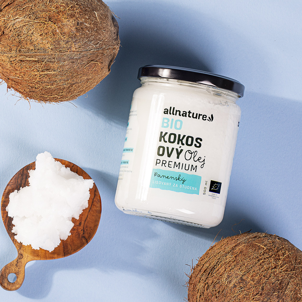
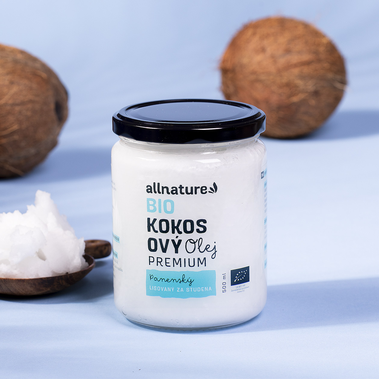
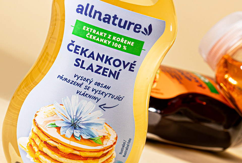
In the process of creating the packaging, which was produced by different technological processes, we always chose the optimal combination of material and printing technology, also taking into account the country and the quantity in which they were produced. For example, to achieve a premium effect on coconut oils, we used matt polyethylene film with transparency, while for other products plain paper with a matt finish was suitable. We believe that for packaging design, expertise in manufacturing processes and knowledge of the behaviour of different materials is just as important as creativity and a flair for graphic design.