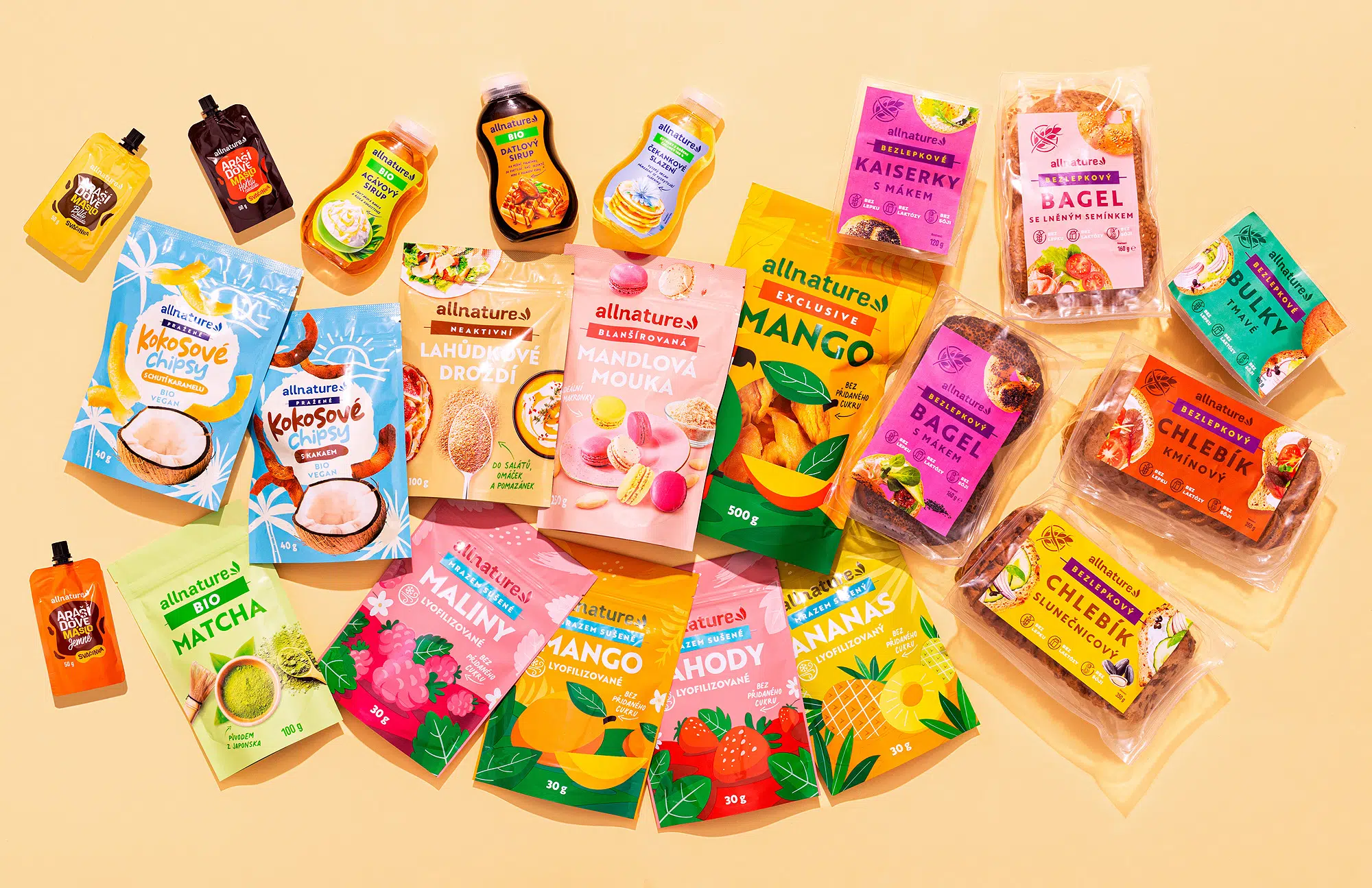
We had the privilege of collaborating with Allnature, a prominent Czech brand specializing in modern, healthy products derived from natural ingredients. Our objective was to develop a distinctive visual identity that could be seamlessly applied across various product lines, ensuring consistency while highlighting the unique qualities of each item.
Packaging Design Philosophy
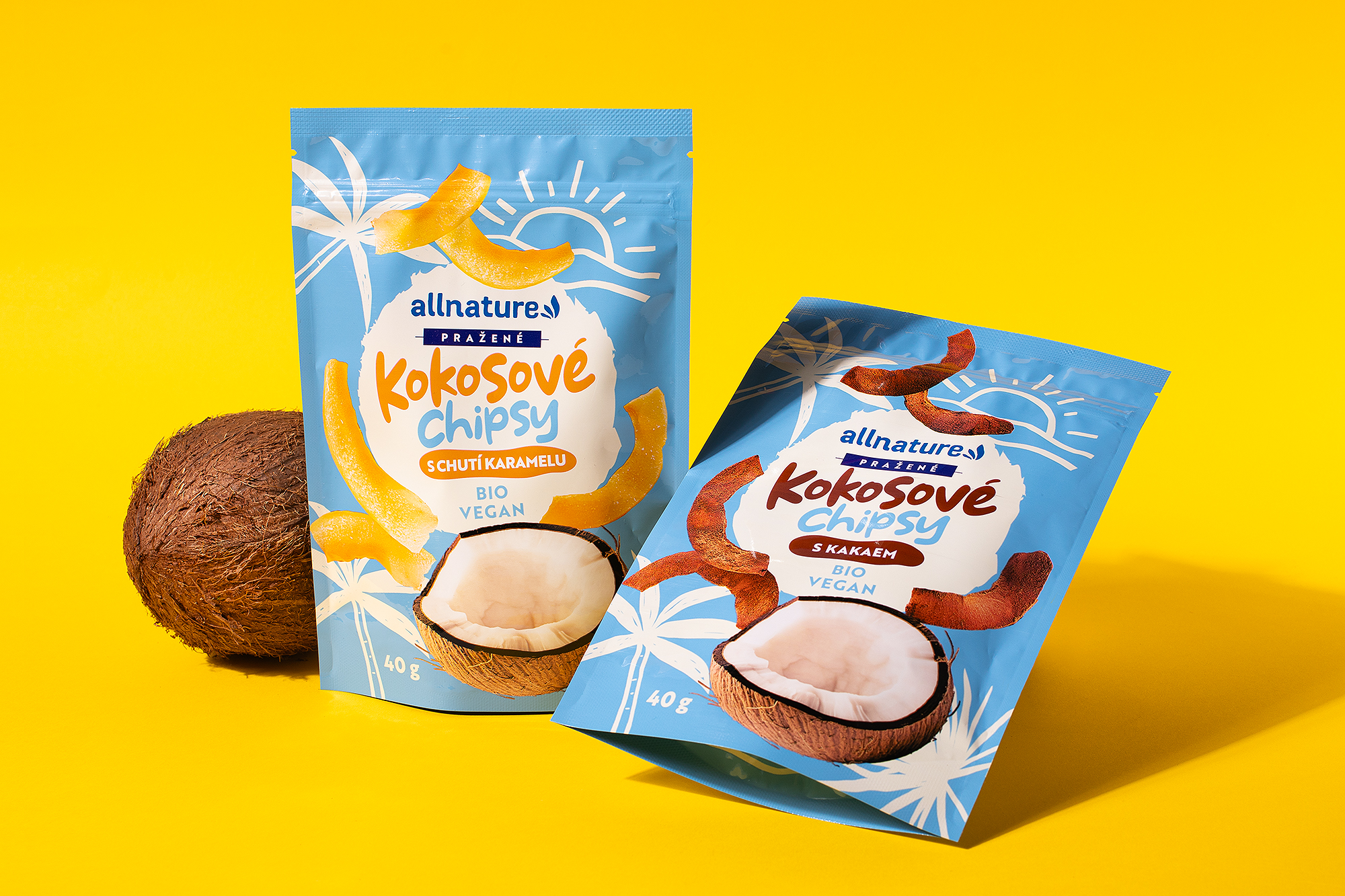
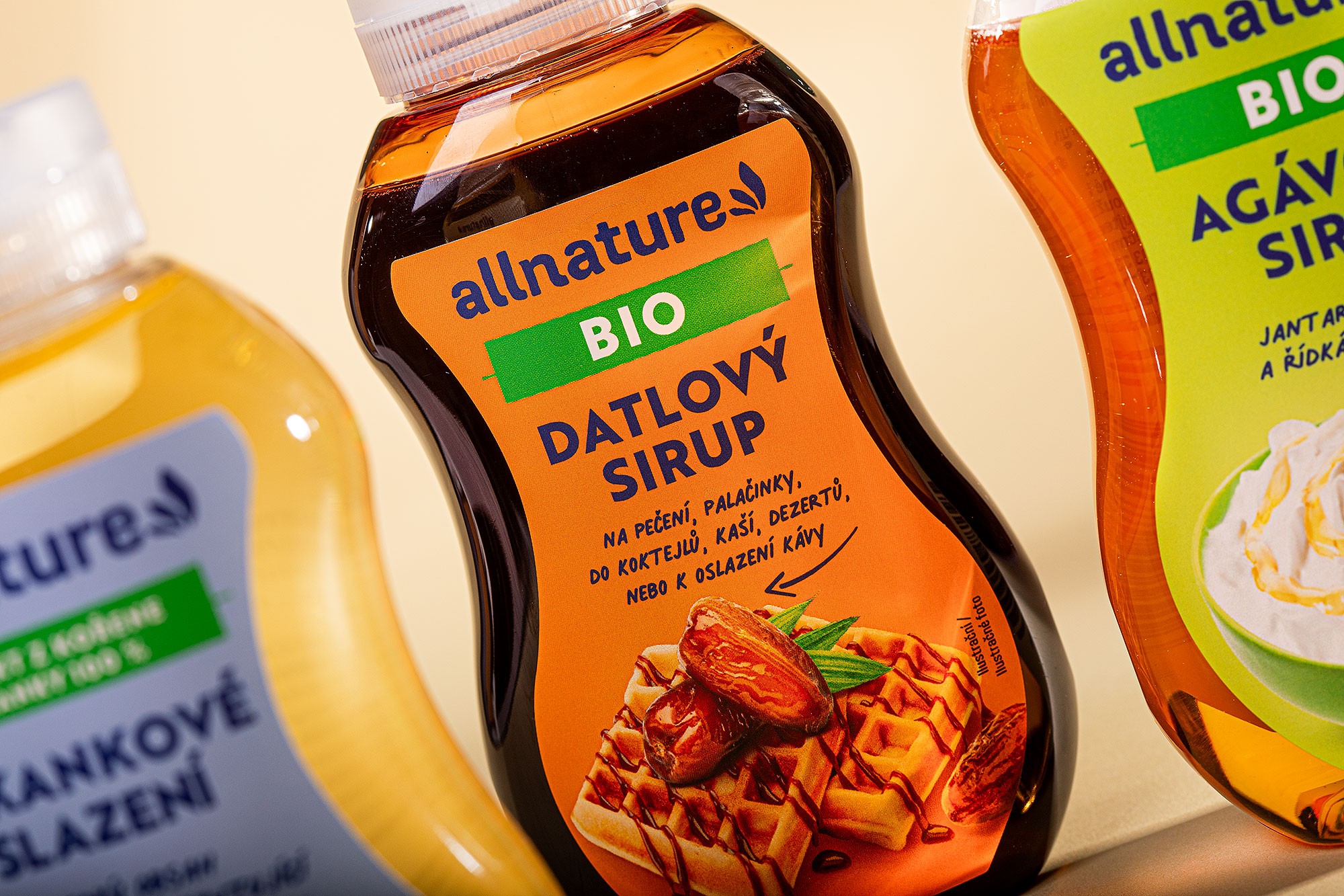
Our design approach centered on creating a visual style that resonates with Allnature’s commitment to health and nature. We employed playful typography with irregular shapes to evoke the imperfections inherent in nature, thereby reinforcing the brand’s natural ethos. This was complemented by the use of modern, vibrant colors to attract contemporary consumers seeking healthy options.
Packaging Elements
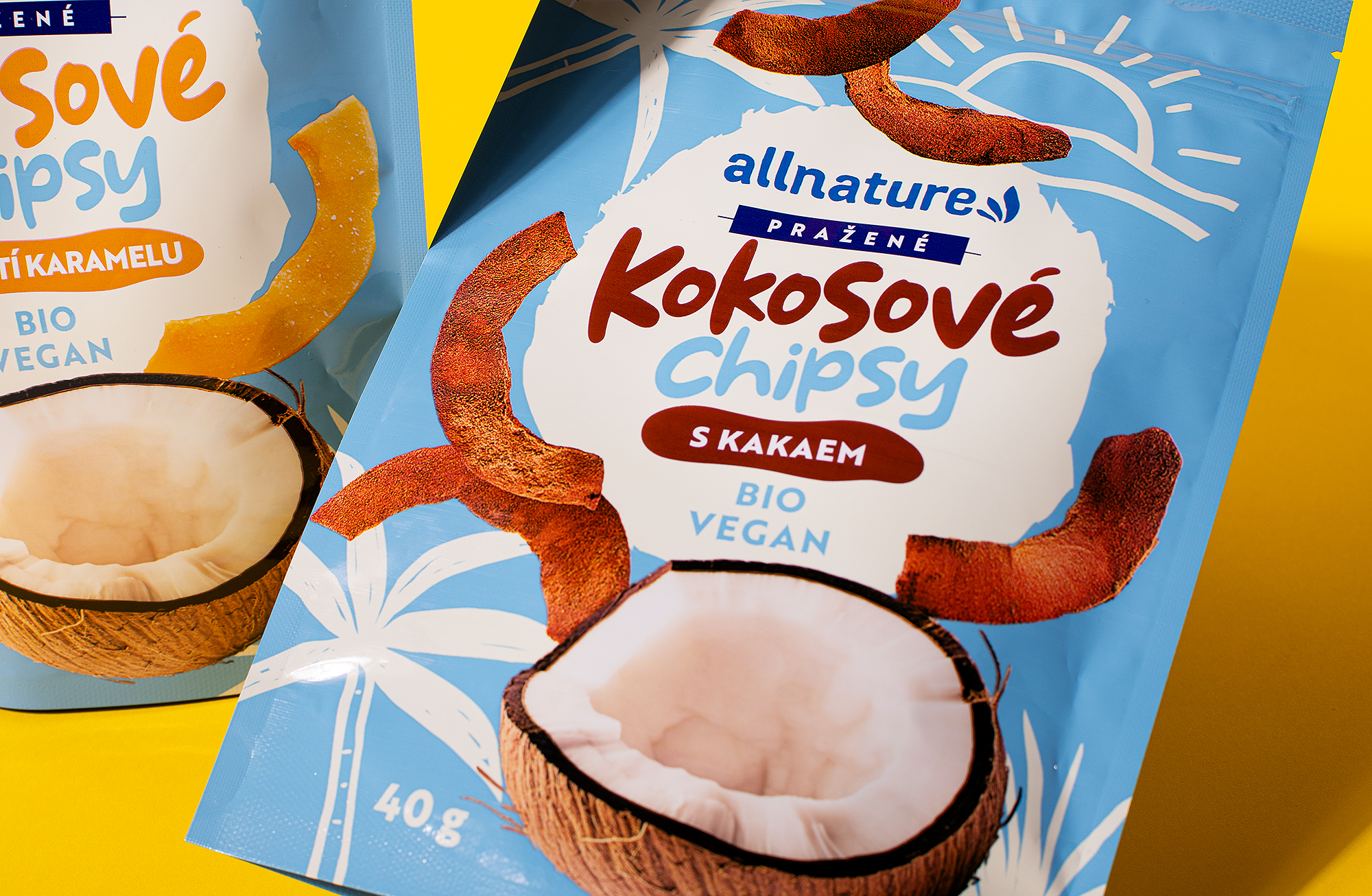
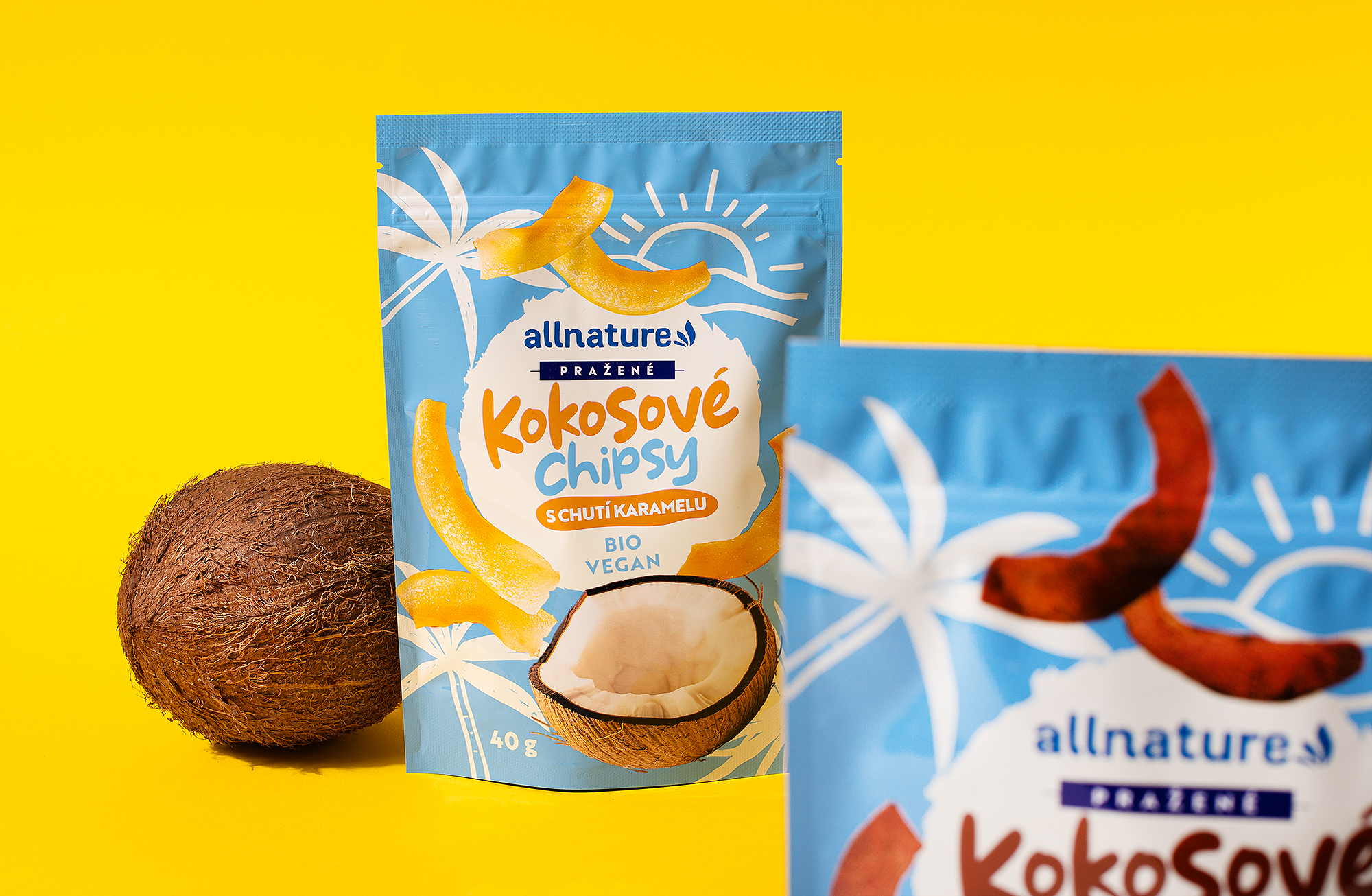
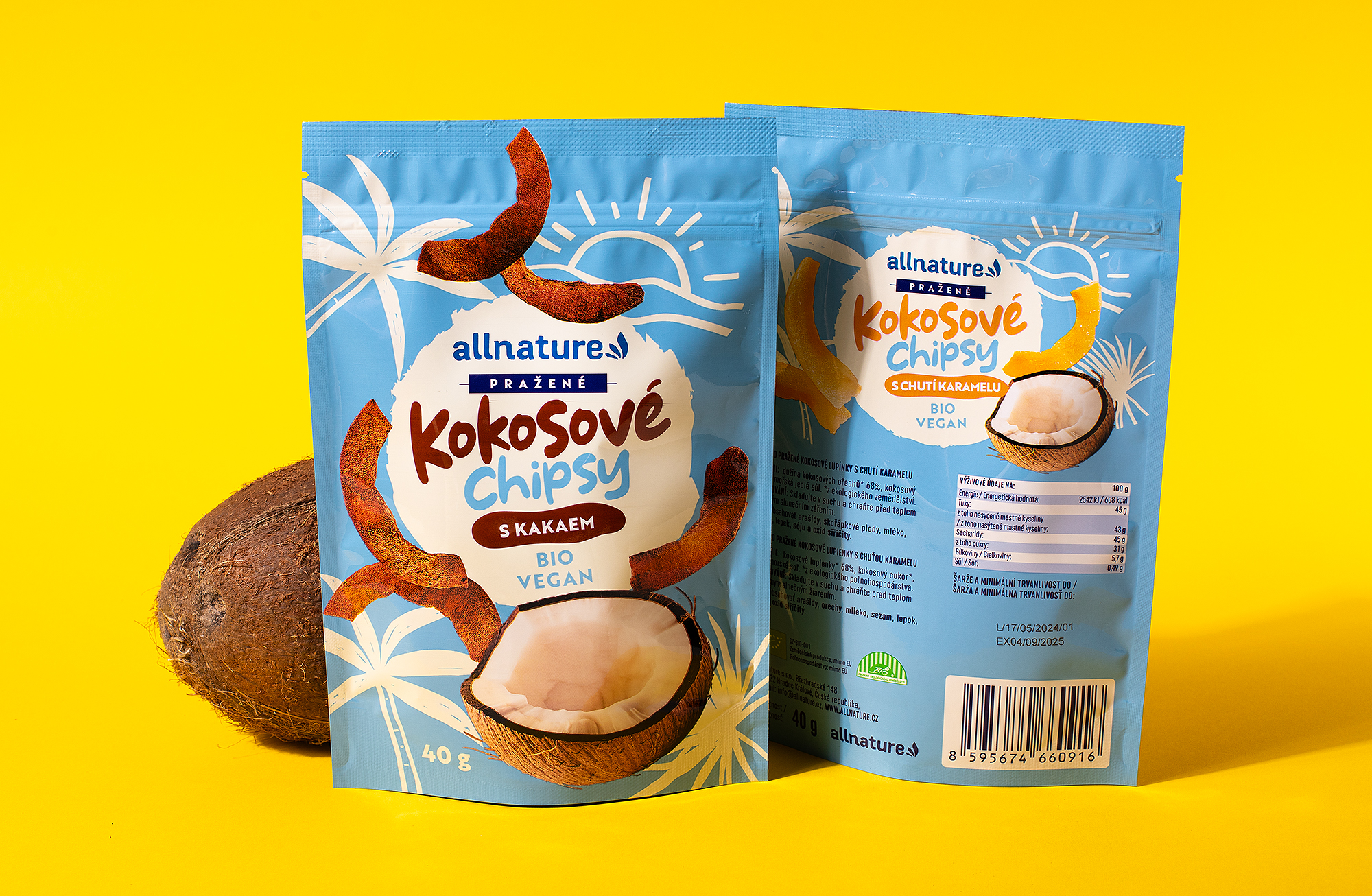
- Typography: We utilized stylized, irregular typography to convey a sense of natural imperfection, aligning with the brand’s emphasis on natural ingredients.
- Color Palette: A bright and modern color scheme was selected to make the products stand out on shelves and appeal to health-conscious consumers.
- Imagery: Appetizing food photography was incorporated to enhance the visual appeal and communicate the product’s benefits effectively.
Packaging Design Process and Adaptation
Understanding the diverse range of Allnature’s products, we adapted the packaging design to align with the overall brand concept while considering the technological possibilities of printing individual products. This involved close collaboration with printing partners to ensure that the design elements were accurately reproduced across various packaging formats.
Outcome
The result is a cohesive yet flexible packaging design that effectively communicates Allnature’s brand values. The playful typography and vibrant colors not only capture attention but also convey a sense of natural authenticity, aligning with consumer expectations for modern, healthy food products.
Through this project, we demonstrated how thoughtful design could enhance brand identity and product appeal, ultimately contributing to Allnature’s success in the competitive health food market.


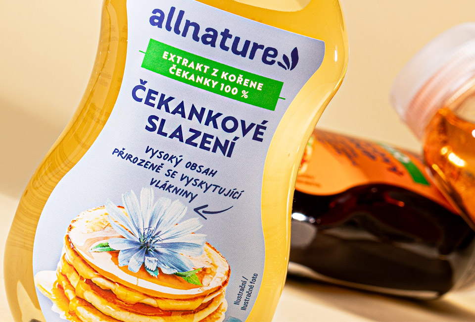
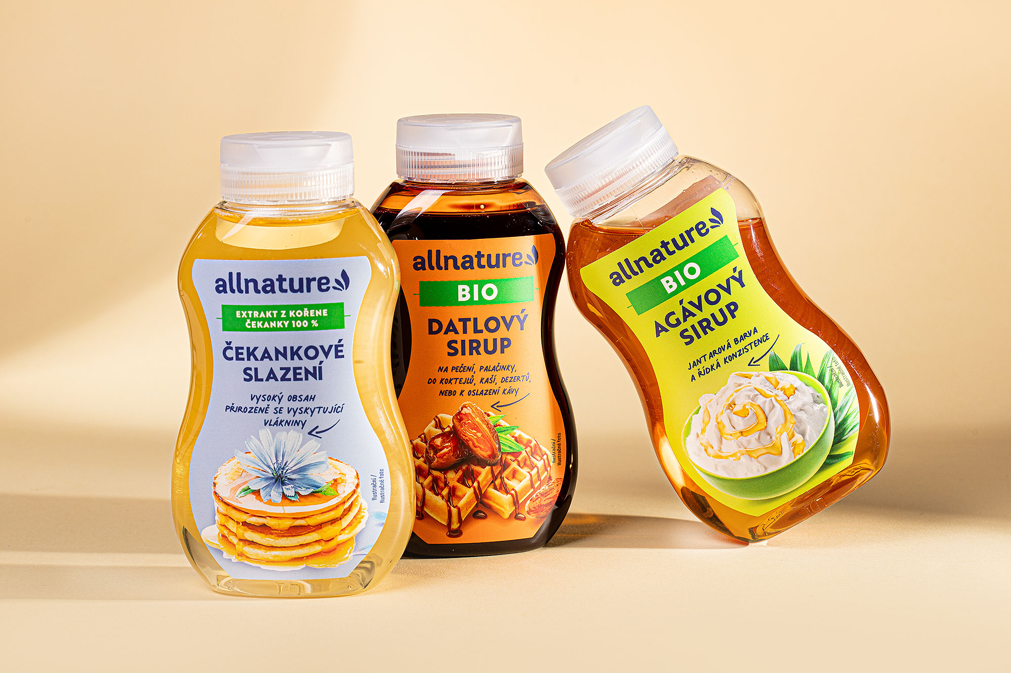
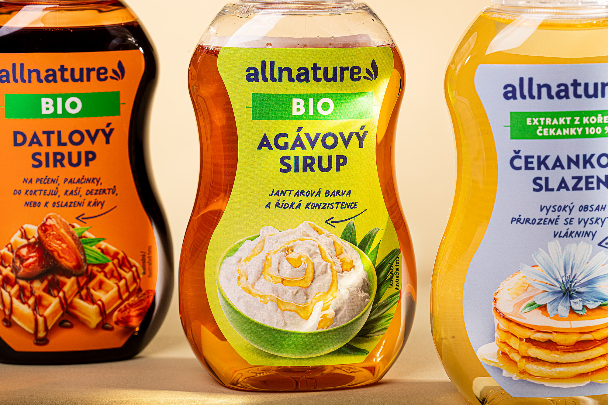
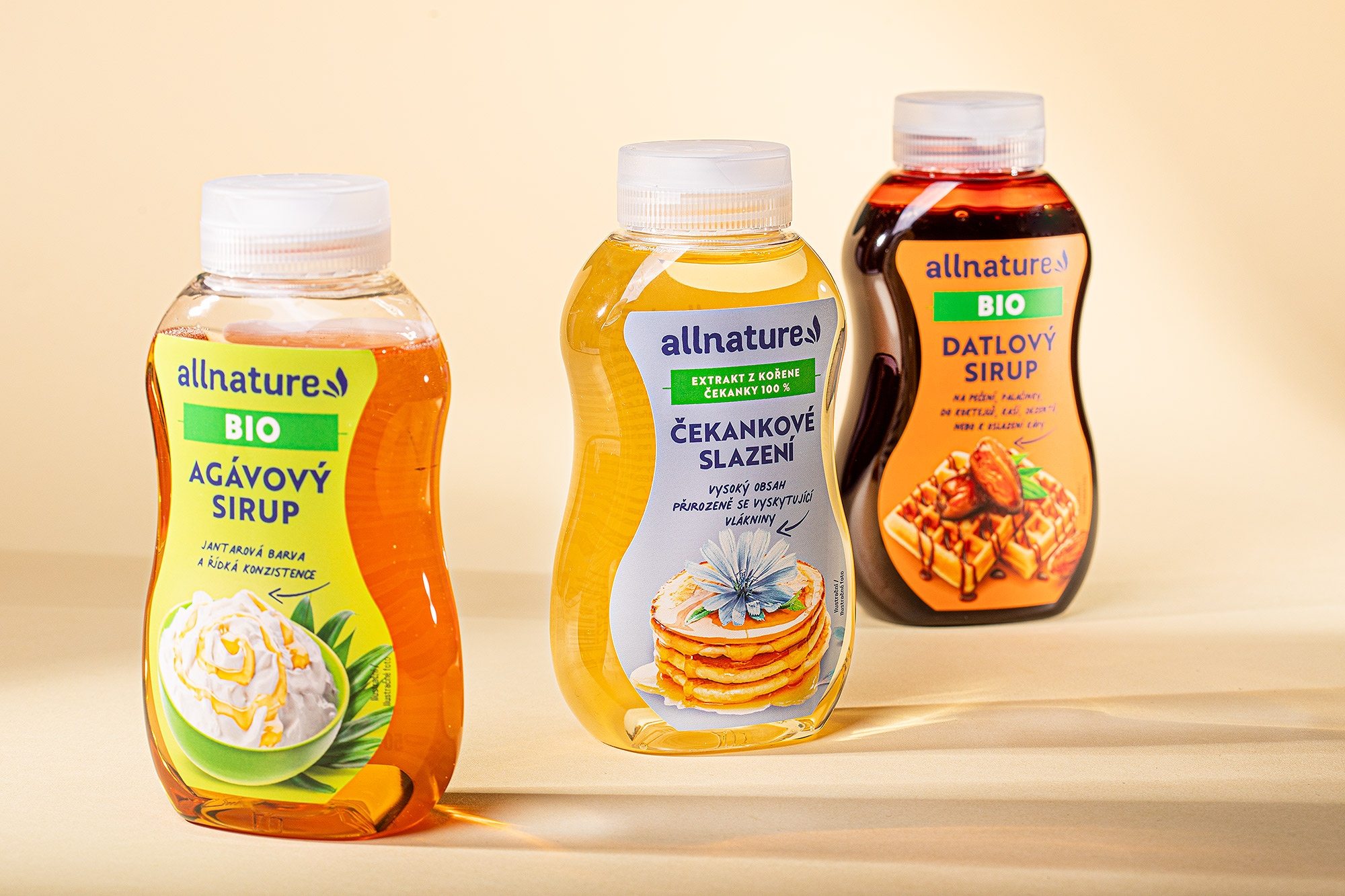
Packaging for organic chicory, date and agave syrup
#allnature #packaging #design #nutrition #health
Our goal was to connect the line of alternative sweeteners with the wide range of already existing products under the Allnature umbrella brand. The label design is clean and functional, bearing all the necessary information for the consumer. We chose a design that is clear and easy to understand.
Using alternative sweeteners is a rational choice, so we made sure that benefits are communicated clearly. Also, we wanted the product to feel and look tasty, so using a delicious food shot was a must. The bottle itself is plastic and transparent, with a practical dispenser.
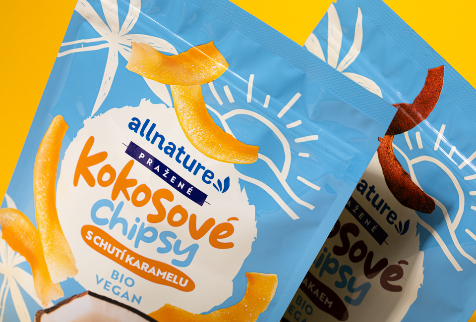
Packaging design of doypack for coconut chips
#doypack #packaging #design #chips #coconut
We designed a playful summer packaging design for coconut chips with cocoa and caramel flavour.