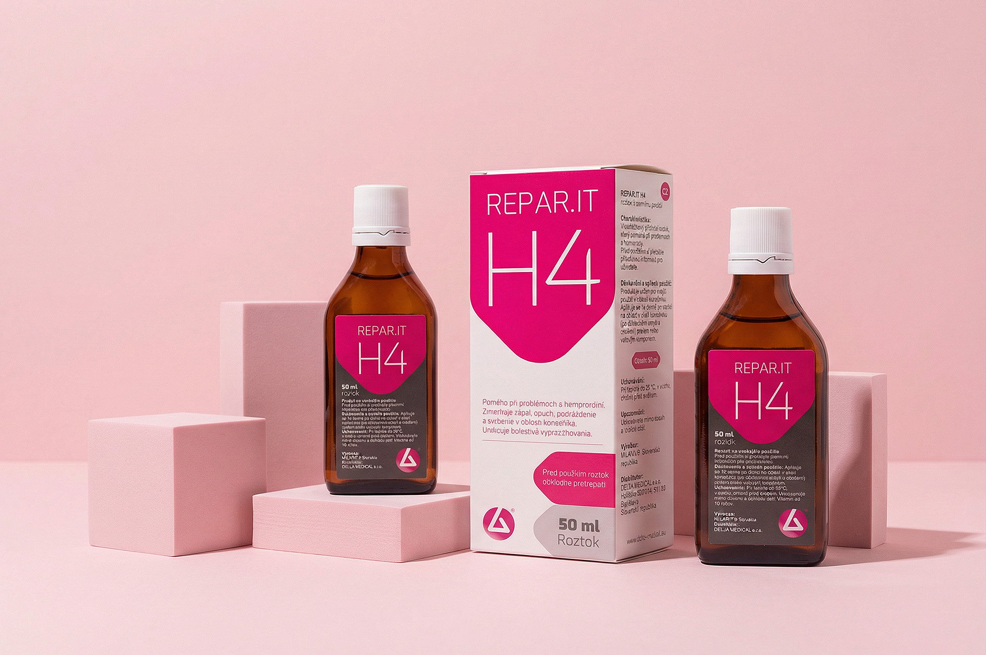
The packaging design for REPAR IT H4 brings together medical credibility and modern simplicity. A clean white base ensures clarity, while the bold magenta accent instantly creates recognition and energy on the shelf. The structured typography and balanced layout communicate precision, reliability, and professional purpose without feeling overly clinical.
The use of a strong geometric “shield” element behind the product name reinforces the idea of protection and active performance. Clear hierarchy guides the eye, making key product information easy to understand. Overall, the design stands out in the pharmaceutical environment while still fitting naturally into a trusted healthcare context.
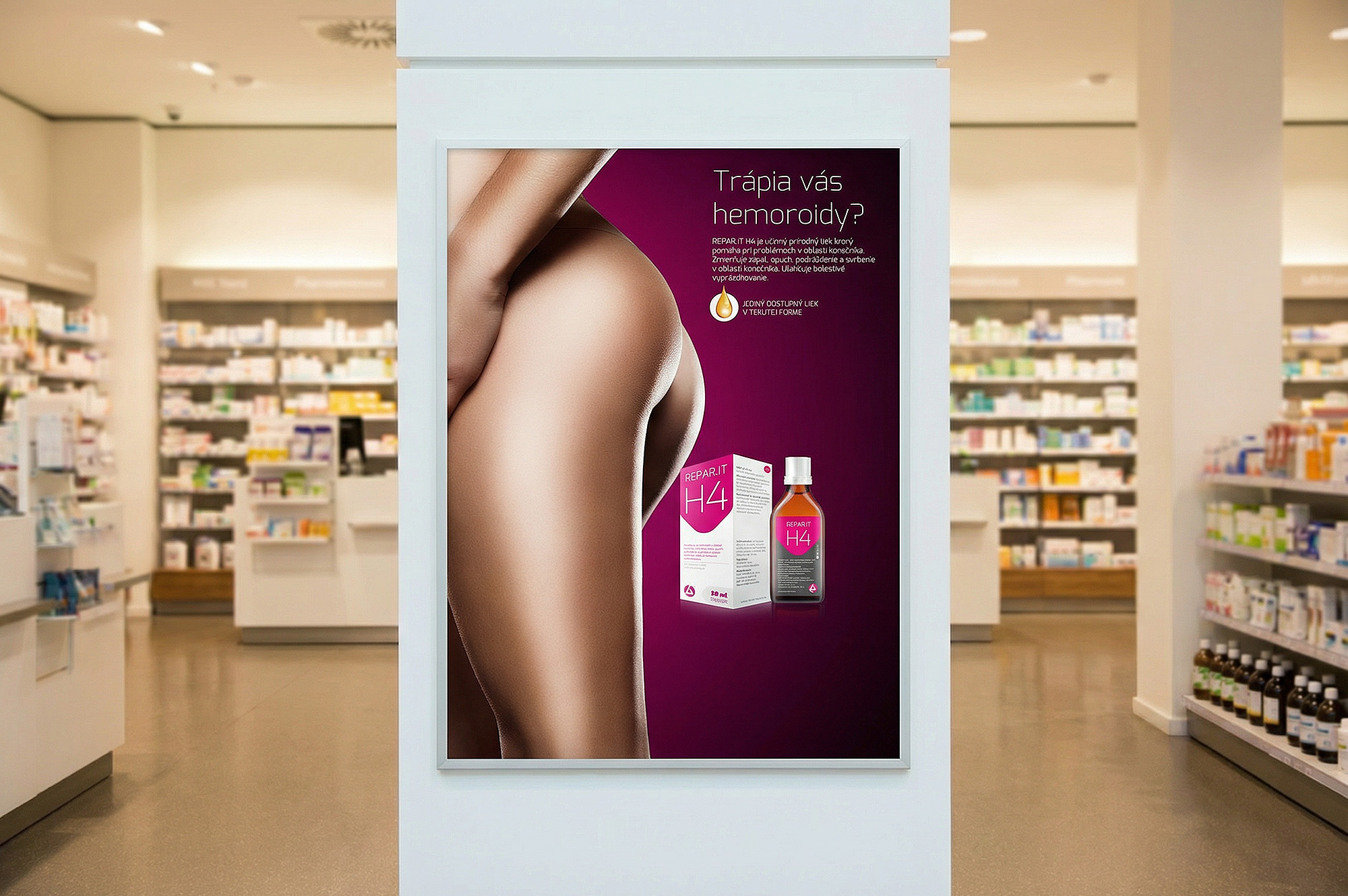
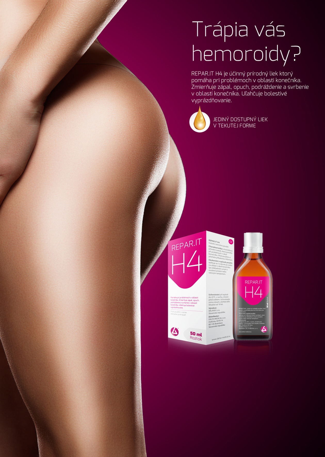
In advertising communication, the brand speaks with confidence and clarity: science-based, effective, and easy to trust. Visuals maintain the same clean white space and magenta signature for quick recall. Messaging is direct and empowering — focused on reassurance that the user is choosing a solution supported by research, not complicated claims.
Project name: Reparit.It H4 Pharmaceutical Product Design
Art Director: Martin Kuspal
Agency: MAISON D’IDÉE
Client: DELTA MEDICAL s.r.o.
Design year: 2014
Country: Slovakia