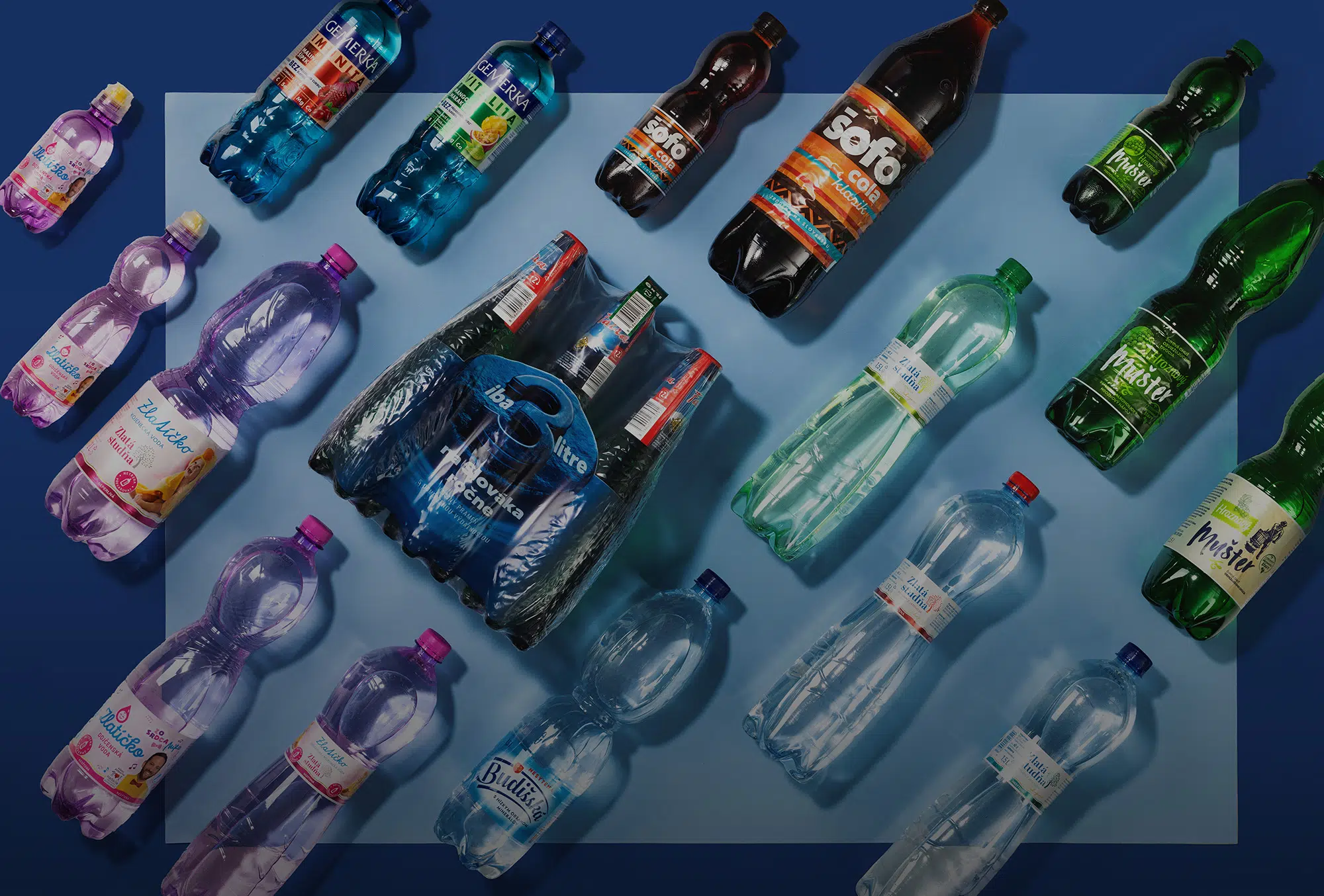

At our packaging design agency, we’ve had the privilege of collaborating with Budiš a.s. for many years, creating designs that define some of Slovakia’s most beloved beverage brands. From natural mineral waters to refreshing sodas, this long-term partnership has allowed us to refine our expertise in the beverages segment, both in Slovakia and beyond. In fact, thanks to products like Gemerka, our designs proudly travel across borders — finding success in the Czech Republicand making Slovak waters internationally recognized. Here’s a closer look at the visual identity behind each product from the image above:
Fatra 6-Pack Sleeve packaging design
For the Fatra 6-pack, we didn’t just create a sleeve — we designed a complete 3D graphics campaign key visual. The visuals were carefully tuned to match the technical constraints of printing, ensuring seamless color reproduction and precision. The result is a striking, shelf-ready pack that balances eye-catching branding with production efficiency, enhancing both visual impact and practicality for consumers.

Gemerka Imunita & Gemerka Vitalita packaging design, bottle shape and label graphics
Gemerka has become one of Slovakia’s most successful mineral waters — and a growing favorite in the Czech Republic — thanks to its excellent product recipe and taste, which we’ve complemented with distinctive packaging. We created two separate personalities for Gemerka Imunita and Gemerka Vitalita while maintaining a cohesive brand system. Vibrant color accents and fresh imagery communicate energy, wellness, and vitality. Beyond the label, we’re proud to have also designed the bottle shape itself, ensuring that Gemerka stands out both visually and ergonomically on the shelf.

Šofocola, emphasizing retro
Šofocola brings a nostalgic nod to traditional Slovak soda culture, so we designed a bold, retro-inspired label infused with playful energy. The rich, deep cola tones paired with vibrant orange highlights create a sense of indulgence, while the dynamic typography and diagonal striping lend the packaging a sense of motion. The result is a modern twist on a classic, helping Šofocola appeal to both loyal fans and a new generation of consumers.

Zlatá Studňa
For Zlatá Studňa, the challenge was to balance purity and elegance with everyday accessibility. We chose soft pastel tones, airy backgrounds, and clean typography to evoke freshness and naturalness. The flowing wave elements hint at the smoothness of the water, while subtle metallic highlights elevate the perception of quality. The resulting design resonates strongly with consumers seeking affordable, everyday hydration without compromising aesthetics.


Zlatičko kids water packaging design
Zlatičko targets families with young children, so the packaging needed to feel friendly, playful, and trustworthy. We leaned into soft pink and lilac color palettes, complemented by cheerful illustrations and rounded typography to create a sense of warmth and safety. The compact, ergonomic bottle design ensures easy handling for kids and parents alike, making Zlatičko a delightful addition to the Slovak children’s beverage segment.


Budišská water packaging design
Our design for Budišská celebrates tradition while embracing a clean, modern aesthetic. The typography communicates heritage and authenticity, while the transparent blue tones reflect purity and refreshment. We wanted to highlight the product’s premium mineral composition while maintaining a light, approachable personality, ensuring that it resonates equally with loyal local consumers and first-time buyers discovering the brand abroad.

Muster fizzy grapes summer packaging design
Muster represents a new generation of beverages for a younger, trend-aware audience. Packaged in a PET plastic bottle, the design embraces a modern craft-inspired aesthetic, using clean label layouts and distinctive typography to create a sense of authenticity. The deep green tones add character and visibility on the shelf, while the stripped-back, minimalist approach makes Muster instantly recognizable and appealing to consumers seeking something fresh and contemporary.


Our Expertise Behind the Labels and Packaging
What ties all these projects together is our deep understanding of the packaging design process, from creative strategyand visual storytelling to the technical preparation of print data. Working closely with Budiš a.s., we’ve mastered the nuances of working with different substrates, bottle shapes, and printing technologies, ensuring flawless execution on every project. This experience allows us to create packaging that not only looks beautiful but performs perfectly in production and in the market.


