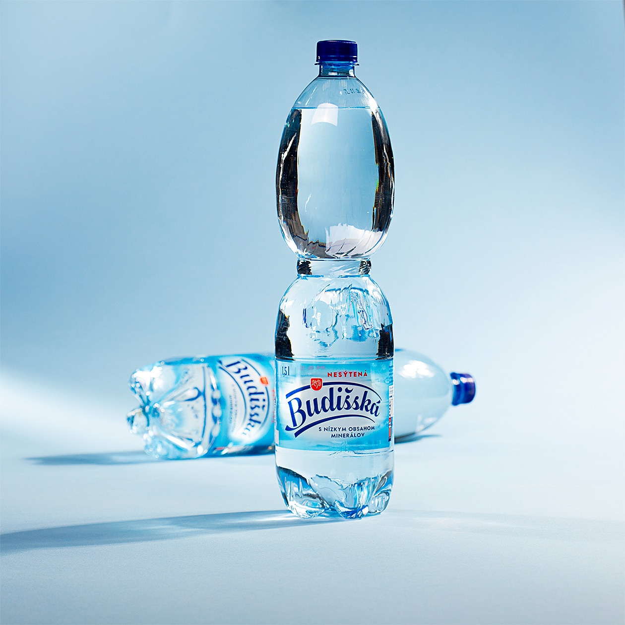
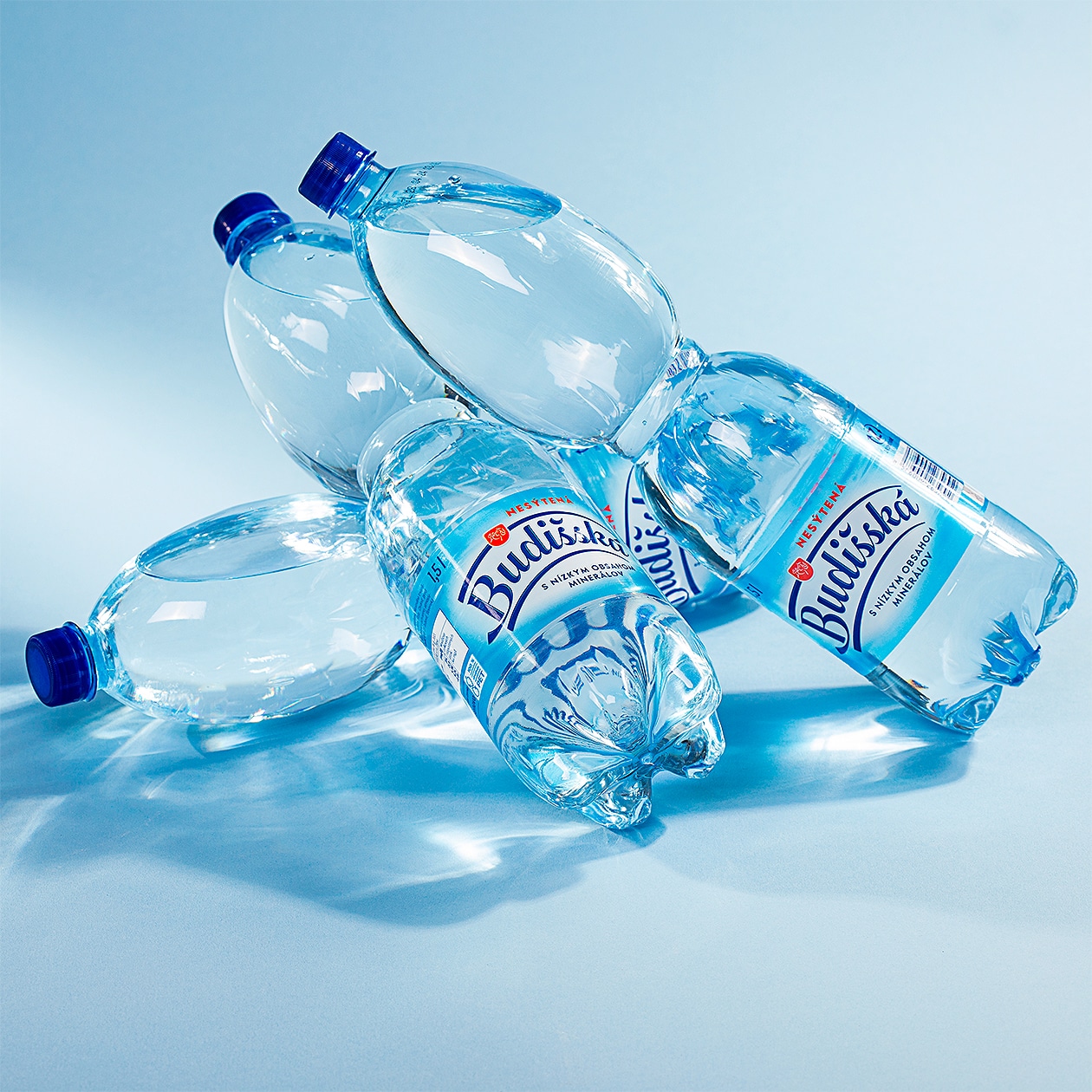
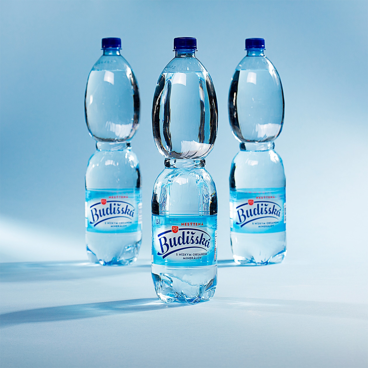
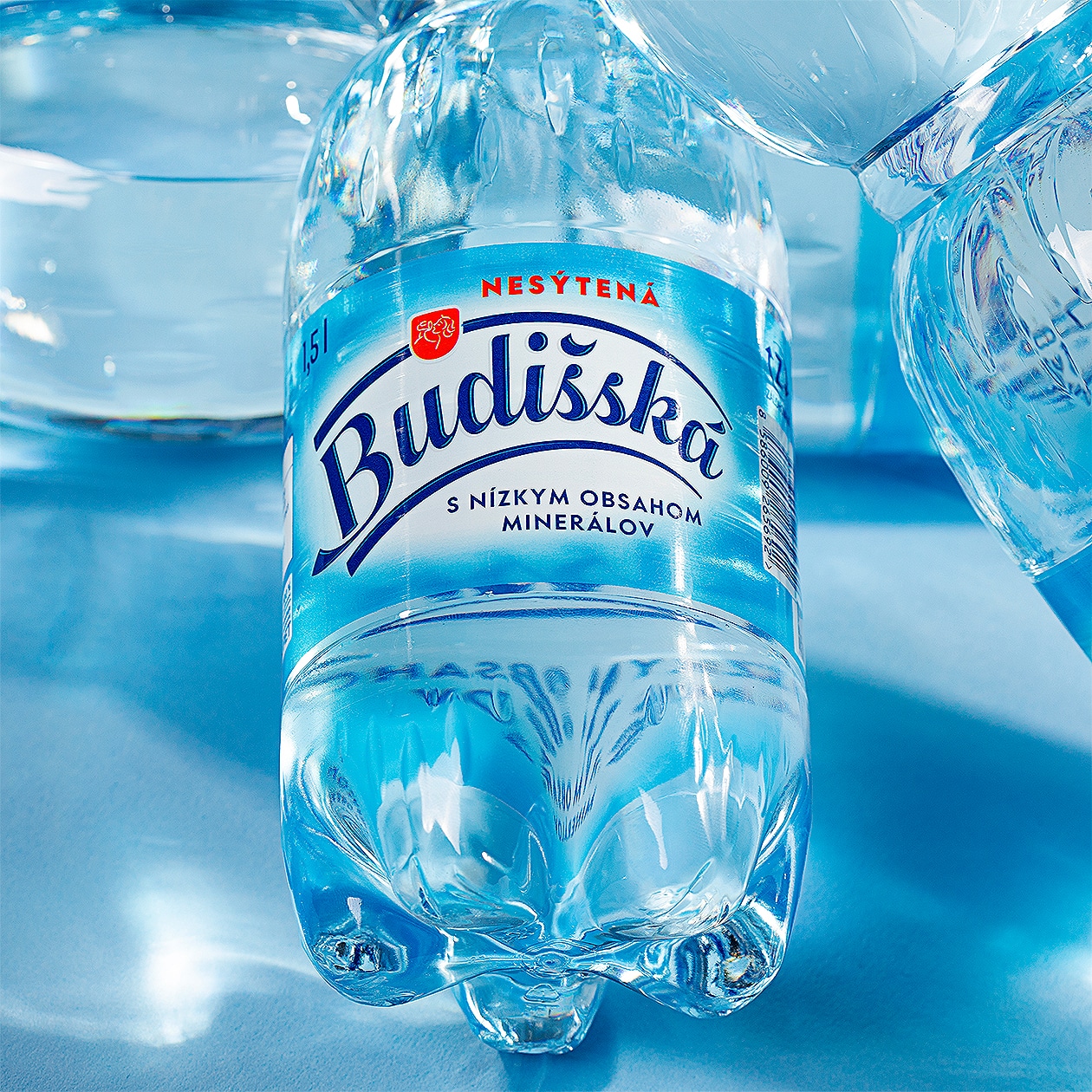
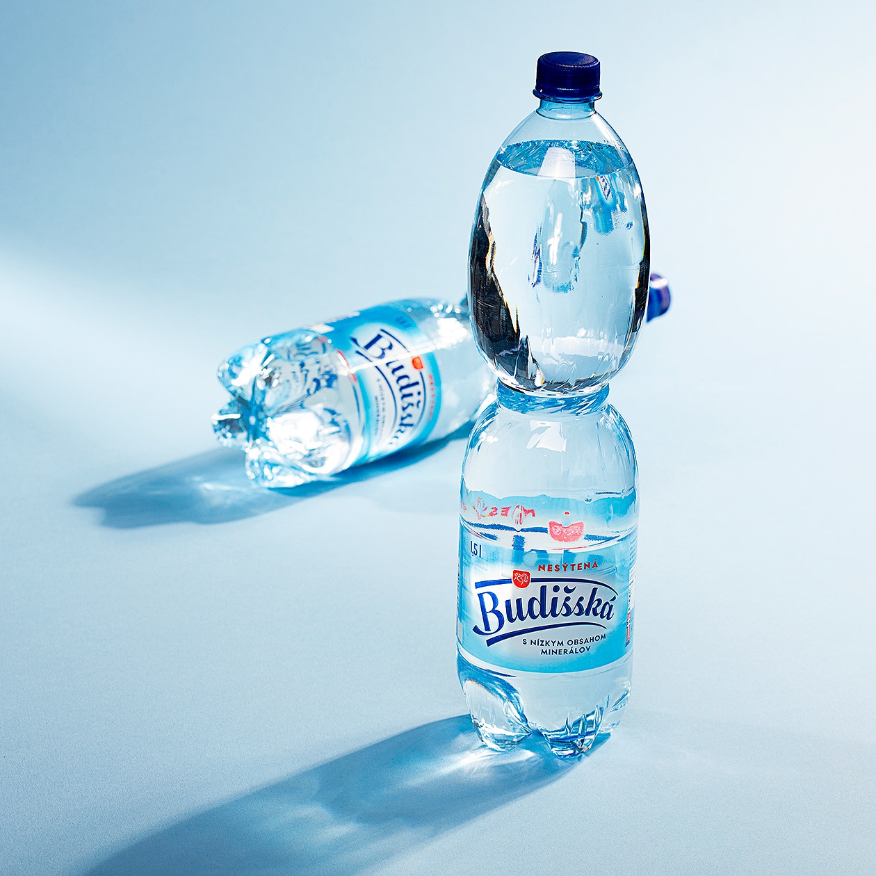
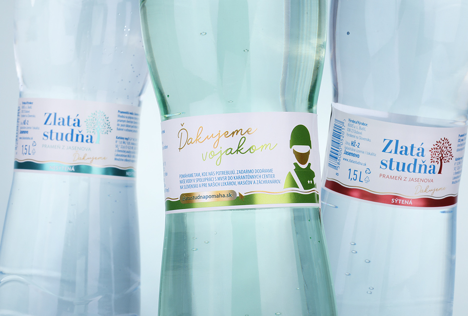
Budišská is one of the purest spring waters from the Jasenov valley in Slovakia. Our agency was given the task to create a facelift of the packaging design. Since it is an established brand, we took an evolutionary approach and approached the label change as a facelift.
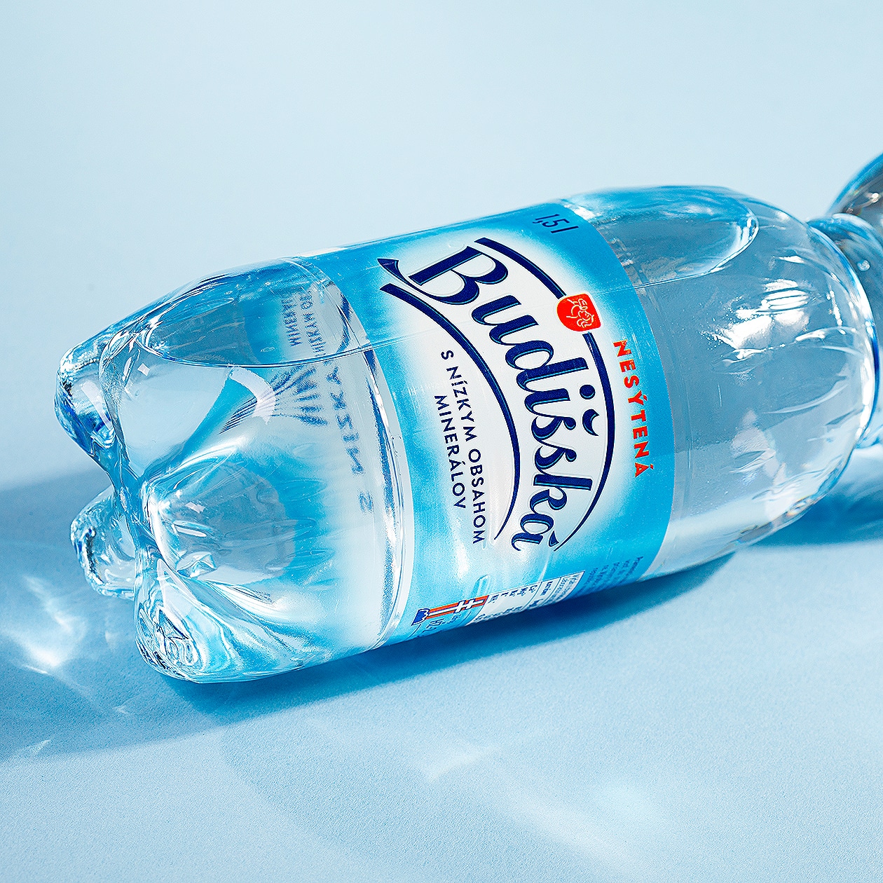
The aim of the redesign of the graphic elements on the front of the packaging was to simplify the graphics overall.
We decided to play with transparency in the background, where a radial white gradient serves as a backdrop for the logo, making the brand name legible on the shelves. This prevents it from being unwantedly associated with the bottle itself. The white gradient gradually transitions to an azure blue colour that is free of underprint, effectively colouring the otherwise transparent water.