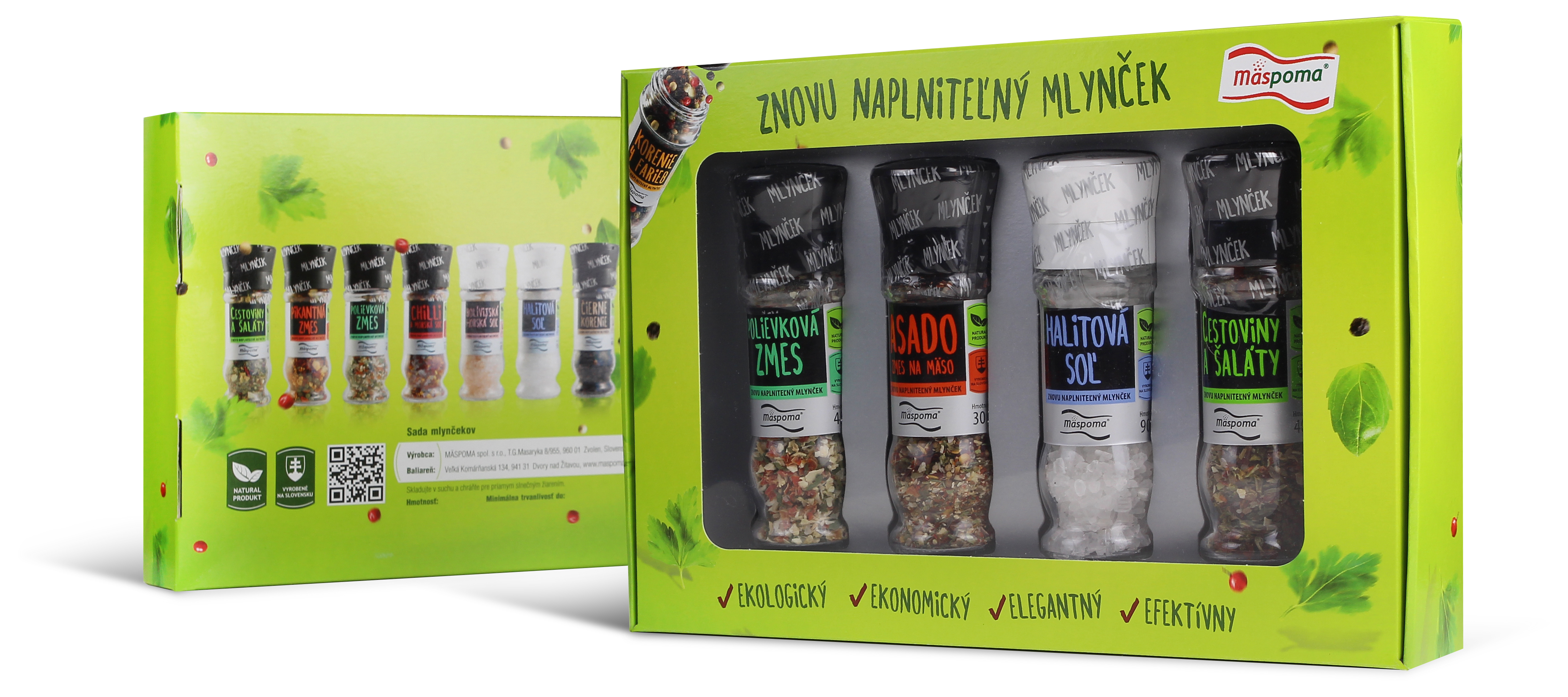
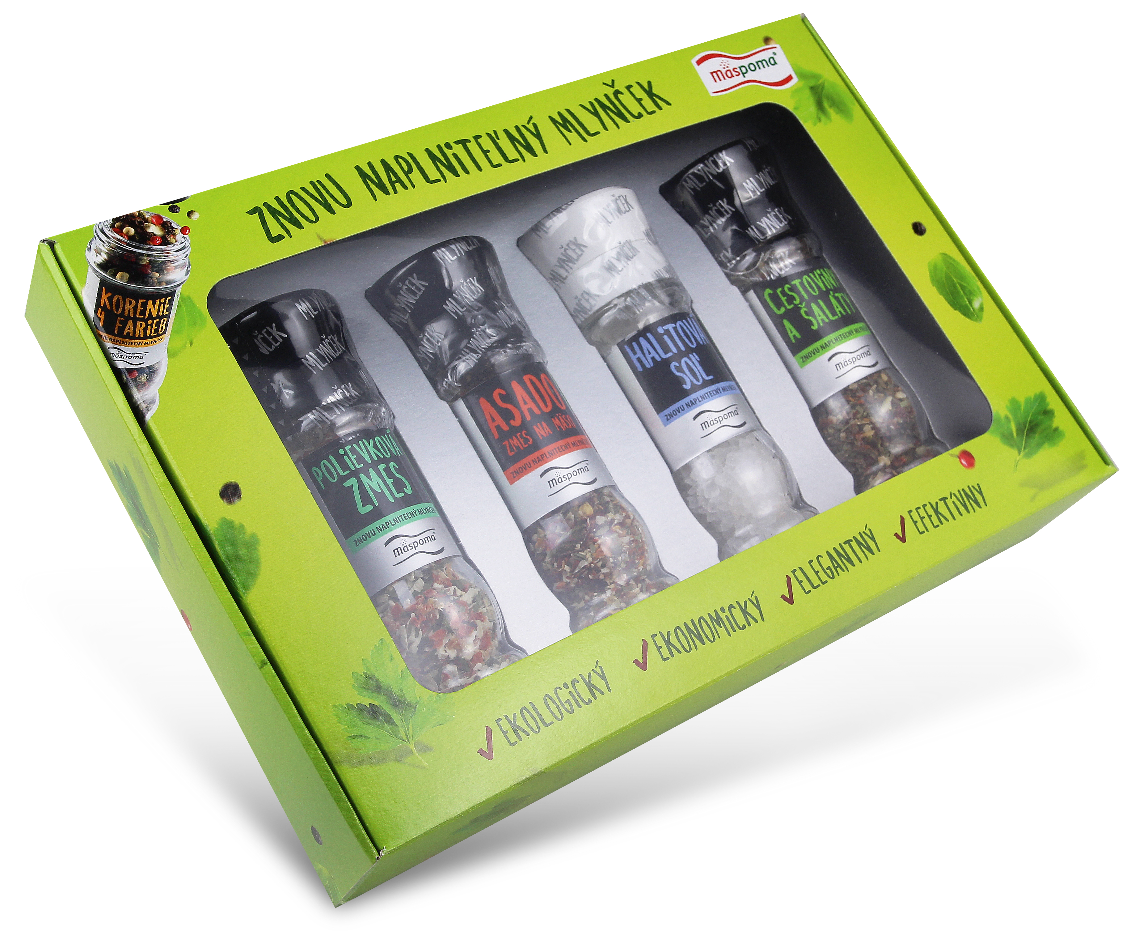
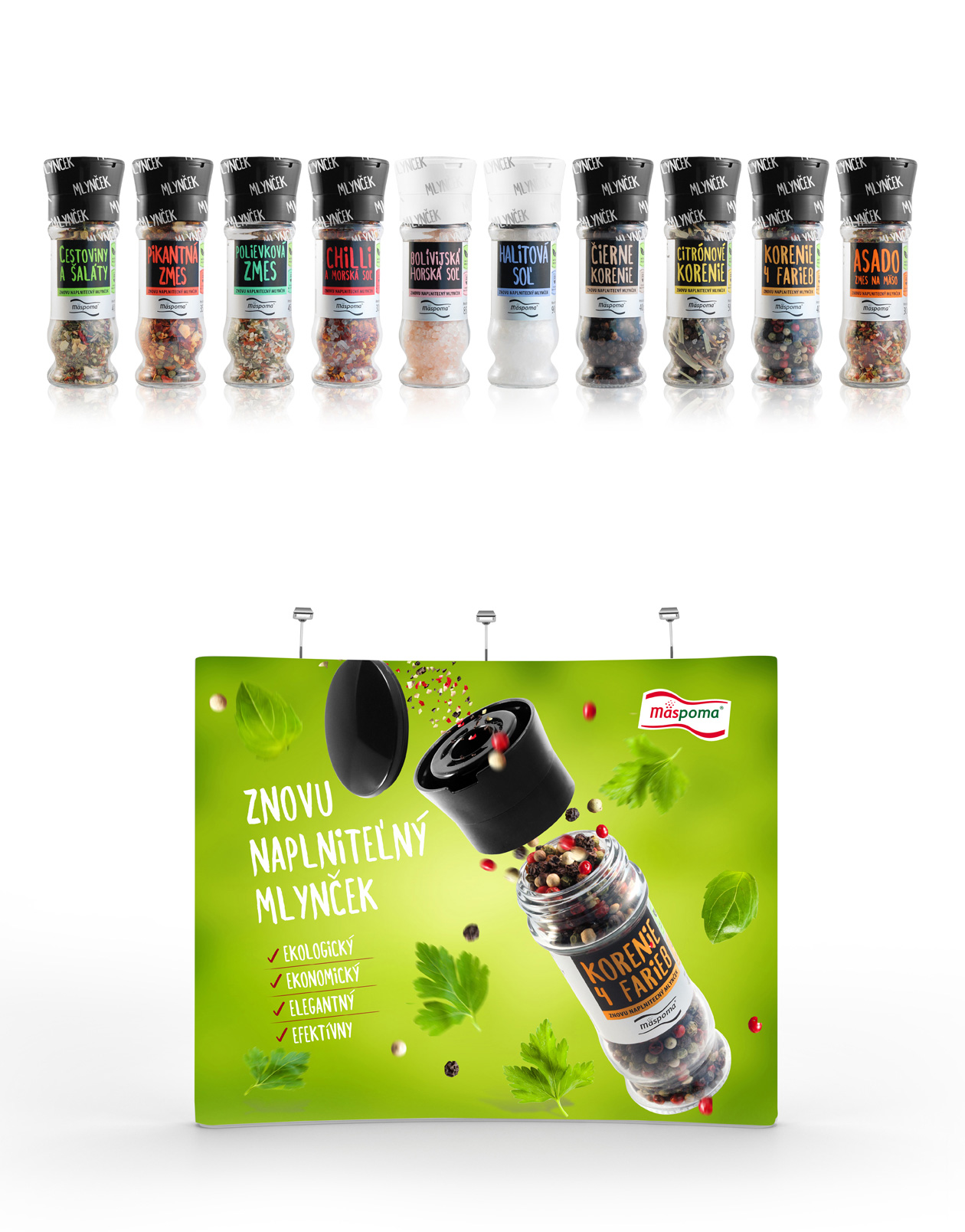
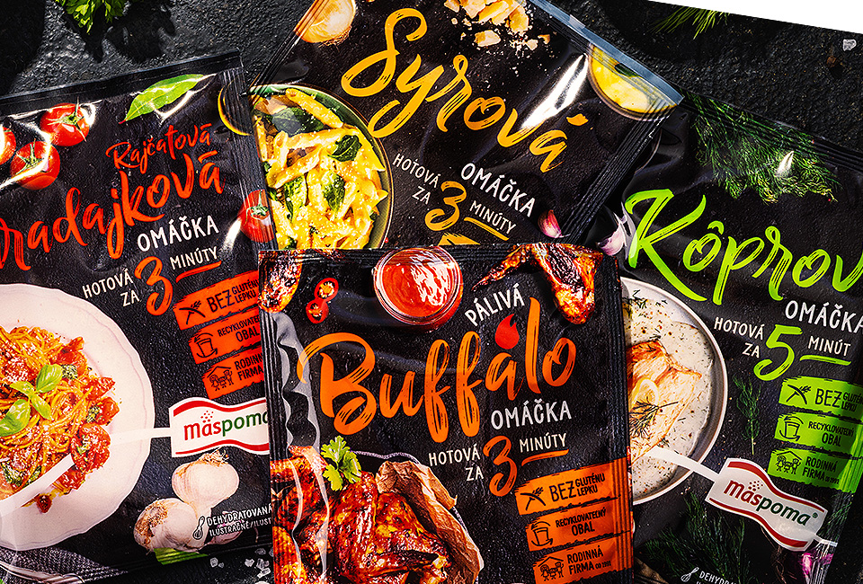
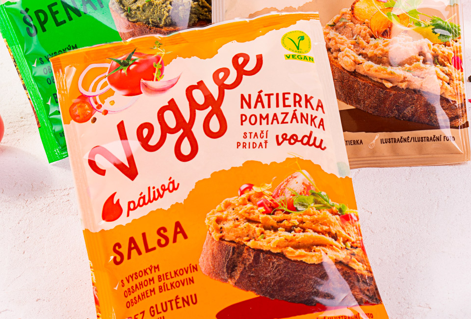
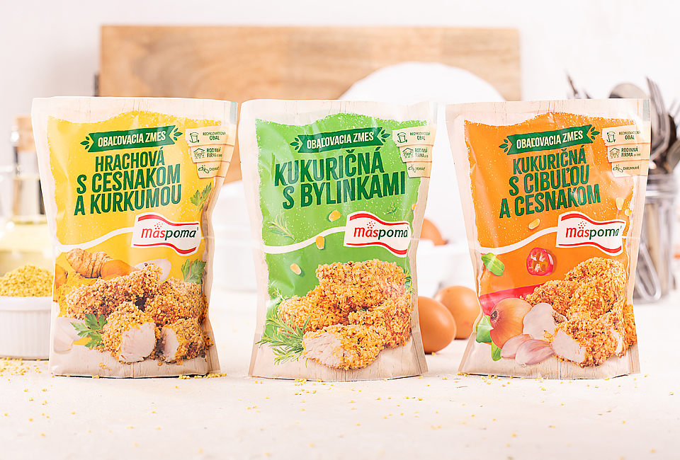
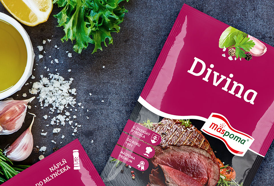
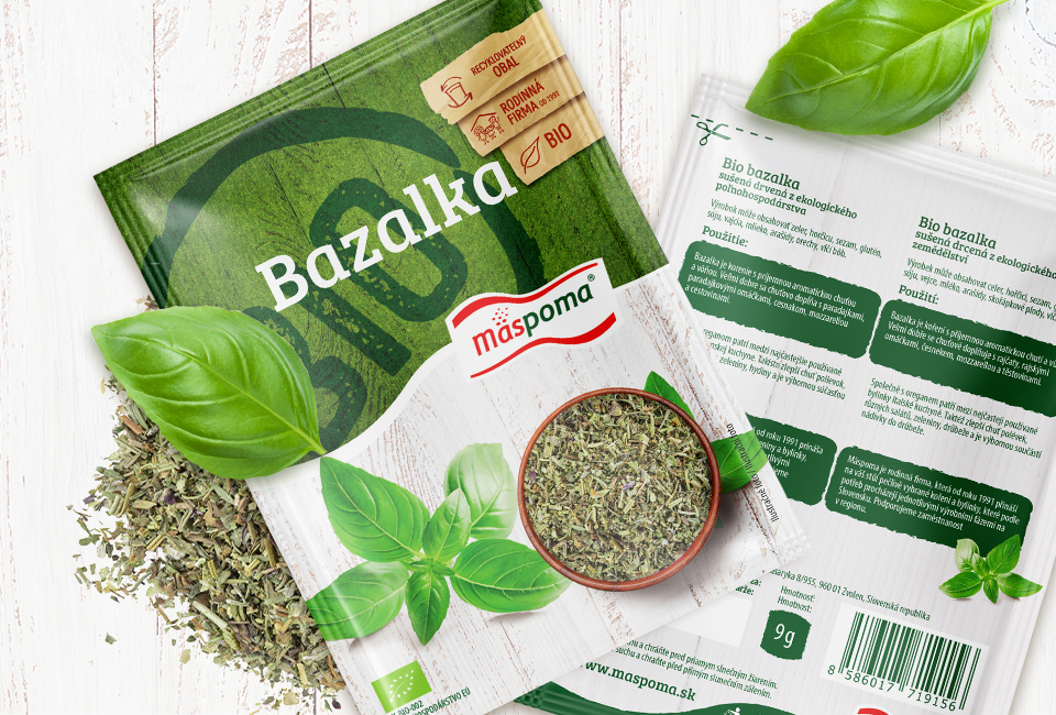
The packaging design for Mäspoma spices was developed to bring strong visibility and clarity to a very crowded retail category. We worked with a clean structural system, clear typography, and color-coding that naturally organizes the large assortment of variants. The transparent window and matte finish allow the product to feel honest and high-quality, while the consistent layout ensures the brand remains instantly recognizable across all flavors. This approach has proven long-lasting: the design has been in continuous use and is still performing successfully in retail in 2025, selling steadily without the need for constant redesigns.
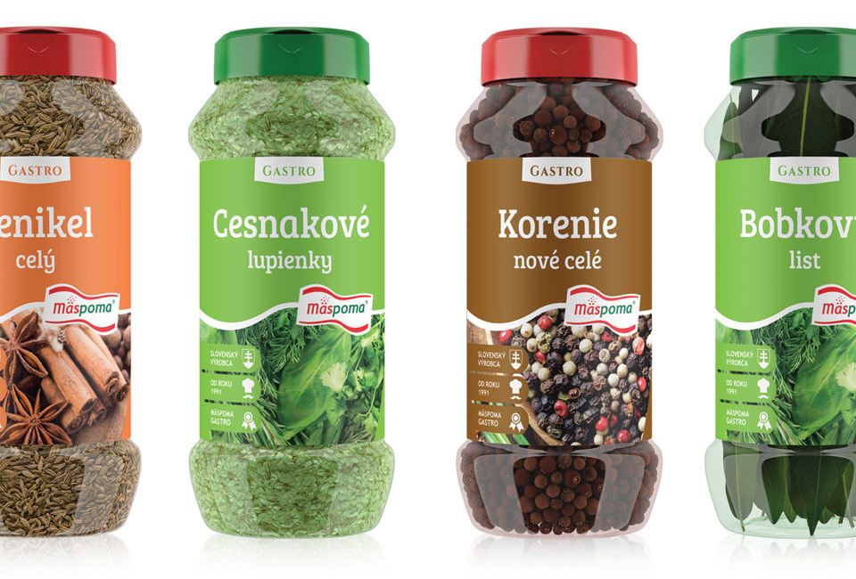
A key reason for its longevity is how well the packaging system scales. The structure supports new flavor introductions and seasonal editions without visual confusion. It maintains a strong brand presence whether displayed individually or in multi-SKU blocks on shelf. The balance of product visibility and brand identity has allowed the packaging to remain fresh and relevant, even as consumer expectations and category trends evolve.
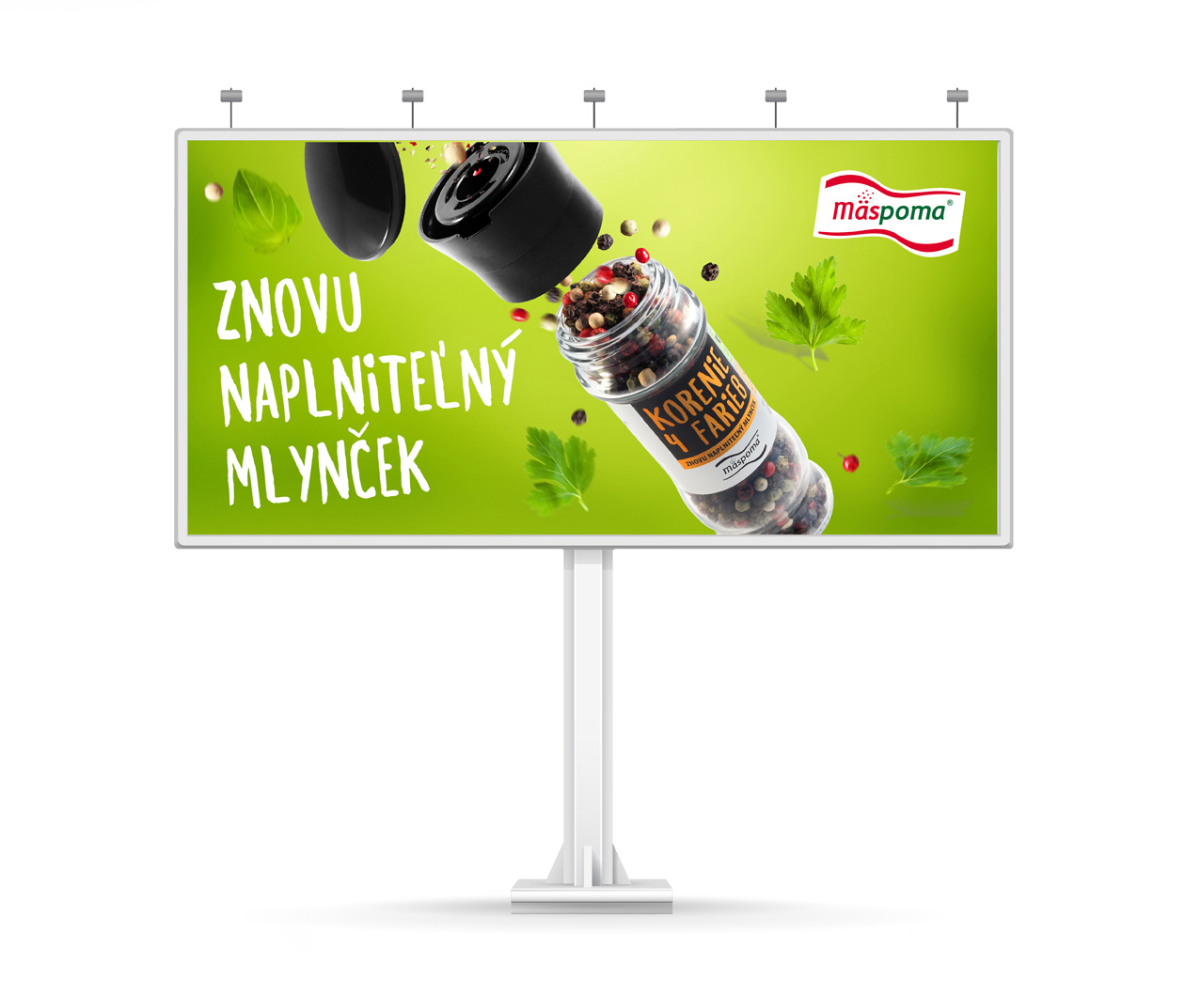
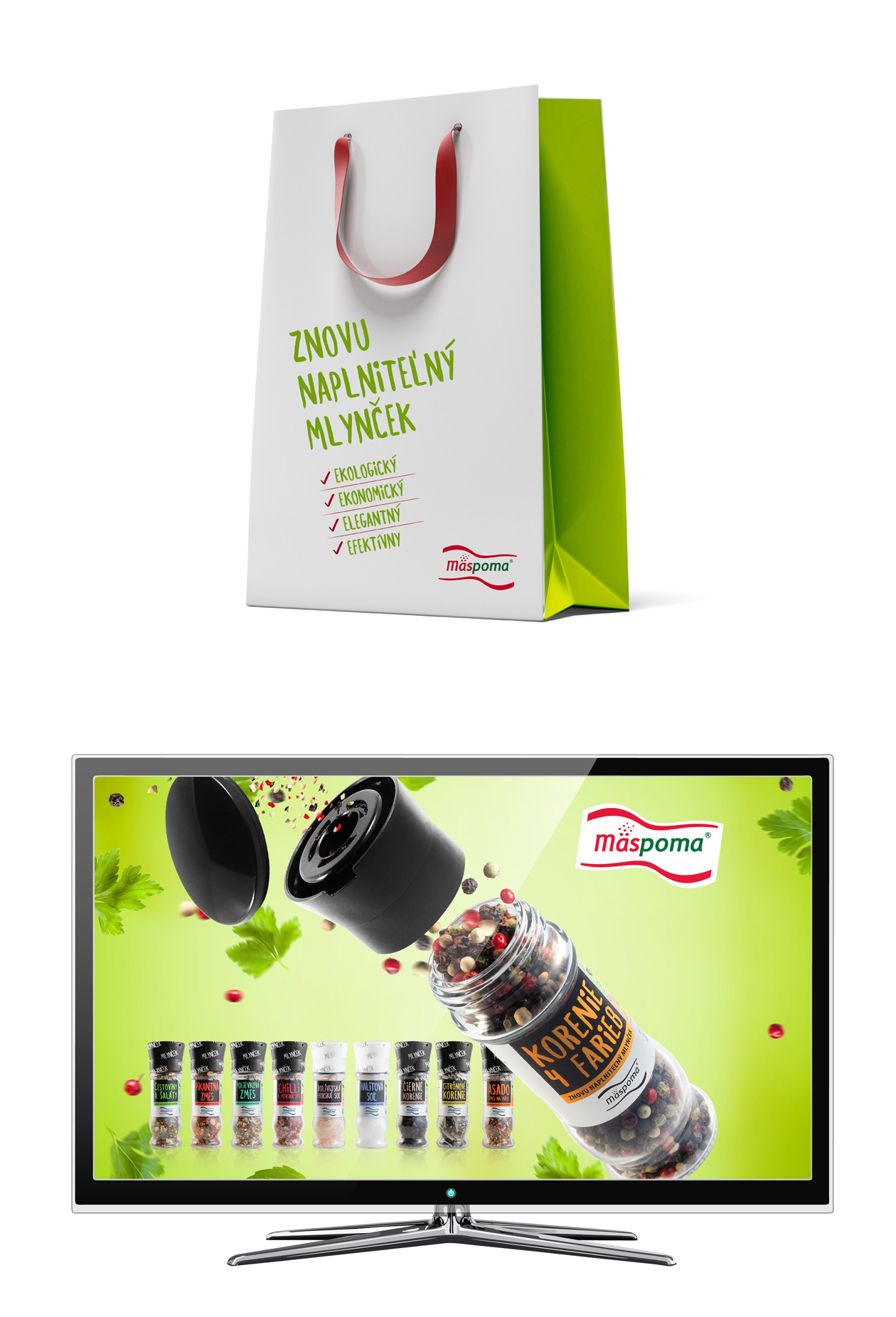
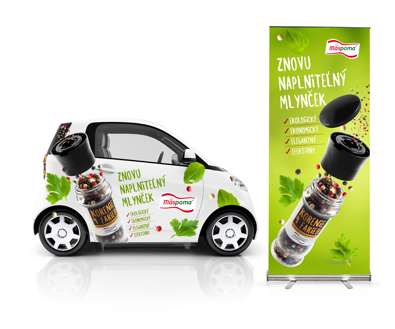
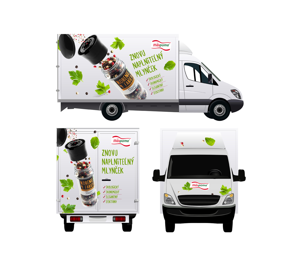
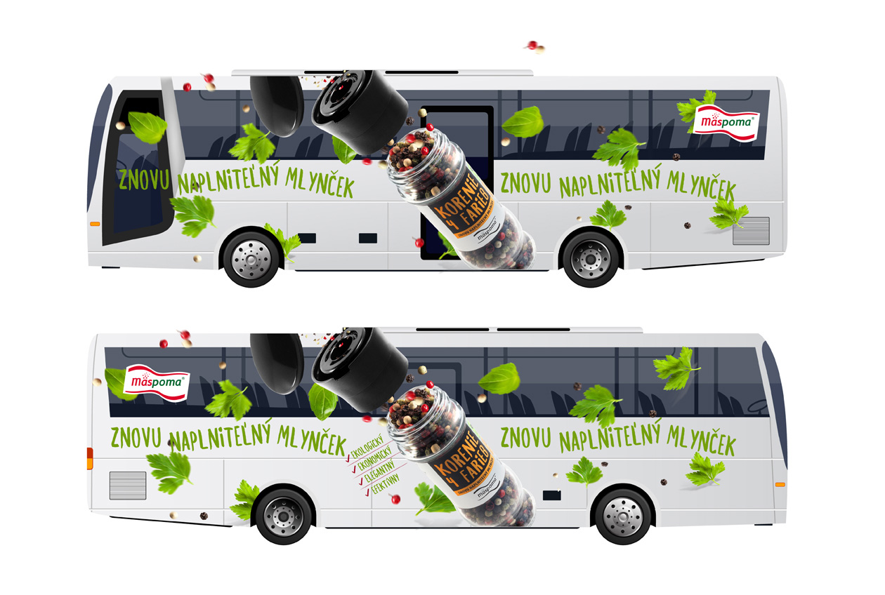
Alongside the packaging, we developed a key visual that carries the brand story into in-store communication and promotional materials. This visual language extends naturally onto POS elements such as shelf strips, wobblers, display units, and promotional banners. By keeping typography, ingredient imagery, and color accents consistent, the POS communication feels like a direct continuation of the packaging itself. This integrated approach has helped maintain strong brand recognition and ensured that the product communicates clearly and confidently at every point of the shopping journey.