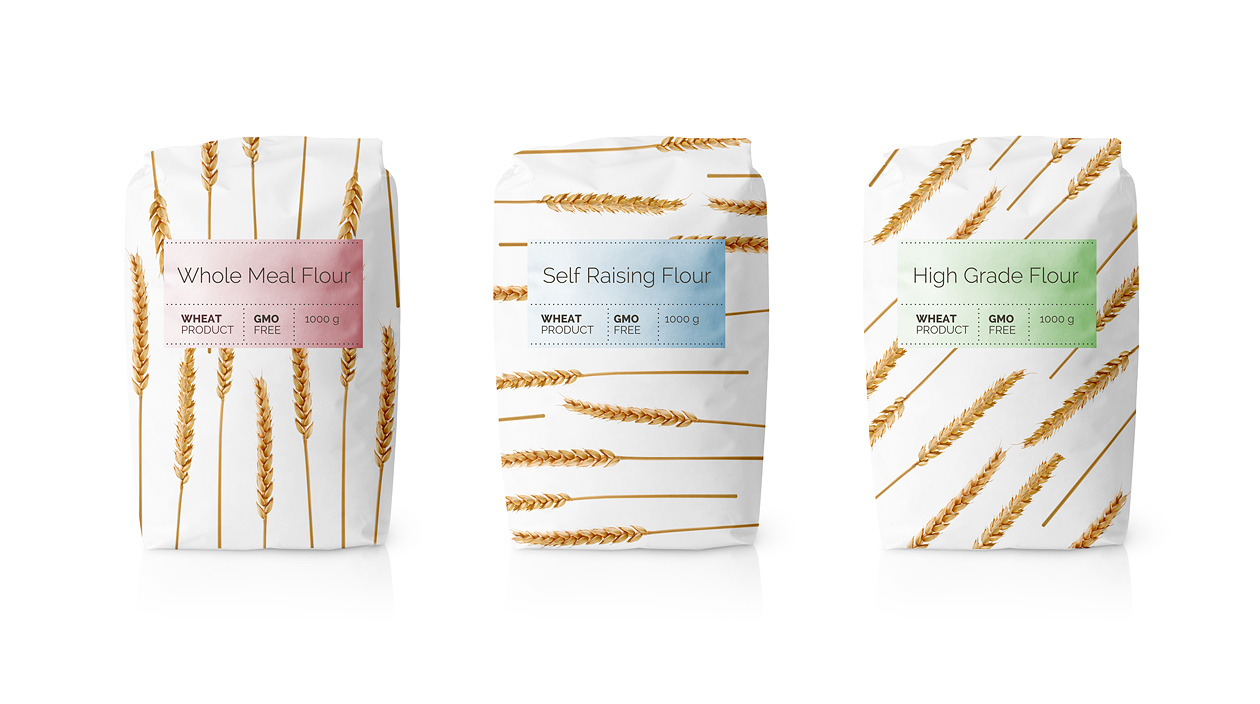
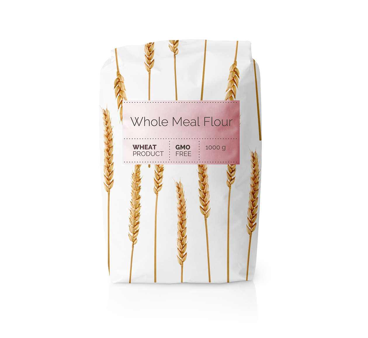
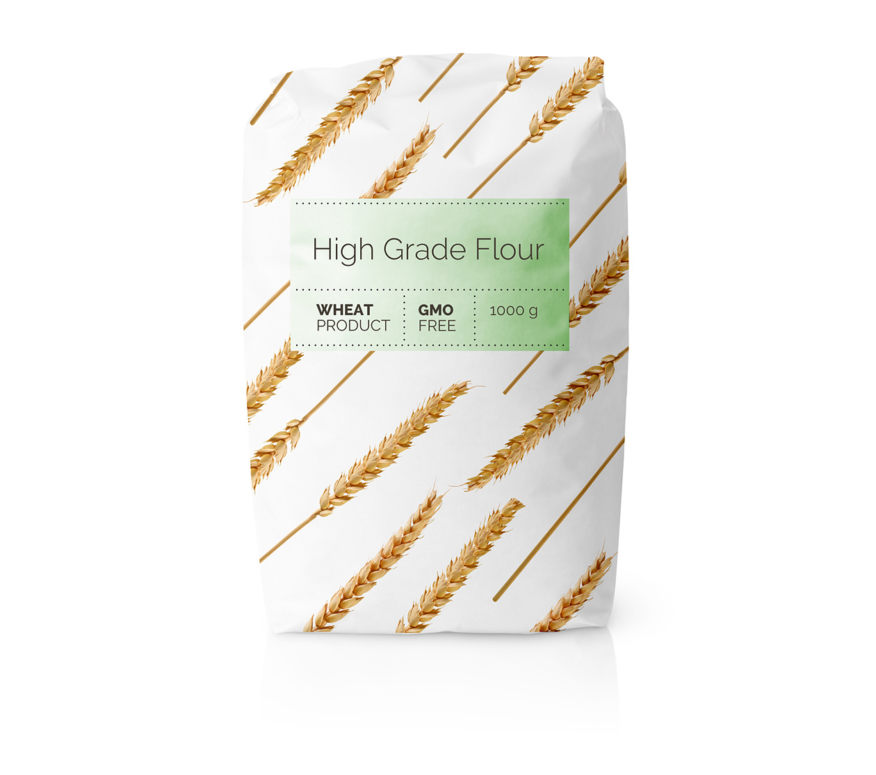
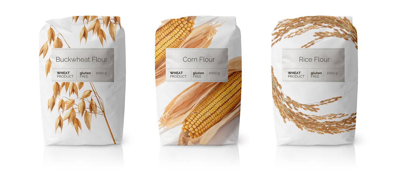
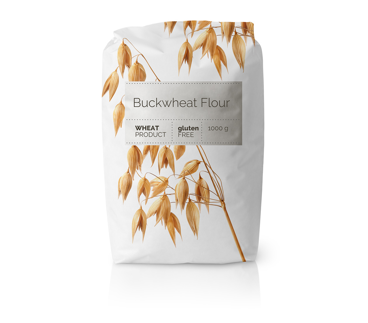
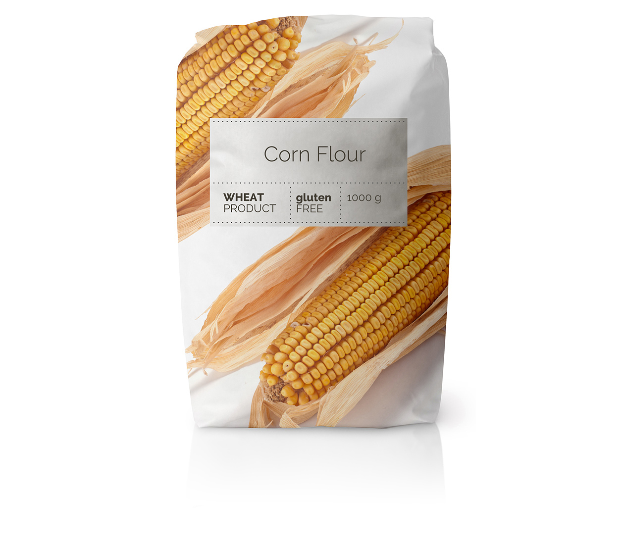
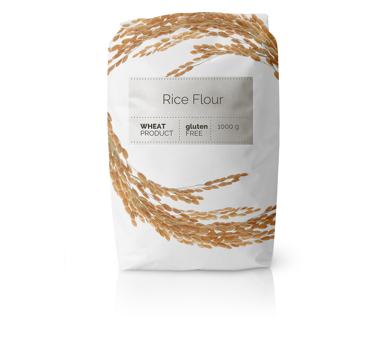
This packaging design uses a clean, minimalist style built around strong geometry and visual balance. The layout is carefully structured so that text, icons, and spacing feel calm and precise — nothing is random. Each flour variety is represented using simple, symmetrical graphic shapes inspired by the product’s origin or use. These small geometric elements act as visual “signatures,” making the design feel both modern and meaningful. Light backgrounds and subtle color accents keep everything visually clean, while the repetition of form across the series creates a sense of harmony and consistency.
The design also highlights the ingredients in a quiet but confident way. Instead of large photos or loud messaging, the purity of the ingredients is expressed through clarity, order, and refined simplicity. The geometric symbols help communicate what each flour is made from — whether grains, seeds, or nuts — in an elegant, minimal form. This approach suggests that the product is natural, honest, and thoughtfully crafted. The result is packaging that feels contemporary and pure, where simplicity is not emptiness but a clear, intentional expression of quality.