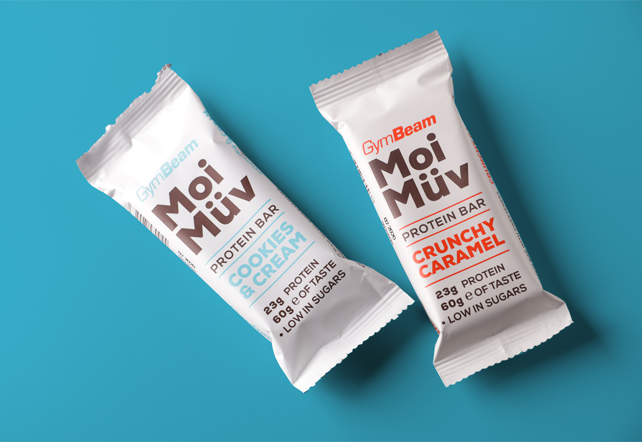
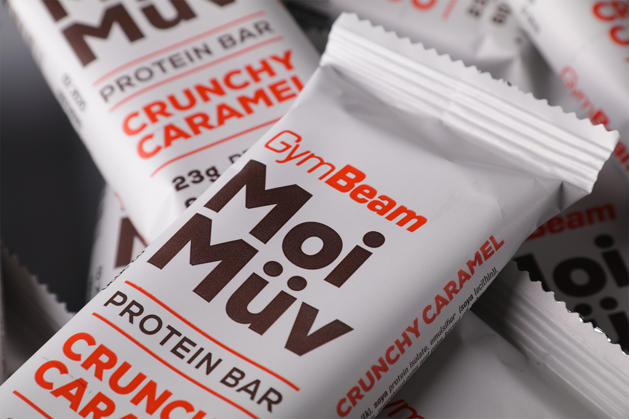
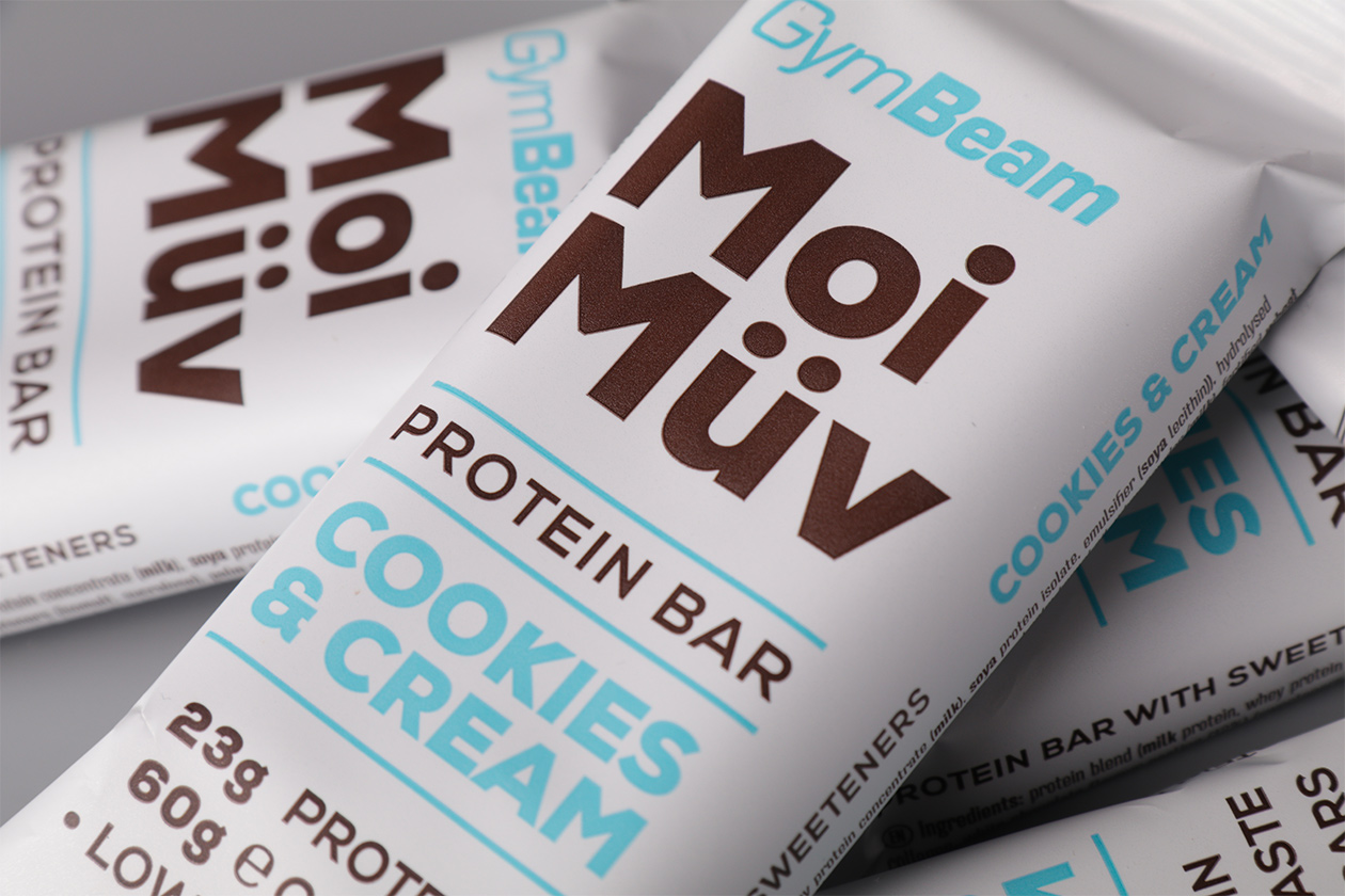
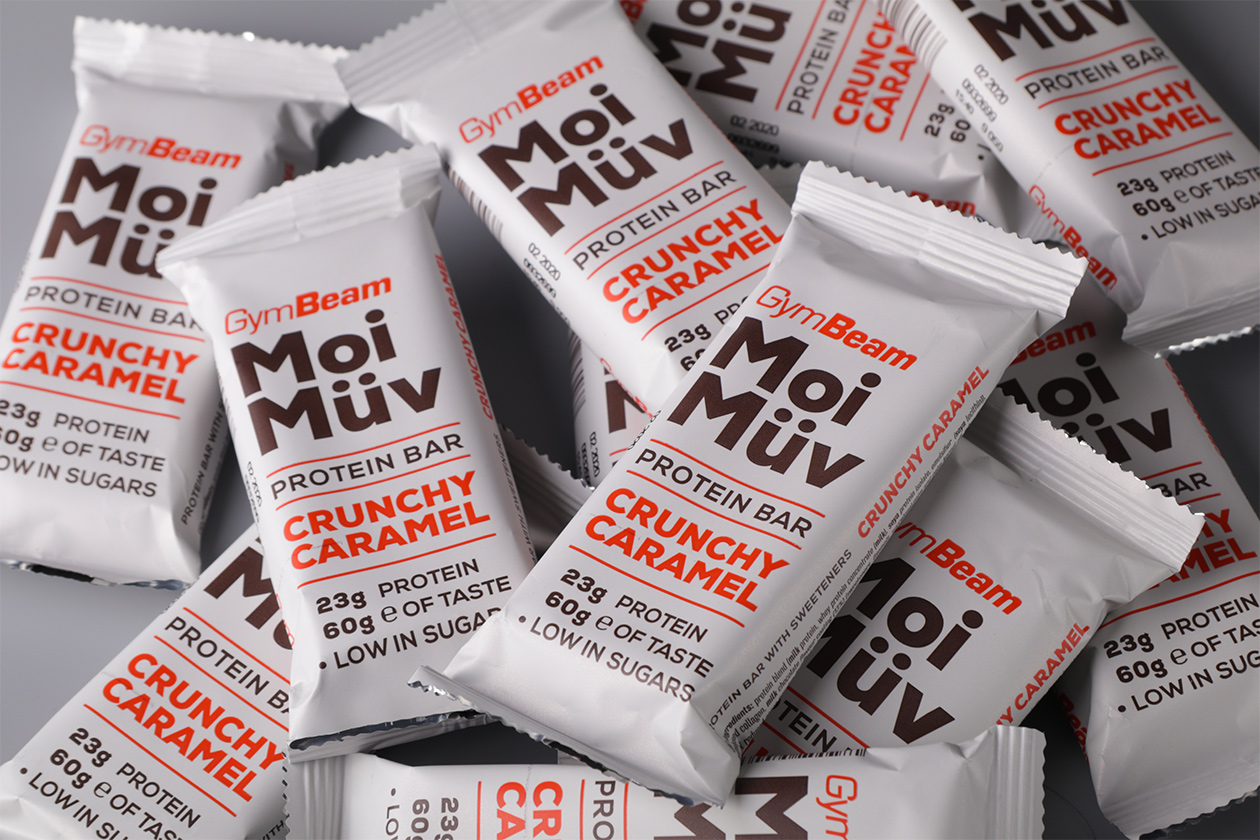
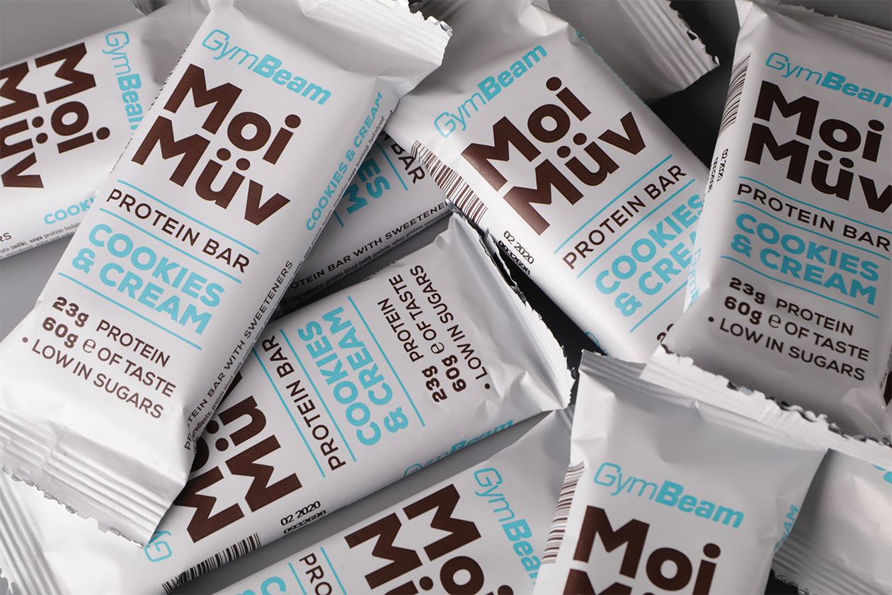
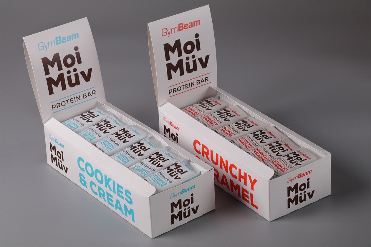
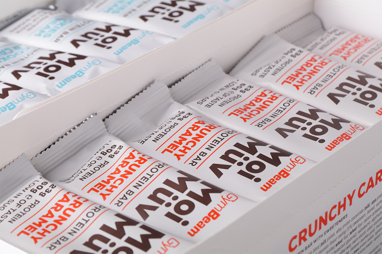
Our packaging design of protein bars comes out of clearly typographic composition and the minimal amount of graphic elements. The important part of every packaging is color coding. We have sensitively chosen the combination of blue and brown on the cookie flavor and the orange and brown in case of caramel.
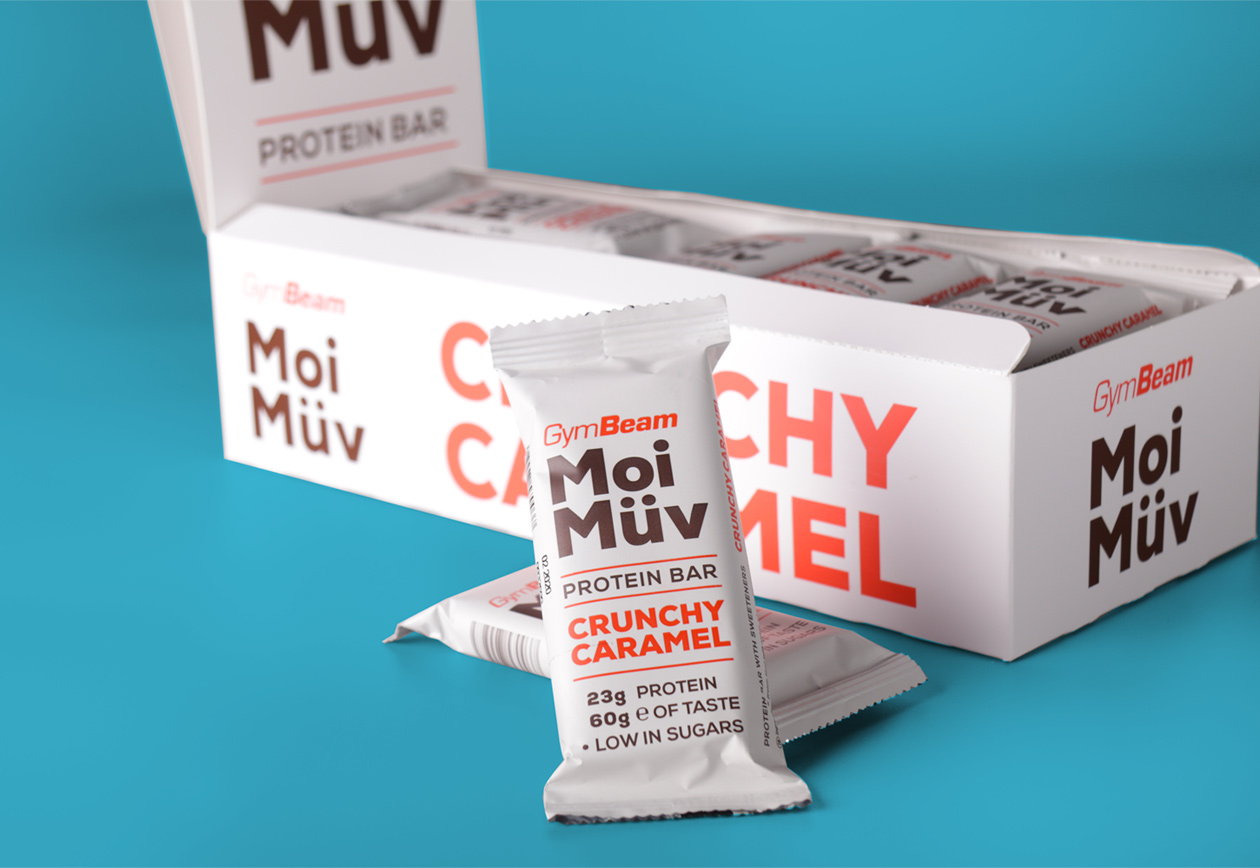
Minimalistic approach works perfectly, because the packages fit beautifuly in the product line of the producer. These are suited primarily for e-shop.
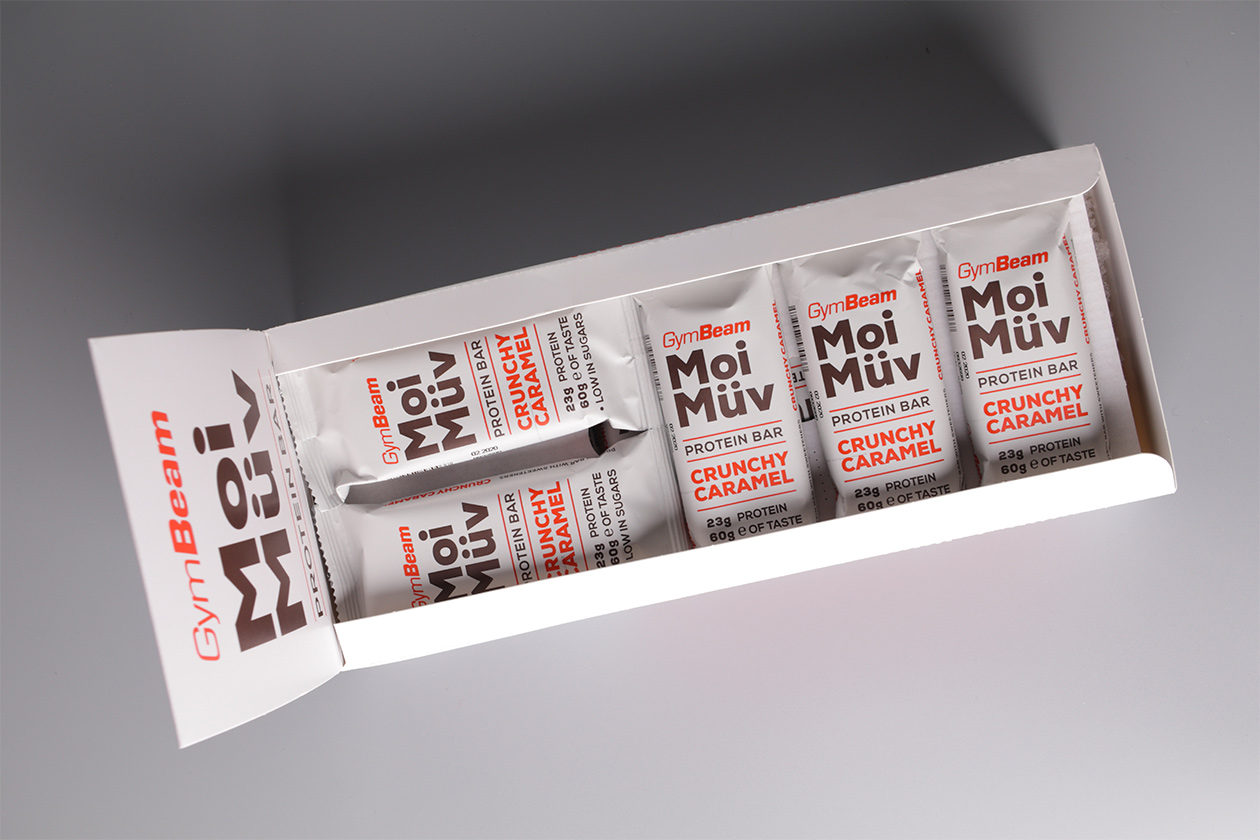
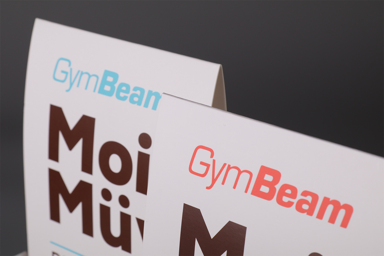
The graphic design was also adapted on the cardboard, which is the part of the product presentation on the website.