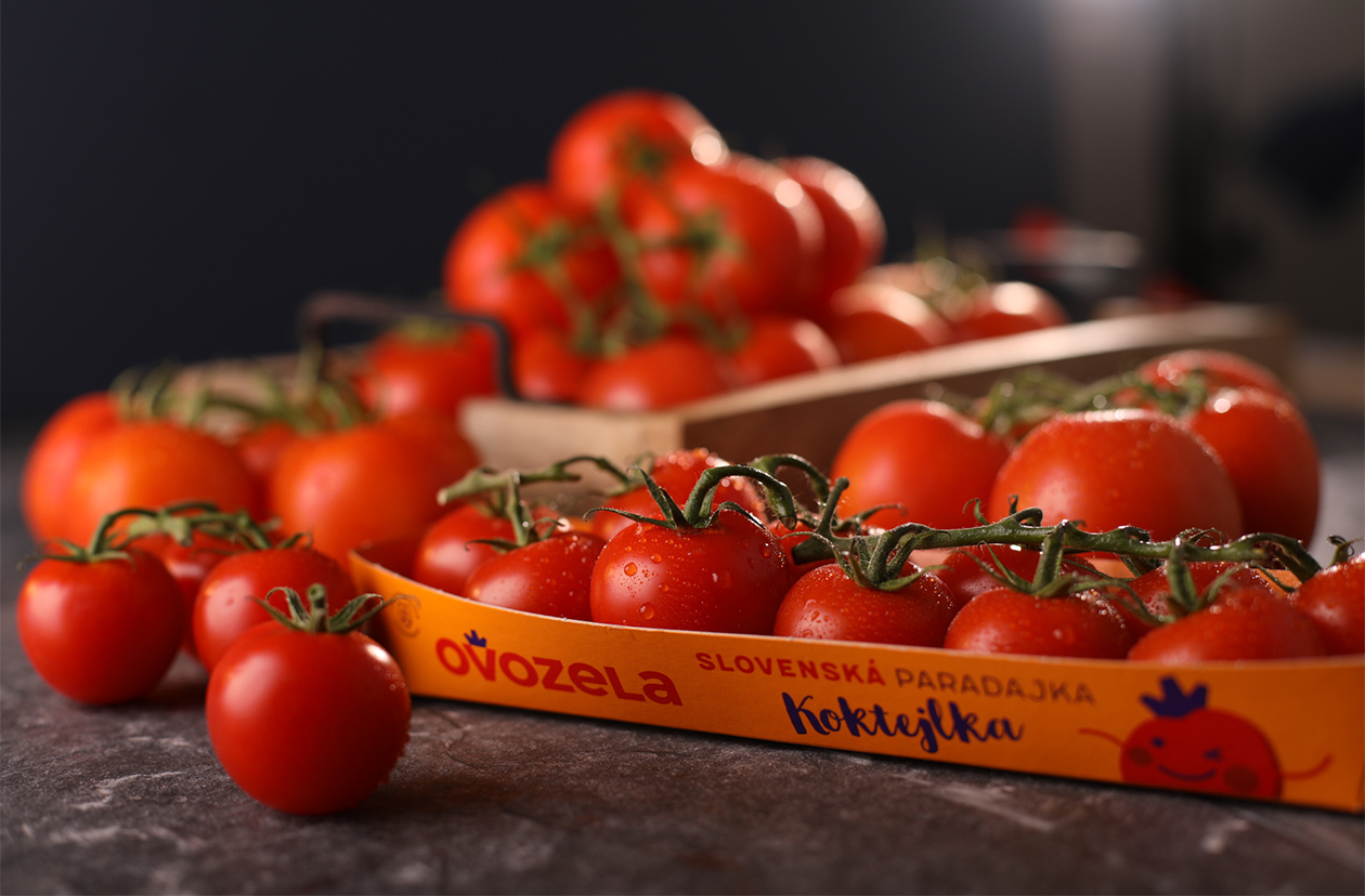
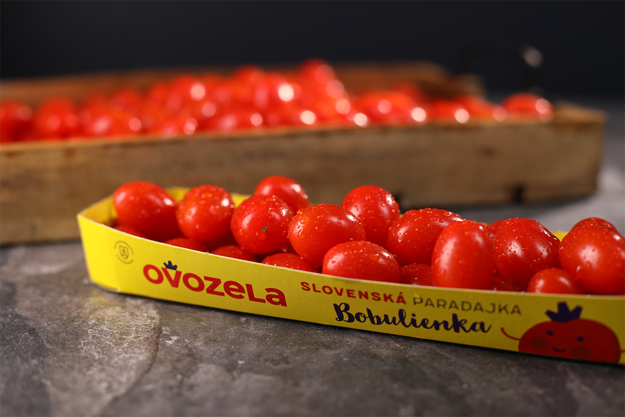
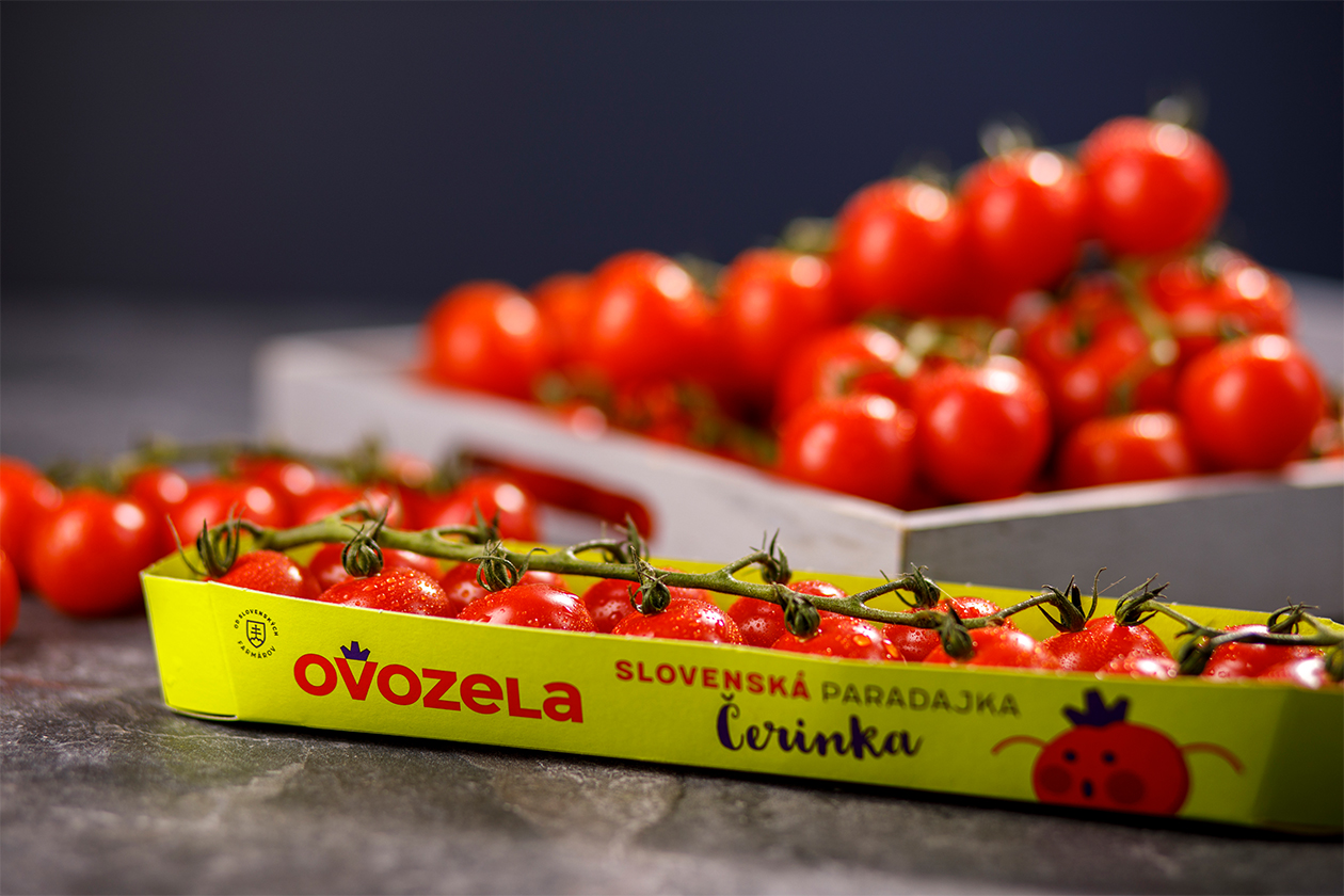
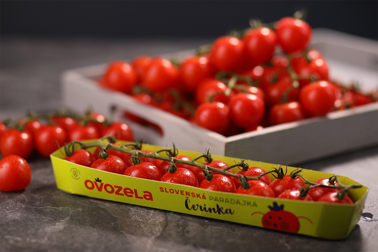
From a strategic viewpoint, the redesign brings clarity and differentiation to a commodity category. The brand’s visuals—bold typographic branding paired with clean, direct colour blocks—give the produce a strong shelf presence, reinforcing the Slovak origin and giving it a premium appeal in a crowded retail space. With each variety distinguished by character icons and unique graphic elements, the solution blends functional segmentation (so customers can quickly spot “cocktail”, “cherry”, etc.) with a distinct personality that raises the brand above generic tomato packaging.
On the execution side, the design balances playfulness with credibility — illustrative elements lend charm, while restrained structure and typography
retain seriousness. The choice of colour-coding each variant and the use of consistent visual grammar across packaging enable both brand recognition and product differentiation. Overall, this packaging refresh positions Ovozela as confidently local, modern, and premium while staying accessible to the everyday shopper.