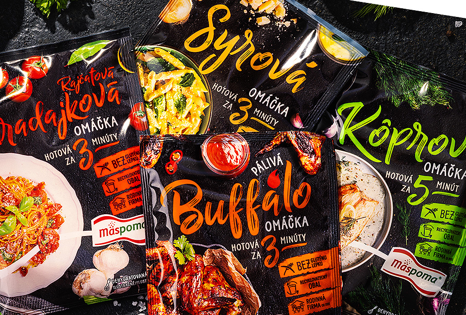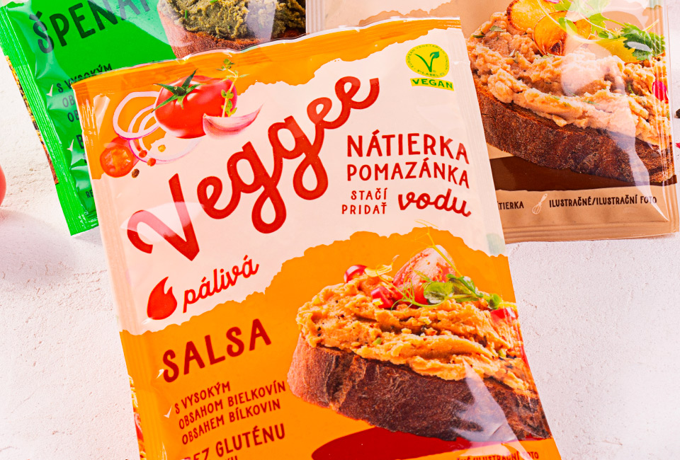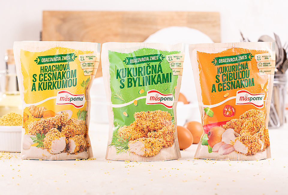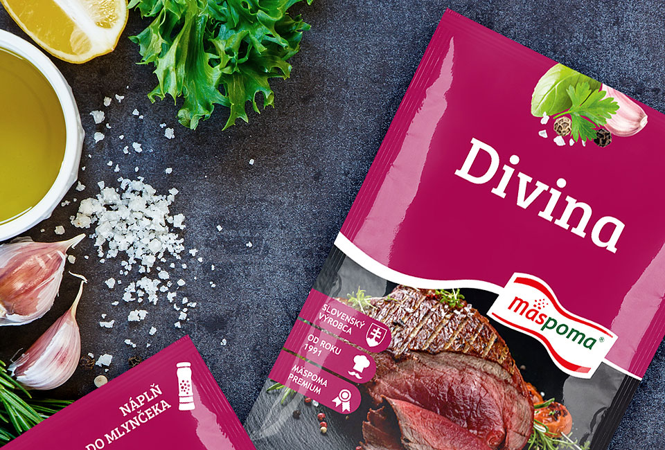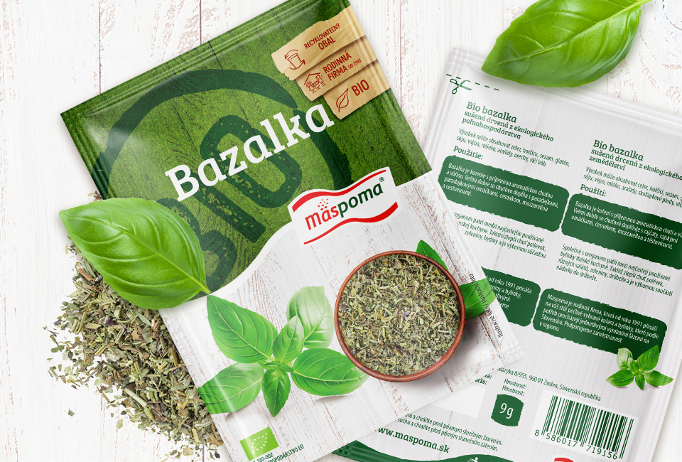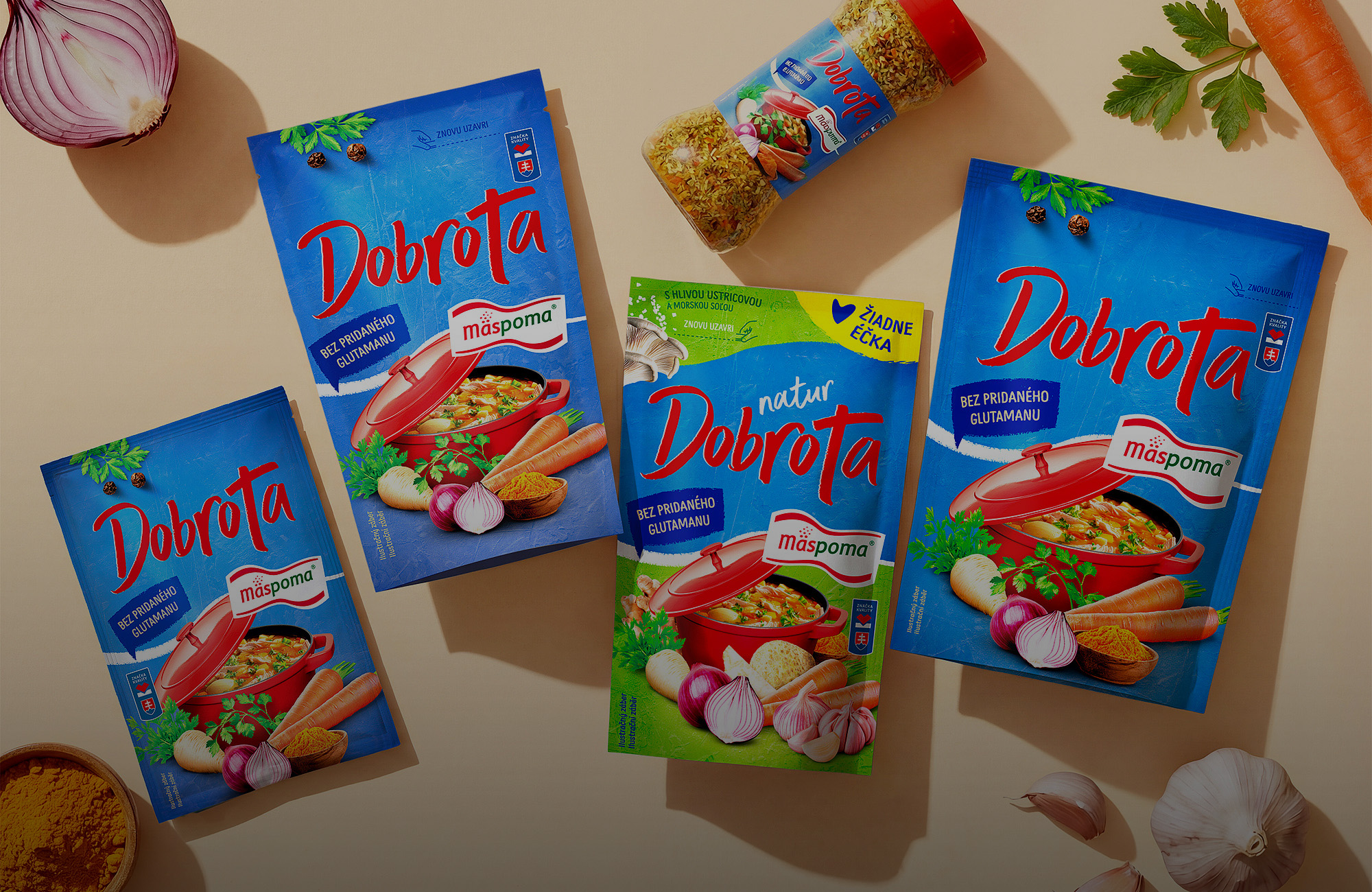
The redesign of the original Dobroty range was built on respect for tradition while addressing the need to strengthen visual readability on shelf. Within the project, we created a new packaging design that preserves the brand’s recognizability while introducing a more modern composition, stronger colors, and a clearer hierarchy of information. The dominant Dobrota name, product benefits, and food styling are arranged so that the packaging design remains strong and easy to read even from a greater distance.
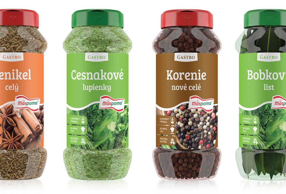
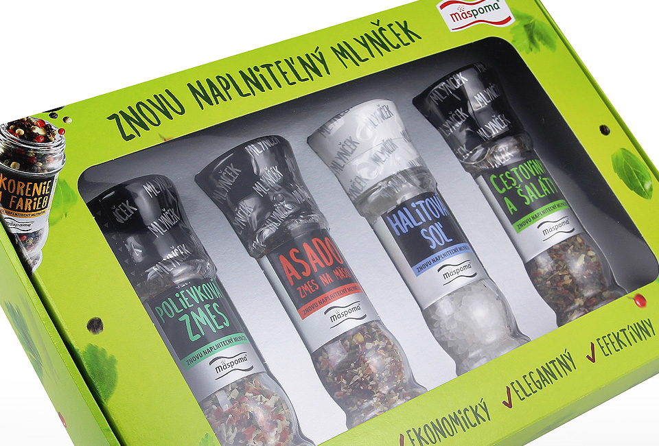
A key element is the consistent use of Mäspoma branding — the characteristic wave running through the composition forms a long-term visual asset of the brand. This element ensures continuity across the portfolio while also supporting readability and shelf navigation. Our systematic work with this line demonstrates how stable branding can function for years while remaining relevant.
The project also included complete visual production. All ingredients and the final food styling were photographed inhouse and then carefully retouched to ensure the packaging appears authentic while remaining visually appealing. We have been taking care of the Mäspoma brand for more than 10 years, and this Dobroty redesign represents another successful step in a long-term strategy of building strong and consistent packaging design in practice.